It’s the end of the month, so it is time to reflect, relax and rewind our way back through the one-sheets, banners, promotional artwork and posters released in the last calendar month, highlighting some of the ones we though were noteworthy. It’s a little section we like to call Best Posters.
The art of the poster is back and we’re loving it as the painted poster revisits our pages with gusto. Plus, someone better cut Saul Bass a cheque this month, as he has “inspired” one of two of our best. We still love them though.
Click images to enlarge
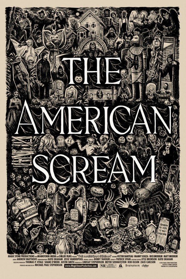
The American Scream – Artist: Johnny Sampson
From the artist’s Tumblr account: “Saw a rough edit of this movie and loved it. It’s about 4 different “home haunters” and their passion for Halloween. It’s also about following your dreams, no matter how silly they might be. Brought to you by the same people behind “Best Worst Movie”, directed and produced by Michael Paul Stephenson”.
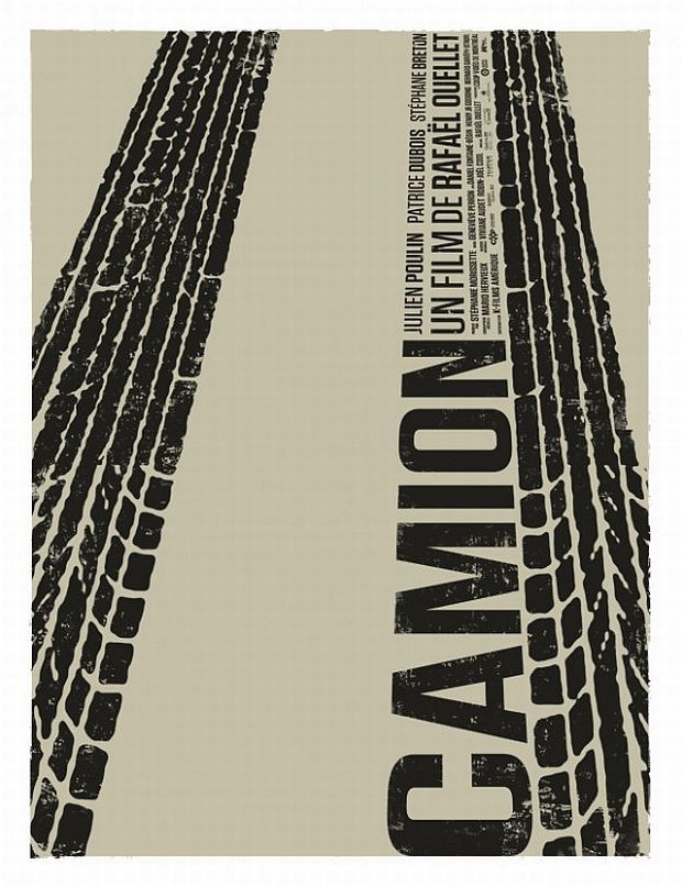
Camion – Artist: Karine Savard
One of several posters for Canadian Rafaël Ouellet’s award-winning new film, that recently screened at the Toronto International Film Festival (TIFF). We love the minimalism of this, incorporating the title into the tire tracks. While undoubtedly not a direct influence on the design, we couldn’t help but me reminded of The Penguin Empire‘s poster for Blame.
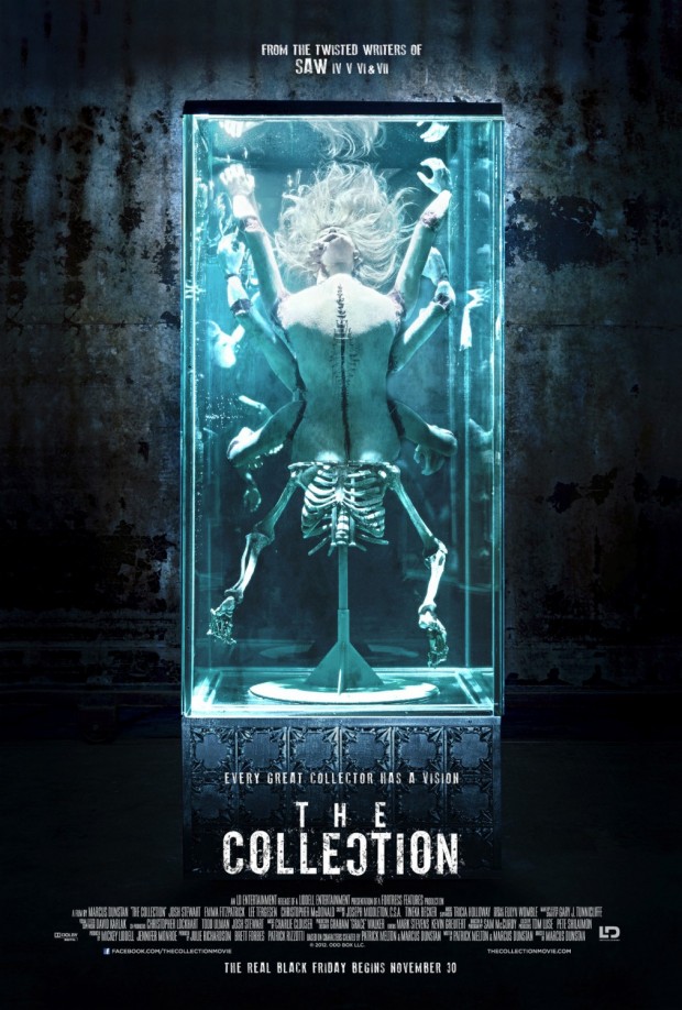
The Collection
If the purpose of a film poster is to grab the attention of the viewer, then this first poster for The Collection does just that. It might not be for all tastes, but like the posters for The Human Centipede series before it, it celebrates the grotesque and exposes it to the harsh blue light of day.
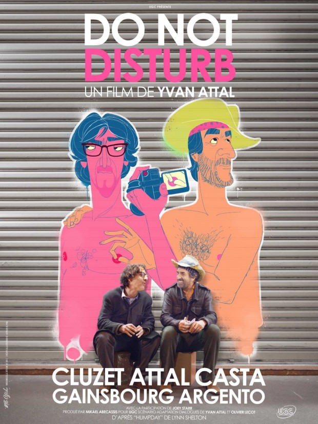
Do Not Disturb – Artist: Mlle Affiche
Nothing screams film poster like a cartoon nipple cripple. Nothing.
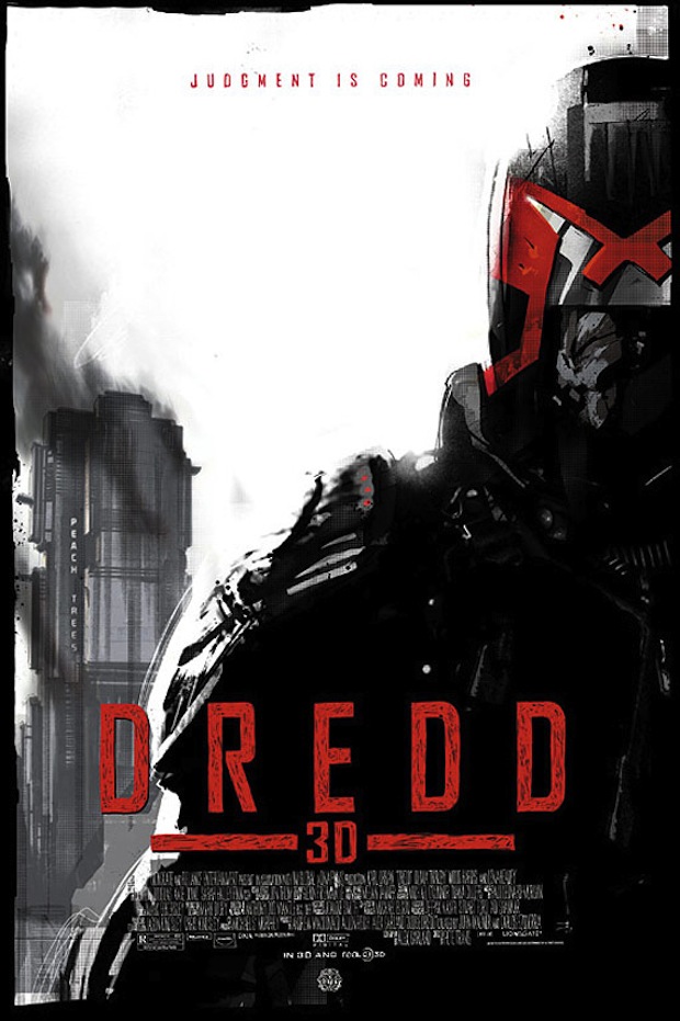
Dredd 3D – Artist: Jock
Comic book artist Jock has been featured in this column before, with his Mondo poster for The Dark Knight Rises, and this month he re-teams with the Alamo Drafthouse to lay down the law on a special poster for the character on the latest adaptation for the 2000 AD character.
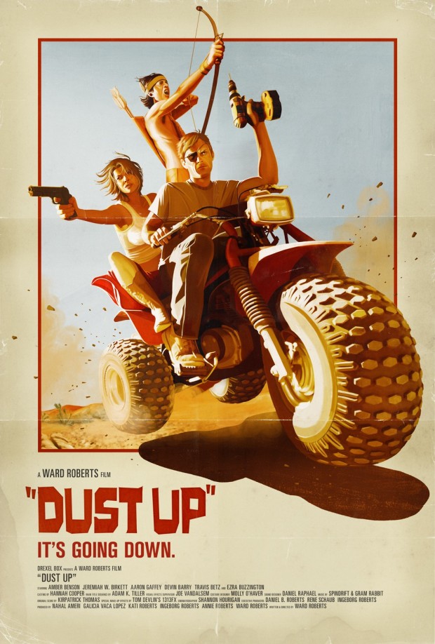
Dust Up – Artist: Akiko Stehrenberger
Painted posters are back this month! Stehrenberger has gained some attention over the last few years with posters for Father’s Day and the Funny Games remake. With this one-sheet, Stehrenberger takes a leaf out of her recent poster for Case di Mi Padre. The tri-fold is a nice touch to add that retro flavour.
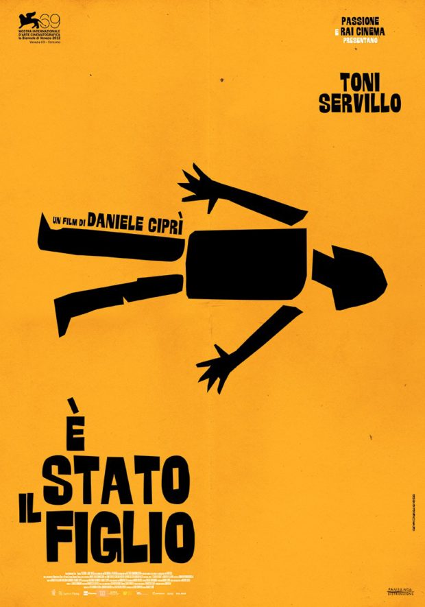
È stato il figlio – Artist: Federico Mauro
Another poster for a film that will not get a huge release outside of its native territory, but the poster ensures that we’ll take a look at it. Federico Mauro has a very Saul Bass inspired design for this poster. By inspired, we mean that it has wholesale taken his design for Anatomy of a Murder. Nevertheless, a cool design remains a cool design.
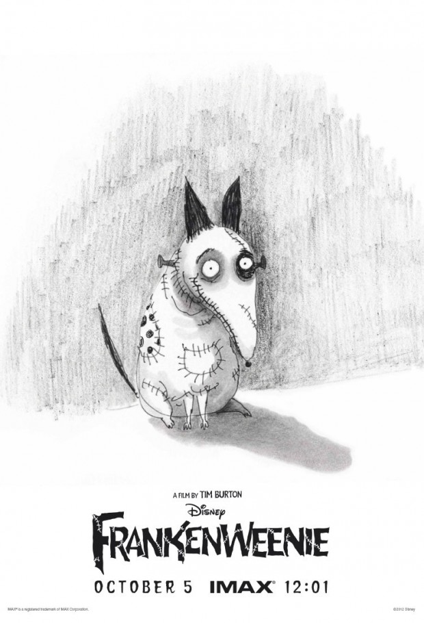
Frankenweenie – Artist: Tim Burton
Remaking his own short film as a feature-length stop-motion animated film, an original Burton sketch graces this IMAX exclusive poster for the upcoming Frankenweenie. Only those attending those sessions can grab this poster, so keep an eye out on eBay for this gem of a poster.
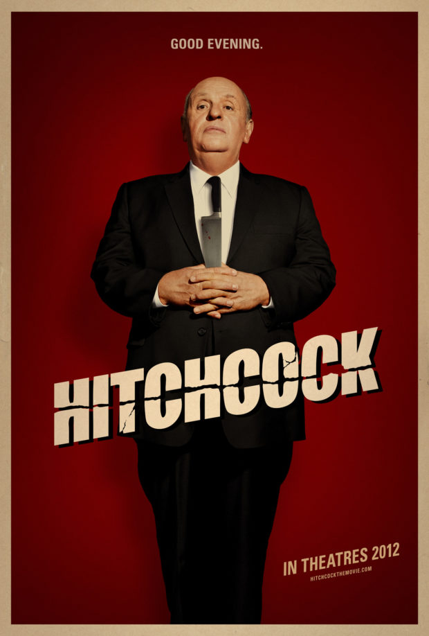
Hitchcock – Artist: Bemis Balkind
To paraphrase Homer Simpson, this poster looks like the things they look like. The only thing more spooky than how much Anthony Hopkins looks like The Master of Suspense is how much this poster smacks of classic Hitch. While there is a flurry of activity around Hitchcock biopics at the moment, this poster takes the cake.
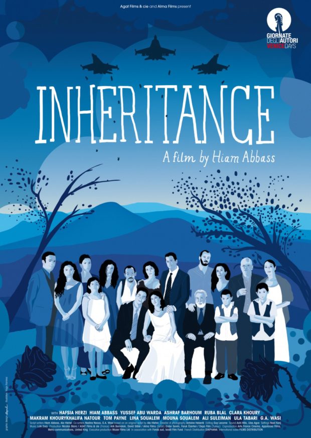
Inheritance – Artist: Aurélie Huet
Keeping it international here at the Bits, we’re digging on the rotoscoped vibe that this poster is giving off. The minimalist design is all about the blue, and it’s lovely to see what can be done with just a few layers of the bluest of blues. The fighter jets flying overhead sit in contrast with the family portrait in the front. Did we also mention blue?
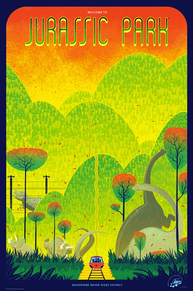
Jurassic Park – Artist: Kevin Tong
How many Jurassic Park posters is this for Mondo now? It seems like a lot. At any rate, any excuse for a new Kevin Tong poster, all with requisite shapes and colours. He continues with a variation on his themes, and it is good to see that all of the nice dinosaurs have been included, and only one scary one up the back. All the dinosaurs up the front are all like “Dude, you’re going the wrong way!” and he’s all like “The colours, man! The colours!”
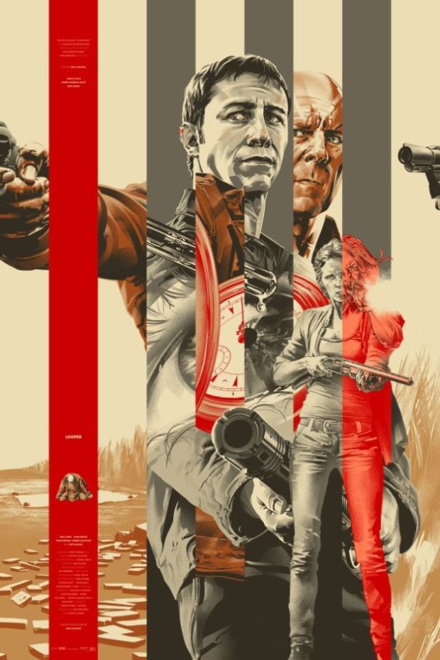
Looper – Artist: Martin Ansin
The film Looper plays with the concept of duality, and this is where Martin Ansin steps in with another fine print for the folks at Mondo. Using the characteristic lines we’ve seen in some of his other work, he splits the images with a two-tone colour scheme as well. The watch, we think, has something to do with time. That guy at the back looks just like Bruce Willis, right?
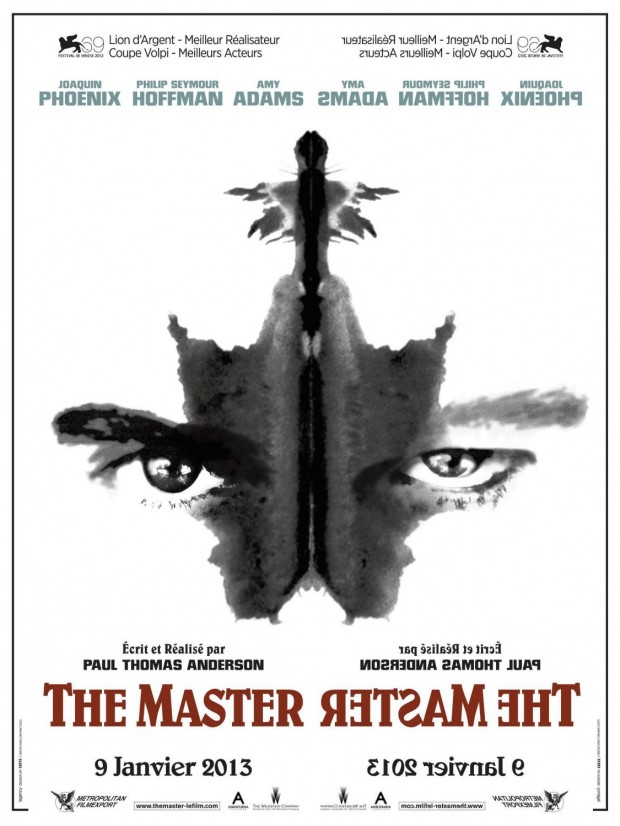
The Master
Before anybody saw a frame of footage, Paul Thomas Anderson’s latest film was already being overly praised by real critics and Internet critics alike. This international poster goes the ink blot test. We think we see a pair of eyes and some ink, but we could be wrong. The backwards title is distracting. We’ve not seen The Master, but we’re happy to give it five stars now if it’s easier?
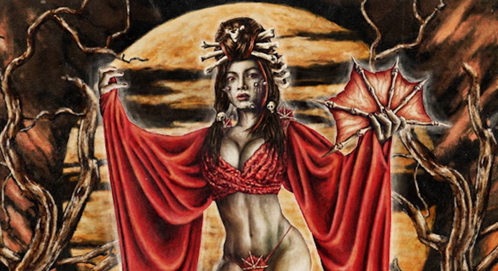
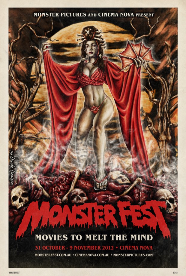
Monster Fest 2012 – Artist: Tom Hodge (The Dude Designs)
Hodge has had an incredibly busy month this September, with at least three column worthy posters. Yet this poster has a local flavour as well, hyping the Melbourne-based Monster Fest. From Hodge’s blog: “The concept was to create a classic film poster design based on the monster geisha character they have made for this promo short created by Isabel Peppard as the face of the fest for 2012…Its a straight down the line celebration of classic exploitation, monster, horror design to really drive home that film style vibe for the folks and as a fun poster momentum of the festival”.
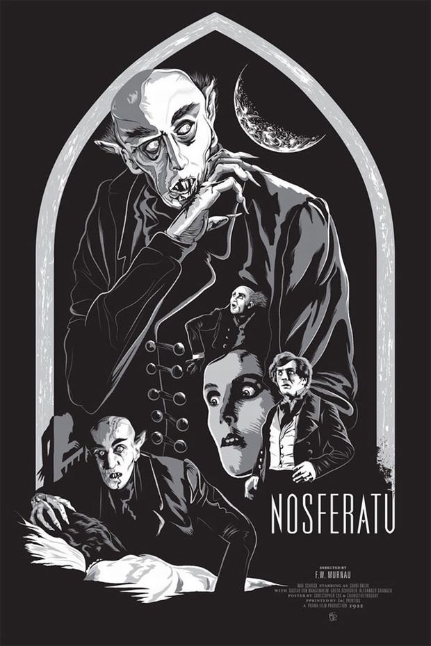
Nosferatu – Artist: Christopher Cox
The Nosferatu poster was designed and illustrated by Changethethought artist and founder Christopher Cox. This is one of several screen prints done for the series, some adding a blood red border while others have an excessive amount of glow paint to give this an after dark glow.
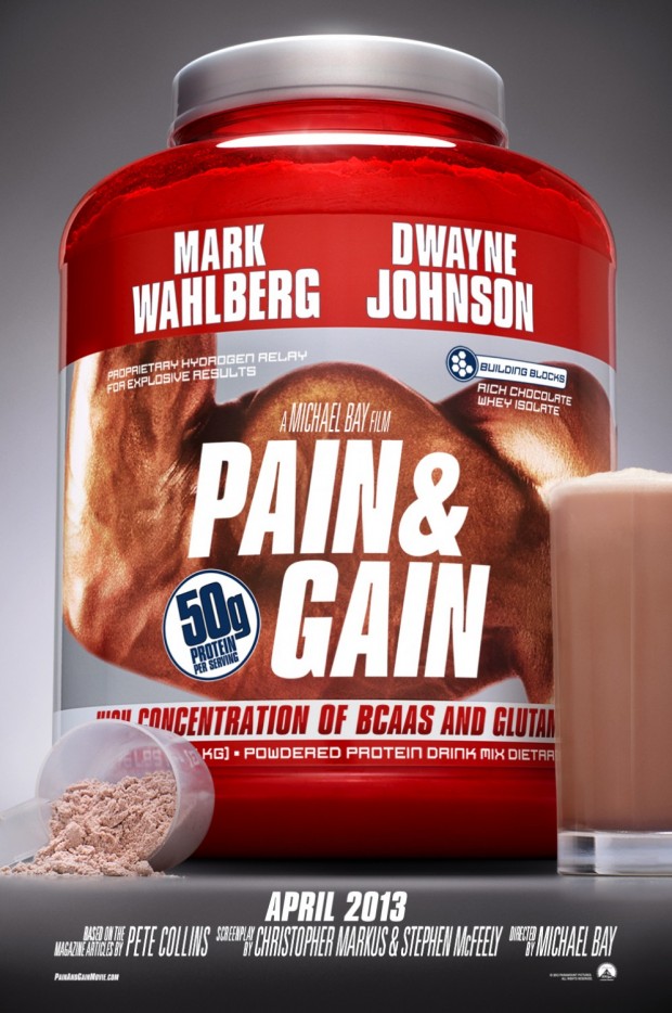
Pain and Gain – Designers: BLT Communications, LLC
This one is kind of cute. Designing a film about weight lifting to look like that weight gain powder may either be genius, or the best thing about a film starring Marky Mark and The Rock.
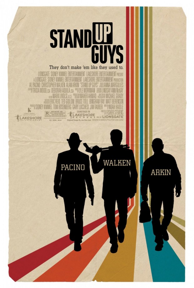
Stand Up Guys – Designers: Works ADV
What is it? Saul Bass appreciation month? Or are silhouettes just big this season? Even more distinct for the folks at Works ADV, who have traditionally done very Photoshop-heavy hero shots for big blockbuster films of the summer.


To me, the Looper poster is the best of the year. Also, Akiko Stehrenberger is a woman.
It’s funny because the genuine posters of Looper sucked arse.