Australians all let us rejoice, for we make pretty good movie posters. With Australia Day coming up this week, what better way for us to celebrate than with a look back at Australia’s cinematic greats – in poster form! This isn’t a best-of list or a call on the quality of the films themselves (there are some fairly questionable choices!), but more an appreciation of the evolution of the Aussie movie poster.
For example, in many ways we could almost run a list of “20 Great Australian Film Posters By Jeremy Saunders“, given that he has had such a huge impact on poster design in the country over the last decade. Ones we didn’t include, such as the fabulous Gettin’ Square poster inspired by Cul-de-Sac or his frightening set of Animal Kingdom prints, were simply to free up space for other posters! The other great group to look out for is Carnival Studio, as both have done great posters for Australian films, and the marketing for the domestic distribution of international films.
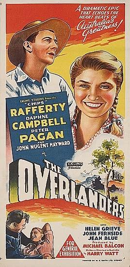
The Overlanders (1946)
While this is co-production with UK’s Ealing Studios, this very Australian film with “Chips” Rafferty sees a group of cattlemen (and one woman) droving a herd of cattle across the 1600 miles from Wyndam, Western Australia through the Northern Territory to Brisbane. A long stretch of land, somewhat represented by the long-form daybill poster that claims the film to be “A dramatic epic that echoes the heart beats of Australia’s greatness”. There is so much to question about that tagline, not least of which is where Australia’s Greatness keeps its heart. Surely this was a model for the less great, but no less dramatic, Baz Luhrmann film Australia.
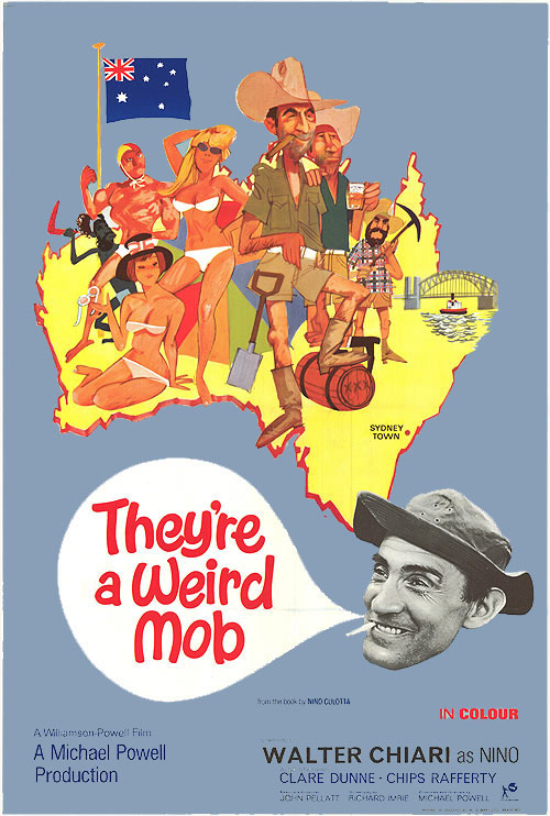
They’re A Weird Mob (1966)
As this is an Australia Day celebration, we couldn’t get away without using a poster that not only has the flag on it, but a map of the country with Walter Chiari as Tasmania. Once again, despite this very Australian of ideas, it’s a classic British filmmaking team that puts it together: Michael Powell and Emeric Pressburger (The Red Shoes, Peeping Tom) would mark this as one of their last collaborations, with Pressberger adapting “Nino Culotta’s” novel (really John O’Grady) under his own pseudonym of Richard Imrie.
Wake in Fright (1971)
This poster shows the US title for the film that would be known internationally as Outback, the same title it used for its world premiere in Cannes in 1971. The unsettling film was almost lost to the ages, with the only print for many years believed to be an unusable one in Dublin, until a copy of the negatives were found in a container labelled “For Destruction” in Pittsburg in 2004, which served as the basis for the magnificent 2009 restoration. Following its restoration, it is only one of two films to screen twice at Cannes, the other being Michelangelo Antonioni’s film L’Avventura.
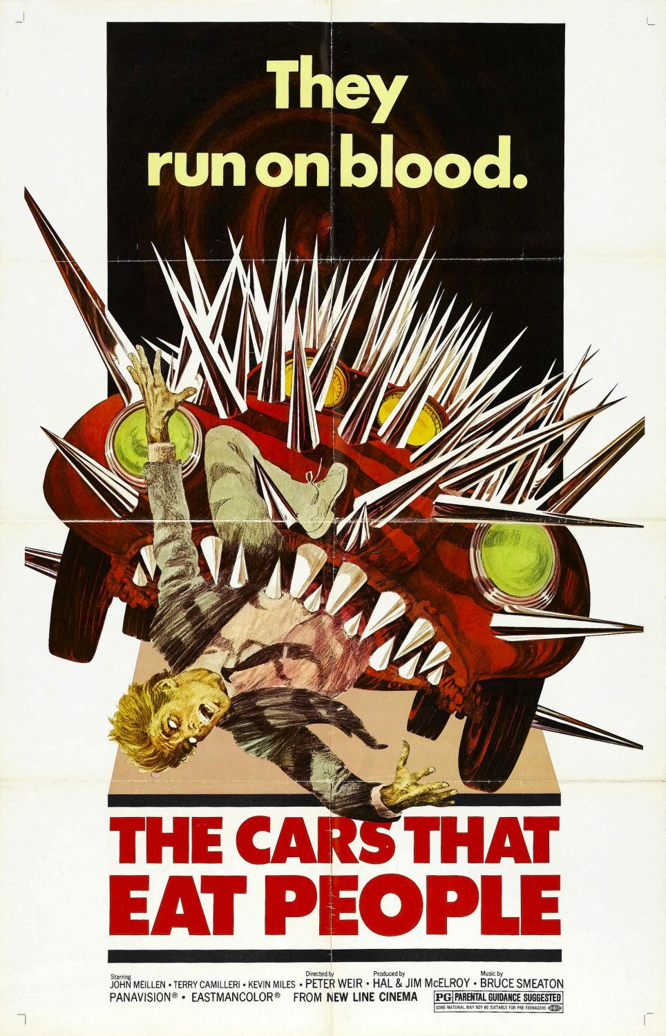
The Cars That Ate Paris (1974)
This poster has it all. It has an alternative title, The Cars That Eat People, and a depiction of a car doing just that. It was apparently retitled for an America audience who may have thought the cars were chowing down on the French. If that doesn’t top it off, the tagline of “They run on blood” has to be one of the best in the business. Of course, the price of blood has gone up over the years, with the choice of unleaded or premium at most servos. Peter Weir’s film has become a creepy classic, and while the original Australian daybill (the only one with the original title) may be the more sought-after of the posters, this US one-sheet conjures up all the best bits of the film.
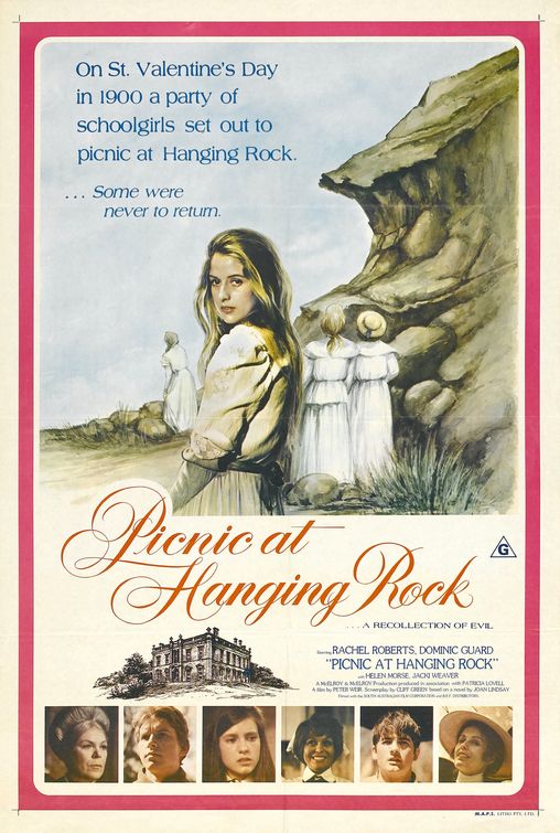
Picnic at Hanging Rock (1975)
Another Peter Weir film. It is such a rarity to see original art on posters these days, with PhotoShop serving as a more economical substitute, and the art was maintained through later re-releases. Not simply one of the best Australian films ever made, but one of the best films of the twentieth-century. Picnic at Hanging Rock remains an excellent mystery to this day simply because it refuses to provide the easy answers, and each repeat viewing allows the film to be examined in a new light. It would be great to see this art as a complete piece without the photos added at the bottom, as it incredibly reminiscent of a paperback cover.
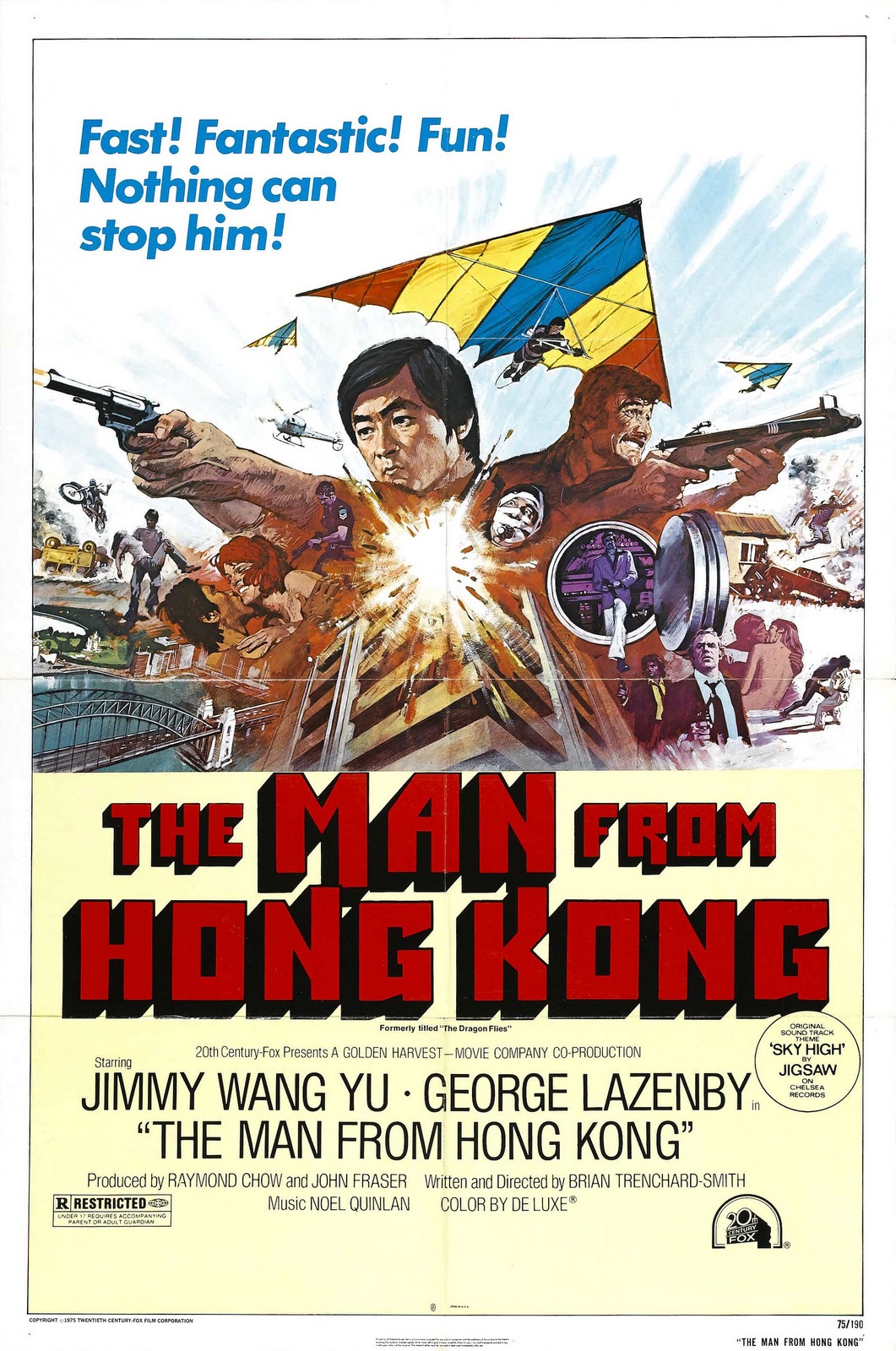
The Man from Hong Kong (1975)
The tagline on this poster says it all: “Fast! Fantastic! Fun!”. One of the countless exploitation films made by Brian Trenchard-Smith in the 1970s, it was not only one of the first co-productions between Australia and Hong Kong, but features an earlier performance of the legendary director and star Sammo Hung. Released at the height of the Australian New Wave of cinema, the making of this film and others like it has been chronicled in the documentary Not Quite Hollywood, which appears a little further down this list.
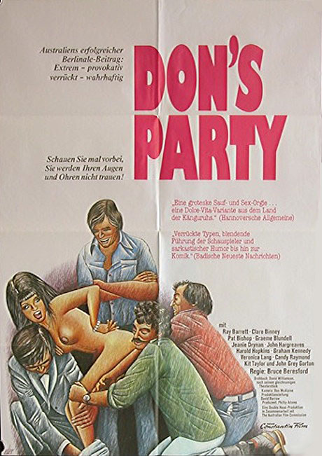
Don’s Party (1976)
The classic Don’s Party isn’t exactly high art, and the original Australian theatrical poster is fairly rough and ready. Yet this German poster for the film takes it all to another level. With a tagline that touts its success in Australia, before informing us that we won’t believe our eyes and ears, there was a deliberate marketing strategy here. The sketch artist may have been going for a playful larakin attempting to get the knickers off the young lady depicted, but it kind of gets lost in translation and comes out the other side as “gang rape”. Insert comment about German sense of humour [here].
Poster source: The Art of Movie Posters
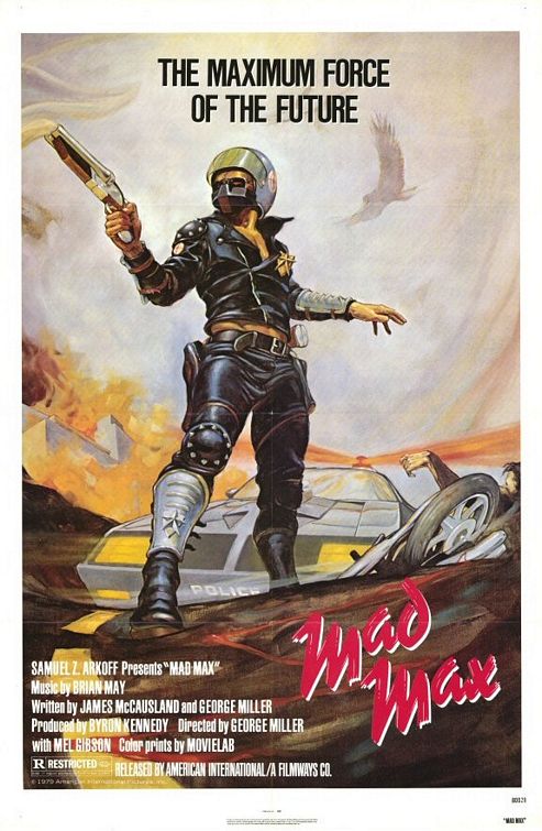
Mad Max (1979)
How could we do a list of Australian movie posters and not include the iconic Mad Max? We could, but we’d get people saying “How could you do a list of Australian movie posters and not include the iconic Mad Max?”. There are a bunch of posters for this film, all of which speak to the maximum force of the future, but this has a retro-cool vibe to it that could place the film anywhere from a 1950s pulp novel, to the not-to-distant future of the early 1980s. This is actually one of those posters we wouldn’t mind getting a print of, but then would have no idea what to do with it.
Gallipoli (1981)
There are a number of Gallipoli posters that have the really insulting tagline “From a place you’ve never heard of…a story you’ll never forget”. Those posters feature a silhouette of the final shot of the film, but this simple Australian one-sheet is no less powerful in its isolating depiction of the leads. Yet another Peter Weir film (what can we say? He gives good film, or at least he did), this is a masterpiece that not only reminds us of the horrors of war, but brings it home. “Peter Weir’s film of Gallipoli” implies that this is not simply a fictionalised account, but a true thing brought to life, and that isn’t too far off.
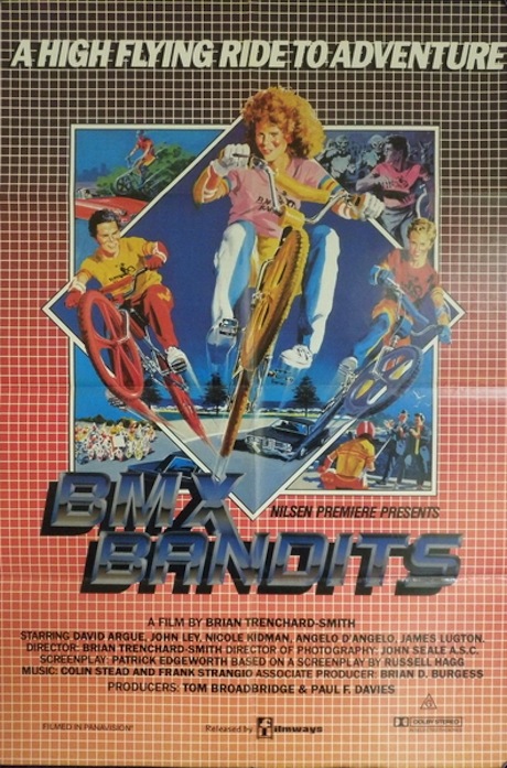
BMX Bandits (1983)
It’s the ’80s, man! Back when Nicole Kidman was still a redhead with freckles, both of which have miraculously disappeared over the years, she was on a high flying ride to adventure. This may have been set in the 1980s, but it was all about the future. How do we know that? Gridlines. Everything in the future had gridlines, as far as we could tell back then. Gridlines would dominate the globe like apes on the Statue of Liberty. Worryingly, this is the second Brian Trenchard-Smith film to make our list, but the only one with kids on flying bikes.
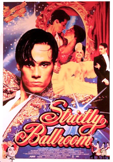
Strictly Ballroom (1992)
The Australian one-sheet for Baz Luhrmann’s debut feature also spoke to the future, as it seemed to predict the trajectory of the director’s career for at least his next two films. The Red Curtain was prophetic of the eventual “Red Curtain Trilogy” that would be joined by Romeo + Juliet and Moulin Rouge, but everything else about the poster is bright, breezy and screaming flamboyant fun. The tiny grinning head in the bottom left corner caps this off perfect for us.
The Goddess of 1967 (2001)
The Goddess of the title is a Citroën DS or “Déesse” (‘Goddess’), a stylish car made in the 1950s and 1960s. A young Japanese man, J.M. (Rikiya Kurokawa) wants one, and finds an Australian man on the Internet who is willing to sell him one. However, as luck would have it, J.M arrives in Australia to find that the seller is one half of a murder-suicide. Talk about your awkward timing. Amid the bloody chaos, there is a blind 17 year-old girl, B.G. (Rose Byrne), who agrees to show him the car. From there, the pair embarks on a five-day journey into the outback, which also takes them into the recesses of their memories. The Goddess of 1967 is not exactly what you’d call ‘linear’, the slightly surreal nature of this poster, contrasting the pink of the car with the unnaturally blue sky, is a bit of a trip.
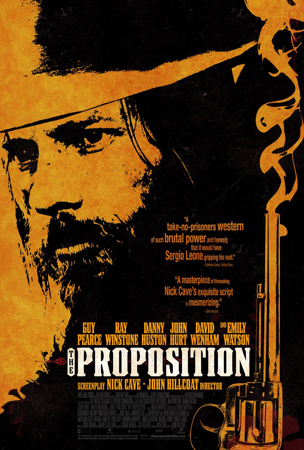
The Proposition (2005)
“Australia, what fresh hell is this?”. While Australians will be more familiar with the GP London poster for this film, these prints done for the US release by Art Machine, A Trailer Park company, are nothing short of stunning. Instantly evoking the Sergio Leone mentioned on the poster, this is part of a set of four prints, each showing different character aspects or scenes from this most powerful of Australian Westerns.
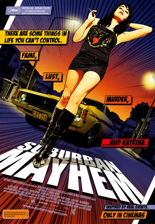
Suburban Mayhem (2006)
Possibly the best of the bunch. A (you guessed it) Jeremy Saunders creation. For a comparison, or to peek inside the creative process, have a look at some of the unused designs for the Suburban Mayhem poster, and just how different some of them are. The pulp fiction aspects of the poster are obvious, but the combination of the layout, the comic book aspects and Emily Barclay’s legs just makes this poster work as an instantly iconic print. Much has been written about this poster, including a blog piece on Saunders’ official site.
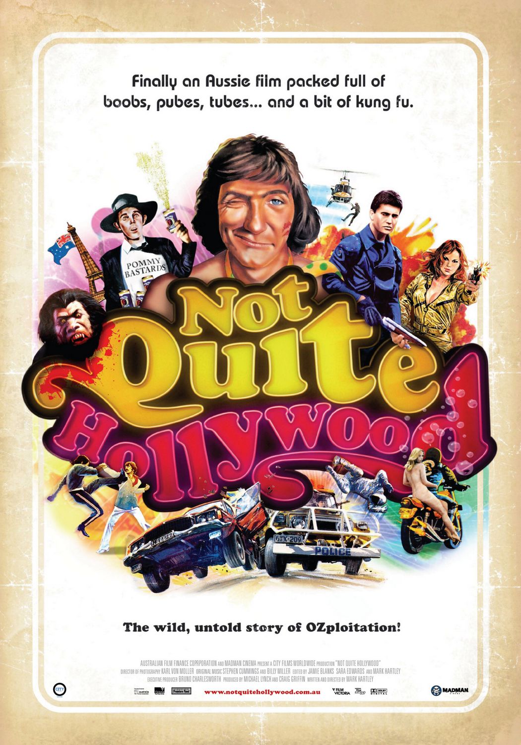
Not Quite Hollywood (2008)
An Australian film poster that is a tribute to Australian film posters. Meta! The kind of goofy and definitely tongue-in-cheek one-sheet is a salute to many of the posters that we mentioned already, referencing Alvin Purple, Mad Max, The Adventures of Barry McKenzie, Turkey Shoot and many more. The documentary itself is a wonderful exploration of the “other side” of Australian cinema, following those films that quietly (and not-so-quietly) put bums on seats while artier fare, such as Picnic at Hanging Rock (above), impressed international critics. As a side note, the US poster seems to drop the reference to Australia and “boobs, pubes, tubes” with the slightly tamer “Finally a documentary full of gratuitous nudity, senseless violence, car crashes…and a bit of kung fu”.
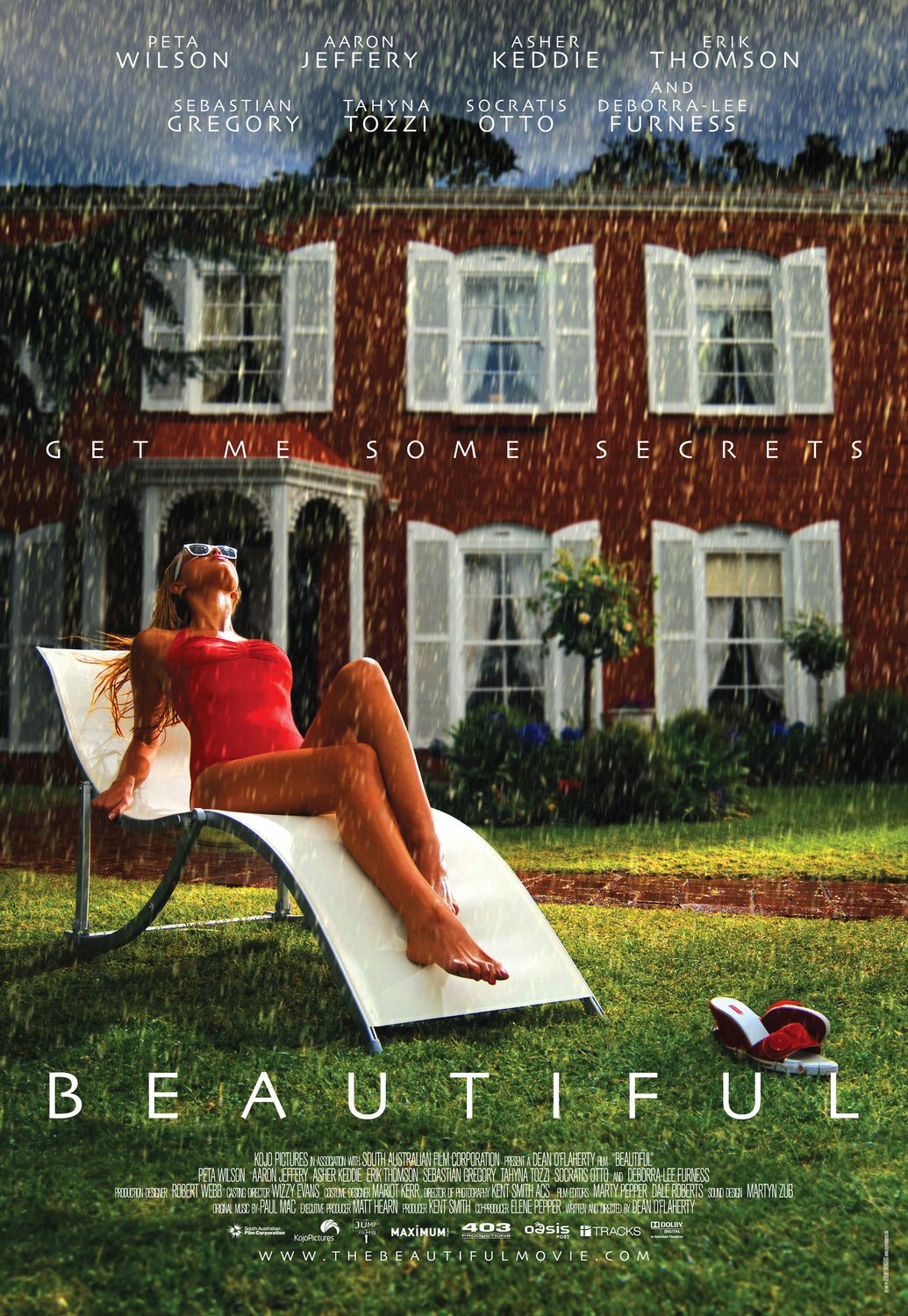
Beautiful (2009)
Yes, it’s Jeremy Saunders again. He just keeps making terrific posters. Damn him and his talent! The hyperrealistic nature of this poster is instantly striking, and there is an almost David Lynch-ian (circa Blue Velvet) quality to the contrasting bright green grass and bathing beauty, with the imposing and foreboding building in the background. Not much needs to be added to this one, as the art speaks for itself. Beautiful.
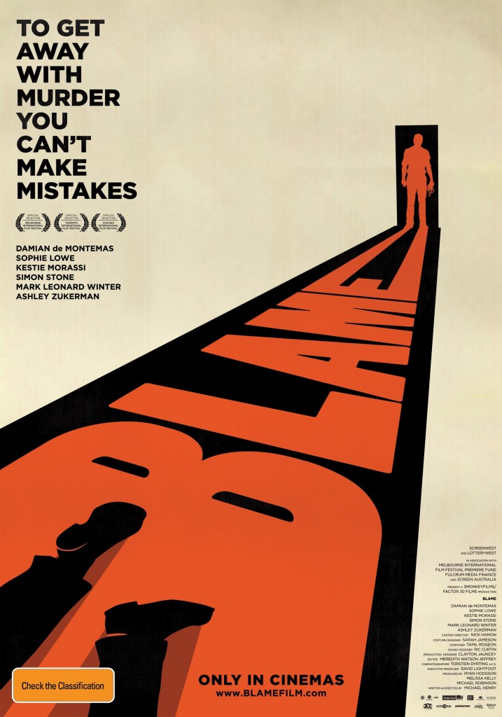
Blame (2011)
Designed by The Penguin Empire, the poster to this Australian psychological drama was reportedly inspired by the work of Saul Bass. This is a masterclass in poster making, proving that often the simplest of designs – using no more than three colours and simple lines and recognisable shapes – are often the most eye-catching. The way the shadow of the figure standing in the doorway forms the shape of the ‘E’ is also quite cool.
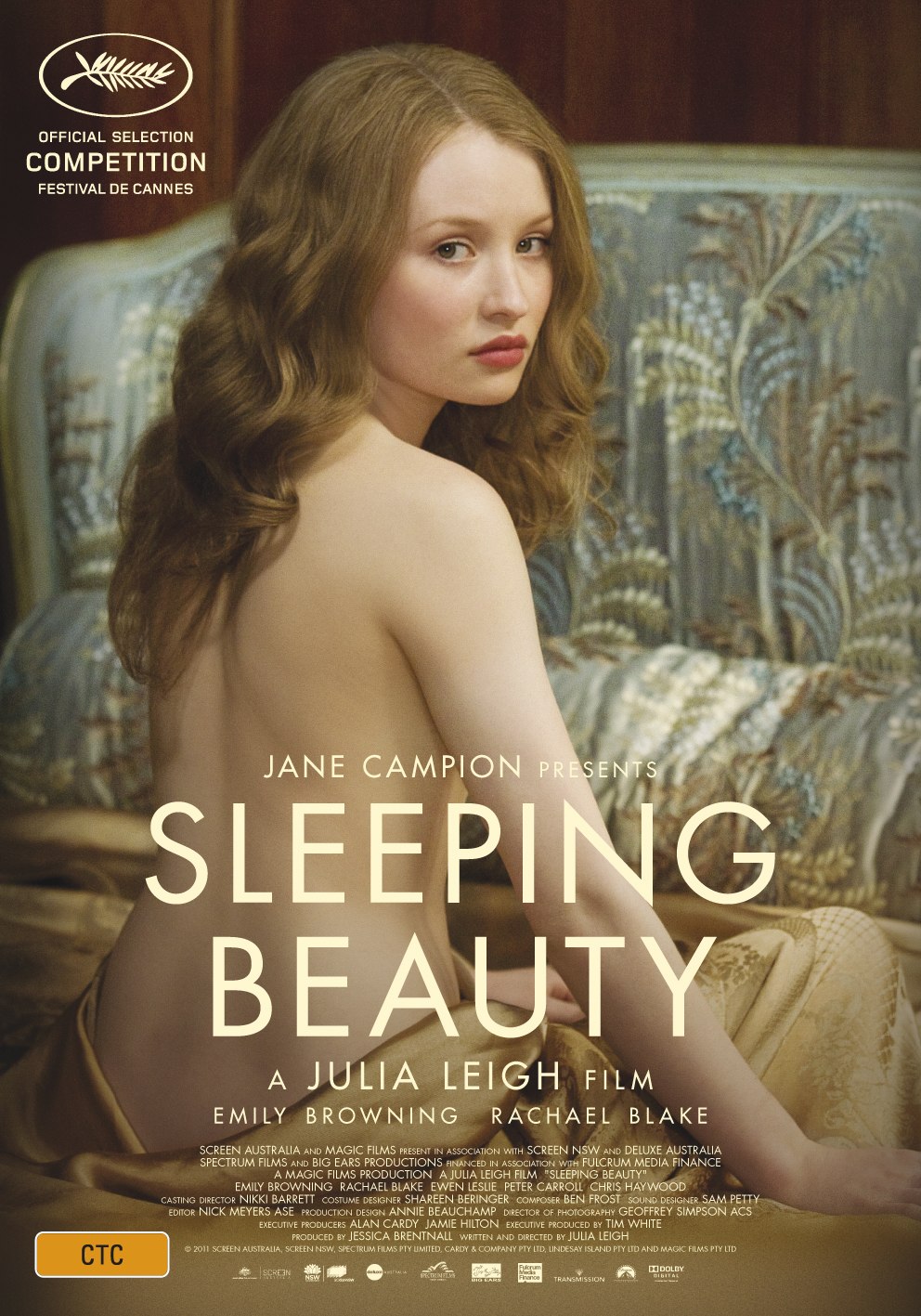
Sleeping Beauty (2011)
The film may have turned out to be a bit of a snooze after all the pre-publicity hype, but the poster had us all gasping with anticipation at the sheer beauty of its design. Indeed, for all of its faults, the film shares this same aesthetic and Emily Browning draped half-naked on a bed doesn’t hurt either. The film itself is a frustrating and sporadically beautiful film, that remains as impenetrable as the activities it depicts. Best watched with a cup of tea. Firmly establishing itself as the Empire Strikes Back of Browning’s Trilogy (following Sucker Punch, with a third entry TBA), the poster says more (or about the same) in a one-sheet than the entire film manages to in 101 minutes.
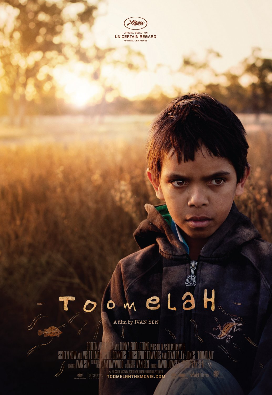
Toomelah (2011)
Carnival Studio designed this striking poster to Ivan Sen’s film, as they did for his earlier work Beneath Clouds and we are quite lucky that their official site actually talks a little bit about the design process. For the poster, they used “new high quality photography…shot on location at Toomelah mission”.
Their aim was “to reflect Daniel’s innocence and vulnerability within his natural homelands but also the underlying conflict and issues he faces”, and rather than add any other visual elements, it was decided that Daniel’s “expression speaks volumes without the need for other visual markers”. Of other special note is the typography, which Carnival says “suggests a boystrous cooee and the tranditional animal totems were introduced to reflect his natural influences and what ultimately grounds him”.
Burning Man (2011)
Once again a Jeremy Saunders creation, this one comes with an extensive discussion over at MUBI as to the creative process. Easily one of the best posters of 2011, and certainly the best Australian poster of the last few years, Saunders explains: “The strewn foods are from a car crash scene, and it helps to reflect (no pun intended) that Tom’s life is out of control. Plus, you know, he’s a chef, so there’s that…I read some internet concern about the tiny type but if it makes people slow down to try and read it, they read it. We see more images before breakfast every day than people 100 years ago saw in their entire lives, so to make people take notice of one in particular is a huge challenge”.







Great list! Although if I had to choose a Brian Trenchard-Smith poster to use it would have been the one for “Dead End Drive-In”.
Thanks, Glenn! So many great posters to choose from, and ‘Dead End Drive-In’ is a terrific one. I’ll mark it down for next year.