It’s the end of the month, so it is time to reflect, relax and rewind our way back through the one-sheets, banners, promotional artwork and posters released in the last calendar month, highlighting some of the ones we though were noteworthy.
Click images to enlarge
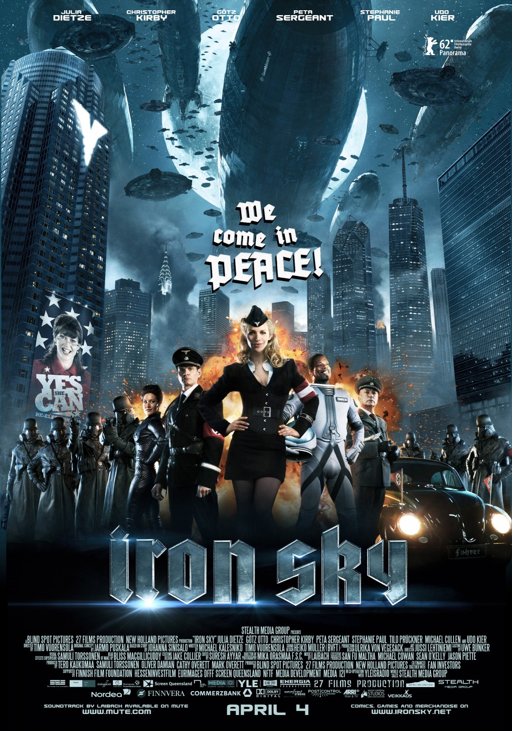
Iron Sky already has it all going for it, and the poster is a microcosm of its coolness. Let’s do the list: Nazis? Definitely check. The only thing better than Nazis? Hot Nazis? Oh yes. One with cleavage and a short skirt, the other in leather. And that’s just the women. Plus, there’s Nazis in gas masks, and they are potentially sexy too, although the gas masks seem to be more of an aesthetic enhancement than a functional one. Airships? Are you even looking?
If that isn’t enough, there are some kind of spacecraft hovering overhead, and…wait. Is that Sarah Palin running for office on the building on the left?
One of the most epic sci-fi films of the year is John Carter, released in cinemas in just a few weeks. The posters to date haven’t tipped their hat to the history of the film, or given the sense of the artistic majesty in the film. Now Hero Complex has released a look at a special Mondo poster from J.C. Richard, to be given out to viewers who catch selected midnight screenings.
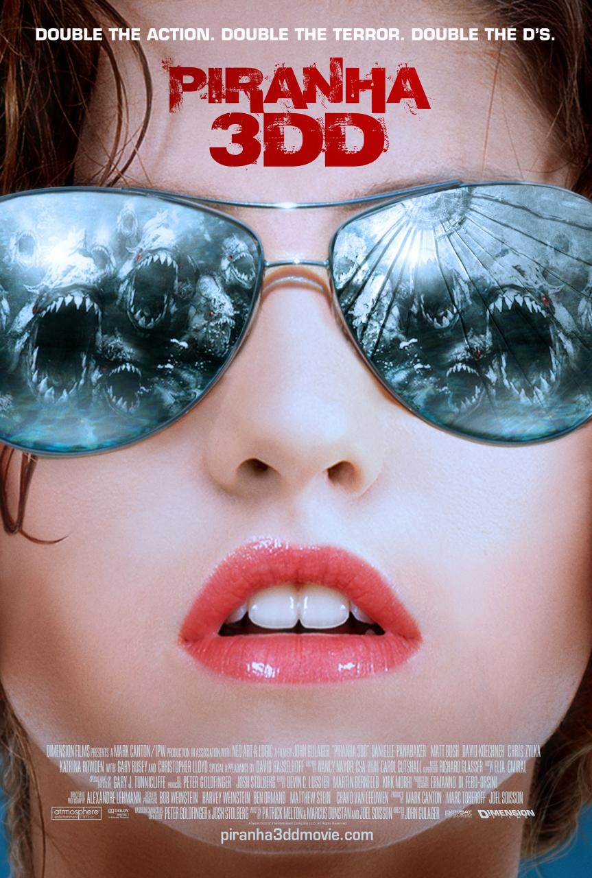
One of two posters for Piranha 3DD, this one-sheet demonstrates that regardless of how the film turns out, horror poster art is alive and well. Talk about telling the audience what to expect: a suggestively open pair of glossed lips, on what we can only assume is a soon-to-be-naked nubile, and a some mirrored shades reflecting the little critters in the title. Not enough? “Double the action. Double the terror. Double the Ds”. It’s good to remember that the important things in life all contain references to boobs. Which brings us to…
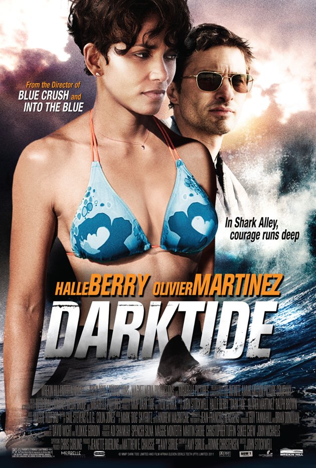
… Dark Tide. Now, bear with us on this one. Dark Tide gives us a poster with two very good reasons to see the film. Did you see that shark fin lurking in the water? Neither did we. You know who else didn’t see it? Everybody. Courage may not be the only thing running deep on the poster, but actor/director John Stockwell is responsible for Blue Crush and Into The Blue, another fact that was on the poster and we didn’t see for some reason.
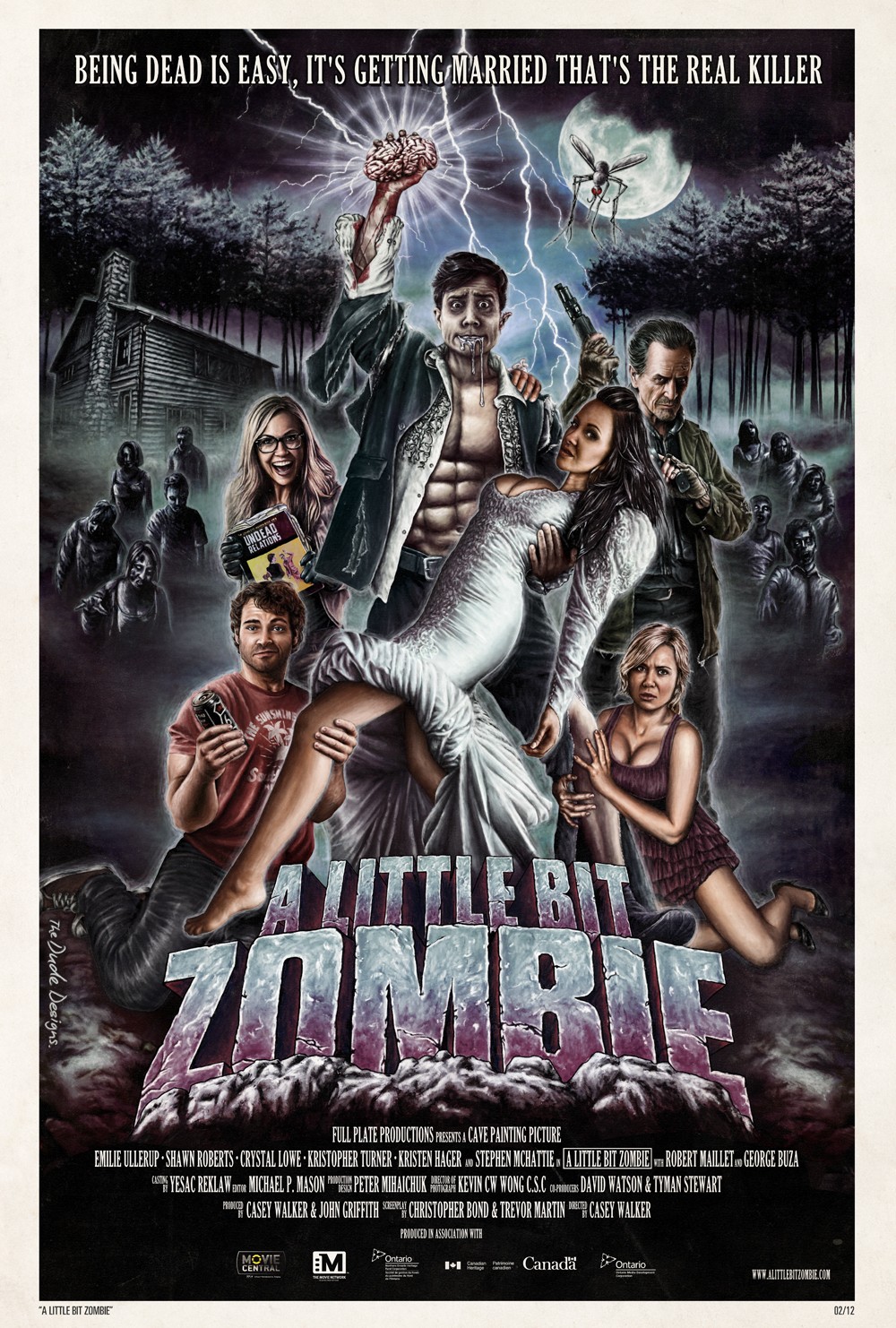
We don’t know much about A Little Bit Zombie, but from the poster we want to see it. Designer Tom Hodge goes into a detailed explanation on his blog about the creation of the classic-style poster: “The basic challenge was to get 6 characters into a montage and give the piece a narrative whilst trying to make the design visually funny… and humour is an incredibly difficult thing to convey in a single static image (with a touch of horror!). To make the poster visually entertaining, I thought the best route was to create something epic and completely OTT…“.
We last featured Hodge in our Best Posters of January 2012 piece, for his Flake & Flames poster, and this was always going to be an entry for the Best of February 2012.
Those crazy Mondo kids are at it again. Academy Award hopeful Hugo may not have taken out the top slot at this year’s Oscars, but it did get this nifty poster as part of Mondo’s Academy Awards series. The poster takes a key moment in the film, rather than just using the actual key from the film, and gives it a nostalgic wash. The artwork from Kevin Tong seems just as inspired by Brian Selznick’s hybrid young adult book The Invention of Hugo Cabret as it does by the film, but like both formats, the inspiration is a combination of the two.
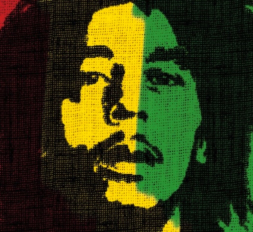
After putting together Life In A Day, last year, a collaboration with Ridley and Tony Scott and YouTube, Kevin MacDonald now turns his documentarian eyes to reggae legend Bob Marley in the simply-titled Marley. The image of Marley is almost as iconic as his music, and is the head that launched a thousand dreadlocks. This poster wisely puts his face forward, framed against the Jamaican flag with a image designed to look as though it is printed on (what else?) hemp.
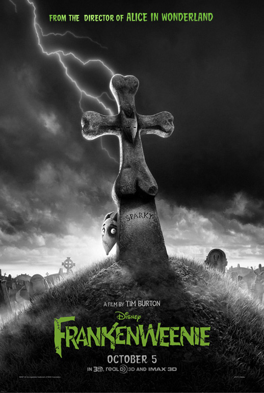
Frankenweenie is Tim Burton’s reworking of his own 1984 short film. The poster may get off to a questionable start, as “From the director of Alice in Wonderland” isn’t going to win any critical acclaim. If the aim is to conjure classic Burton, then mission accomplished. An undead dog hiding behind a bone-shaped gravestone being struck by lightning? Sold, and bonus points for being in sublime black-and-white, with just a hint of slime green to ensure that this has Burton’s Emo-Goth trademark all over it.
The 30th Anniversary of Steven Spielberg’s E.T. – The Extra-Terrestrial has not escaped our good friends at Hopko Designs. Scott Hopko has sent over this wonderful anniversary poster they designed. Where the original theatrical poster simply had Elliot and E.T.’s fingers touching, hovering over the planet Earth, Hopko’s poster puts more emphasis on the title character, and adds the rest of the cast and story elements, evoking a sense of nostalgia mixed with the striking design.
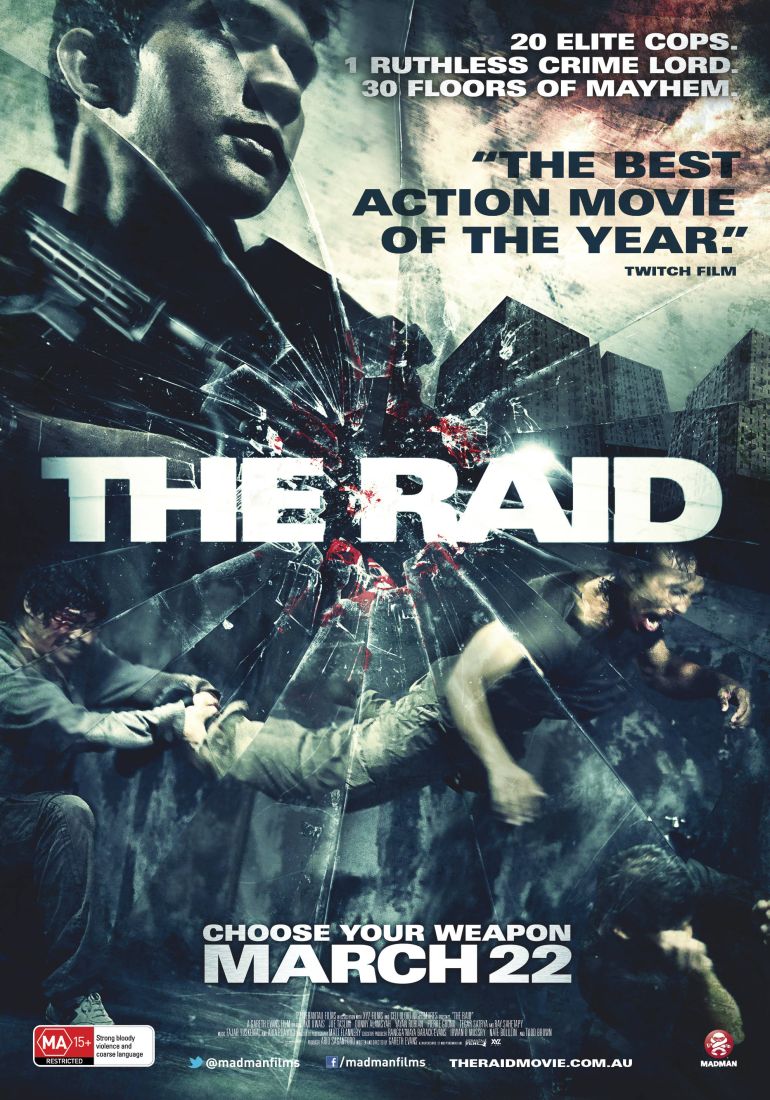
The Raid comes to Australian audiences on the back of a huge amount of buzz from Sundance, not to mention the fact that director Gareth Evans‘ (no, not that Gareth Evans) previous feature, Merantau, rapidly found a cult audience. Madman has released an original local version of the poster, which is leaps and bounds ahead of the US poster which not only re-titles the film (to The Raid: Redemption for some year) but throws perspective out the window. The Australian poster, on the other hand, delivers all the hard-edge we are promised by the film.

