It’s the end of the month, so it is time to reflect, relax and rewind our way back through the one-sheets, banners, promotional artwork and posters released in the last calendar month, highlighting some of the ones we though were noteworthy. The month seemed like slim pickins’ at first…but then we took another look.
Click image to enlarge
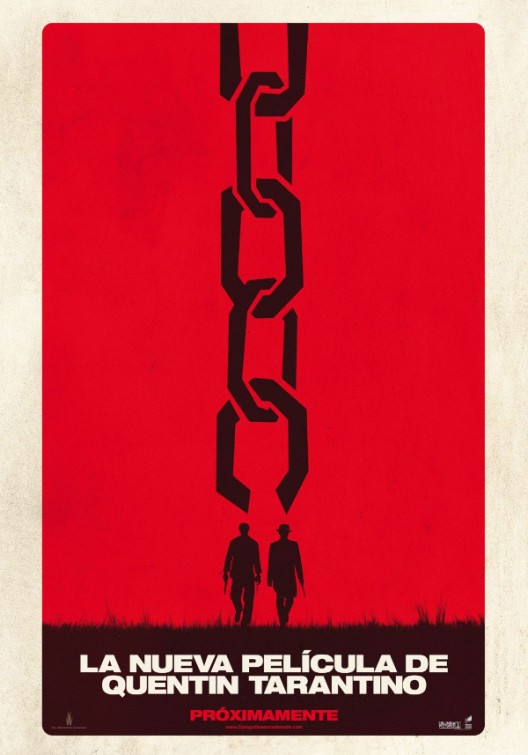
Finally an indicator that Django Unchained is more than just a really long cast list, Yahoo! Movies has unveiled the first teaser poster for Quentin Tarantino’s latest. Tipping his hat to the Spaghetti Western films that he will rip off have influenced him, the poster uses Italian text at the bottom: “La Nueva Pelicula De Quentin Tarantino” (“The New Movie From Quentin Tarantino”). And, below that: “Proximamente” (“Coming Soon”). There is an English language version of this poster, by BLT Communications, but this one is unquestionably cooler.
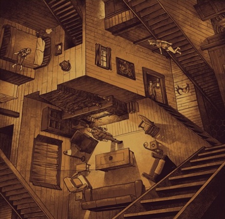
One of our favourite films of the month/year, The Cabin in the Woods, also gave rise to one of our favourite posters of the month. Mondo designed this special variant version, designed by Phantom City Creative. There’s a very Escher inspired design to the poster, which captures the spirit of the film in more ways than we could possibly say without spoiling what is destined to be a horror classic for the ages. It’s just a shame that it is not getting a local release in Australia.
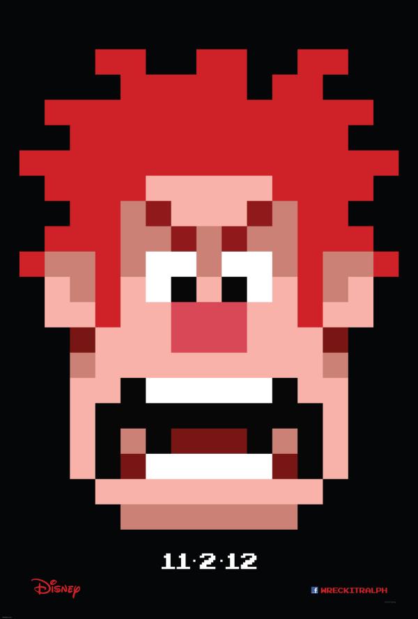
There’s been very little information to date, but Disney (via MSN) has released the first teaser poster to their big (non Pixar) animated film of the year, Wreck-It Ralph. A teaser trailer can’y be too far behind! The simplicity of this poster is its genius, teasing the retro flavour of the tale of this 8-Bit hero trying to make it in the modern world. Expect a whole lot of these closer to the release date, perhaps with a few characters you may recognise from classic gaming.
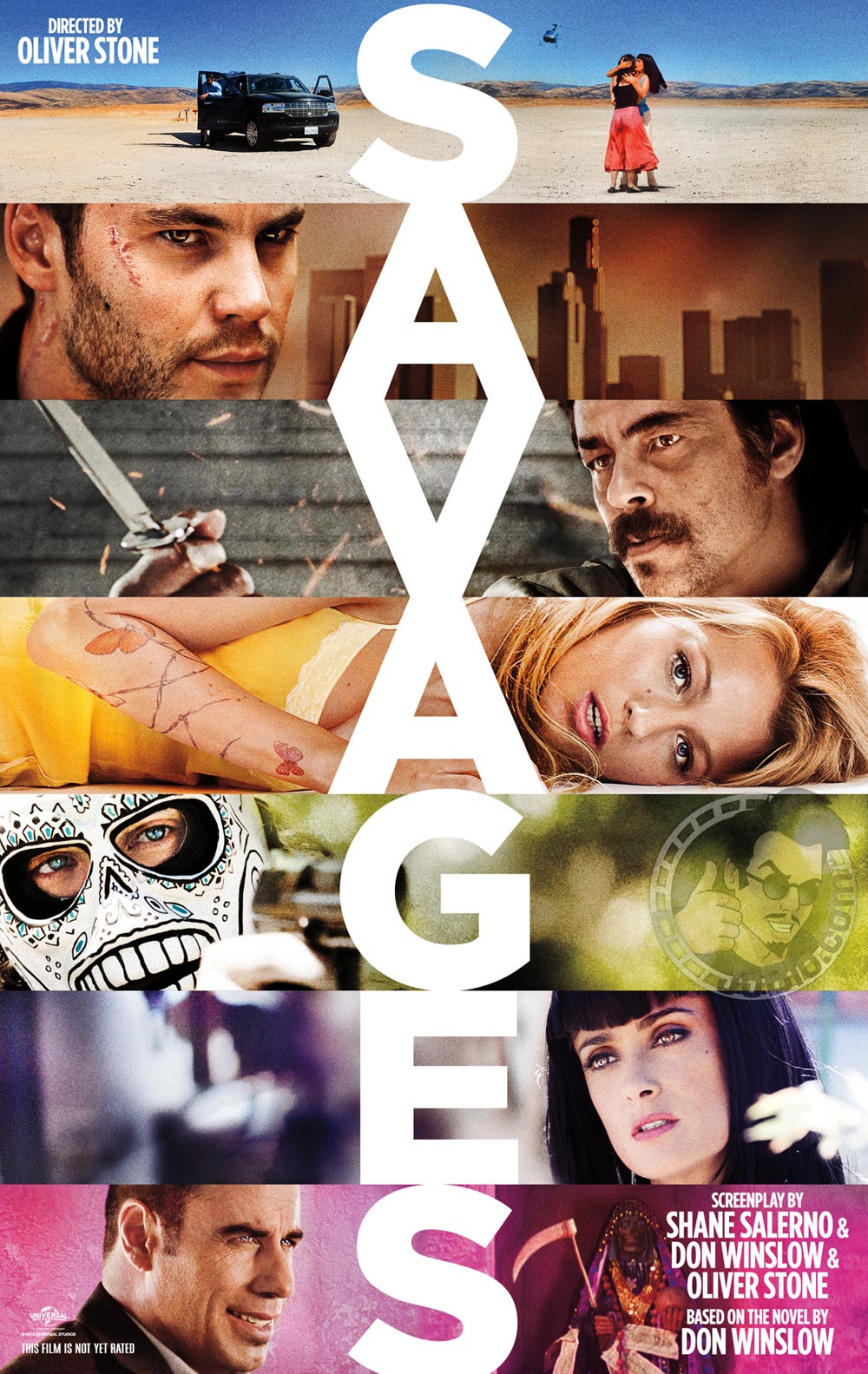
The one-sheet for Oliver Stone’s Savages recalls his 1990s work, particularly U-Turn and Natural Born Killers, and this his can only be a good thing. Designed by Concept Arts, who have been known recently for Green Lantern and Sherlock Holmes: A Game of Shadows posters, their work was arguably at its most iconic back when they did V for Vendetta.
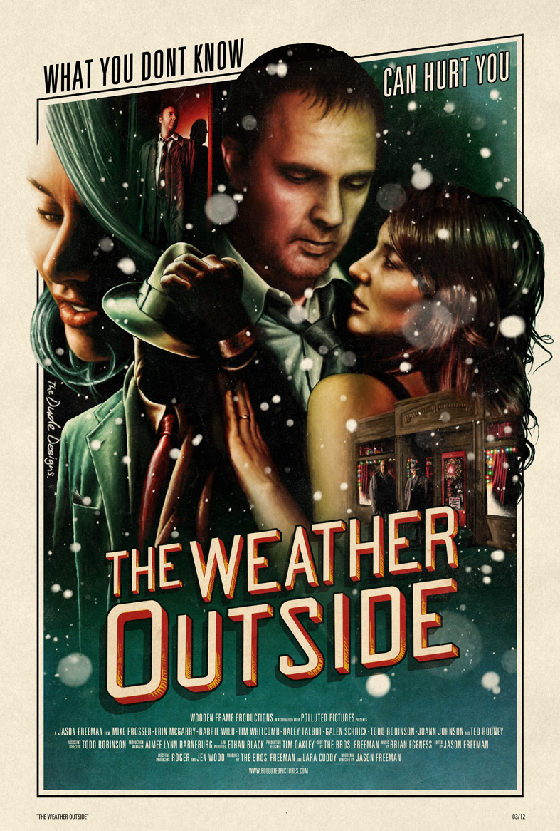
One of our favourite designers, Tom Hodge (aka The Dude Designs), Hodge talks at length on his blog about the creation of the poster for The Weather Outside. Here is an excerpt:
We wanted the direction of the design to have that film noir aesthetic as it has such a rich history it instantly gives the viewerthat visual connection for the films tone. The composition of theelements was an important factor (being a mystery romance) too in showing the interaction of the characters and there relationshipto each other (Every element tells a subtle yet important part of the narrative). I wanted to have all elements merging into one another to show how they are interlinked which i did through thestrong use of shadows, this also worked well to portray a darker atmosphere.
Christmas came early with the partnership of Graham Erwin and Mondo on this poster for Tim Burton’s The Nightmare Before Christmas. Giving centre stage to the Mayor, rather than the traditional Jack Skellington, creates a bold and interesting panel for this display, and something a bit different for fans of the film – which is hitting its twentieth anniversary next year! Now that makes us feel old.
There is nothing about Prometheus that doesn’t excite us, and redundant negatives aside, this faux poster for Michael Fassbender’s synthetic humanoid David8 is perfect in keeping with the tone of this highly anticipated film. Designed to accompany the viral video campaigns, not only do we want to see the film right now, we also want a David8 of our very own. We can’t help but notice that there is a tiny bit of product placement in there for Verizon, but we guess that even Ridley Scott is not made of stone.
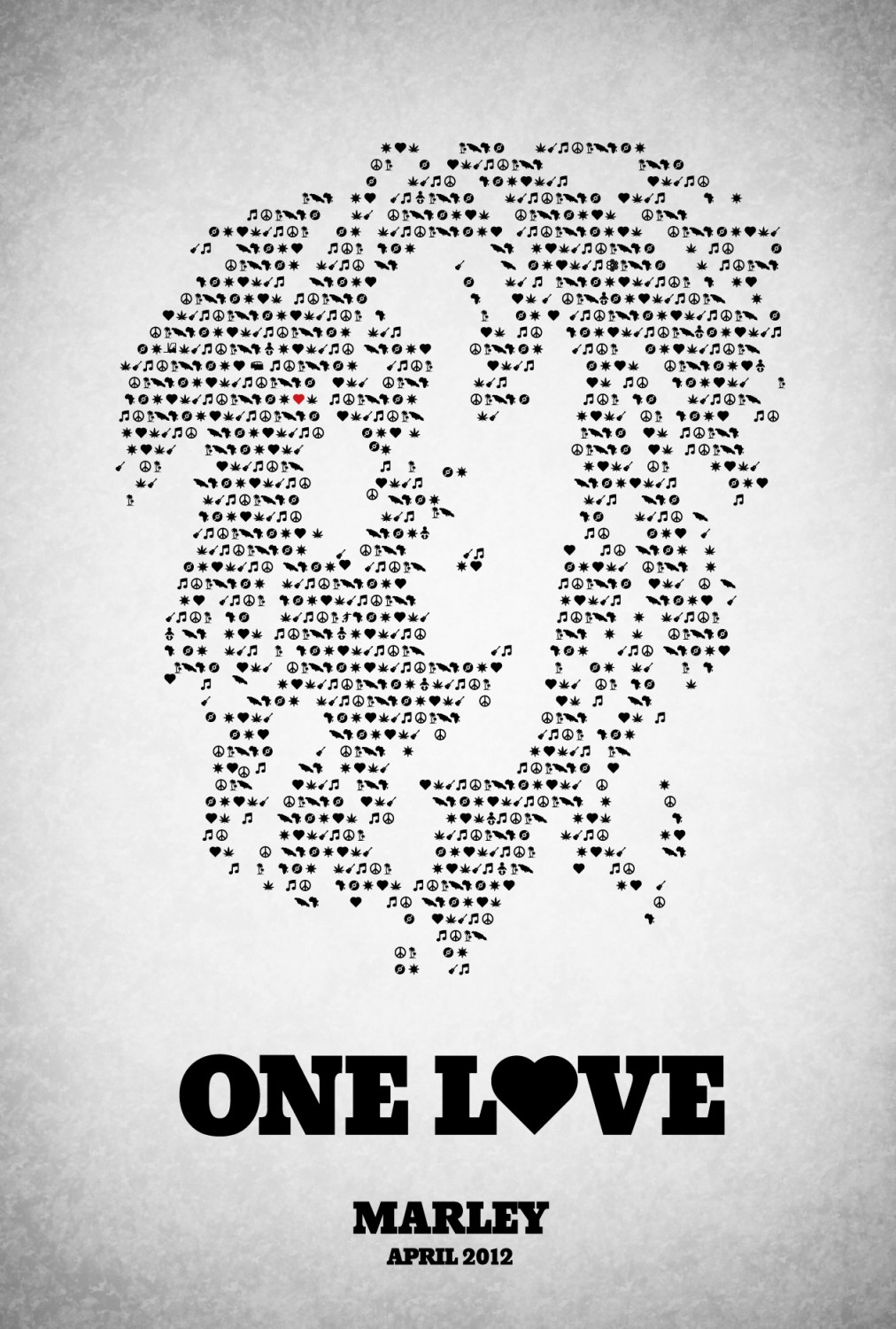
An earlier poster for Marley featured back in February, but this one is just as good if not better. Laying out hundreds of little symbols – including a map of Africa, a love heart, a record, a tropical island and of course, marijuana – to make up the silhouette of Marley. It is not dissimilar to the poster for The Words, but it manages to capture everything you need to know about Marley the person in a singular gesture.
Over at Rama Screen,Swedish artist Viktor Hertz goes into detail on the poster design: “The idea behind the pictogram mosaic portrait, is to somehow show the complexity and all the different things that made the man behind the music. For example, I inserted 11 baby pictograms in the mosaic, depicting his 11 (official) kids, and also a football player and a gun chamber (depicting the two gun wounds he got). There is also a van (which I saw in the movie trailer, actually) hidden somewhere”.
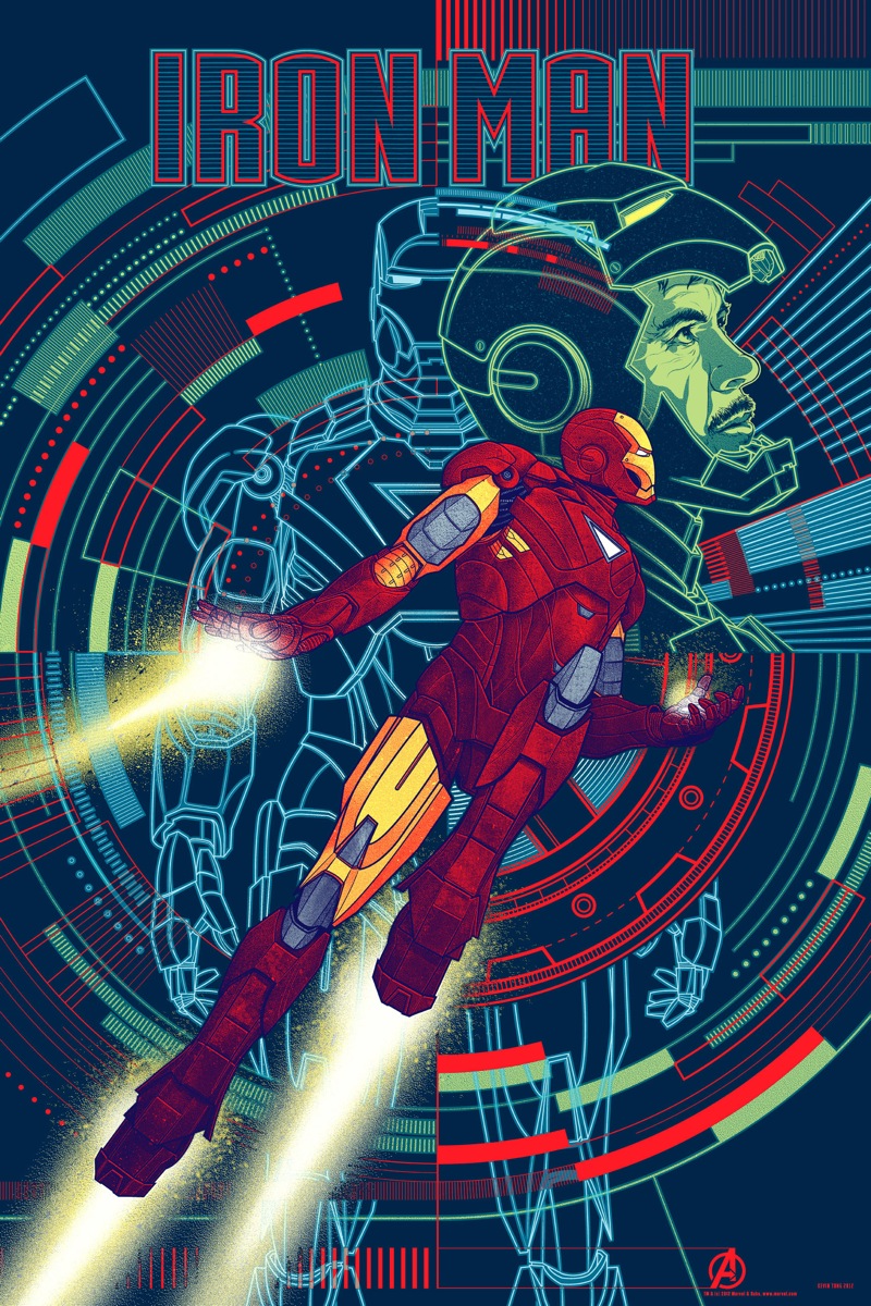
A whole bunch of posters for The Avengers got released by Mondo in time for the film’s worldwide premieres, but this one was one of our favourites. Designed by Kevin Tong, who did some of the Hugo posters a few months back, they combine the tech goodness of the film with the elegant designs of the character. Also check out our full review for The Avengers.
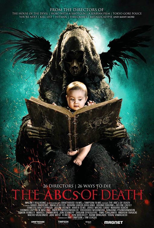
Finally, and for no other reason than it is just kind of cool, we include The ABCs of Death to end our poster round-up for April 2012. See you next month (or every day between now and then hopefully).




Comments
2 responses to “Best Film Posters of April 2012”
Hmm…I wonder what’s David8 is about – it looks pretty interesting.
And the ABC’s of Death…what the hell?
David8 was a viral poster for PROMETHEUS. The ABC’S OF DEATH was an anthology horror film.