It’s the end of the month, so it is time to reflect, relax and rewind our way back through the one-sheets, banners, promotional artwork and posters released in the last calendar month, highlighting some of the ones we though were noteworthy. It’s a little section we like to call Best Posters.
Click images to enlarge
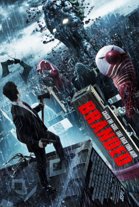
The poster for the anti-corporate film Branded has cracked open our collective noggins and splattered them all over a city, with only a suited man with an axe to defend us from their wicked ways. Taking the concepts of Naomi Klein’s book No Logo to its logical extremes, designers Art Machine, A Trailer Park Company, envisages a world where brands run amok. Actually, this is exactly like the “Attack of the 50-Foot Eyesores” segment from the “Treehouse of Horror VI” episode of The Simpsons. Where’s Paul Anka when you need him? Just don’t look.
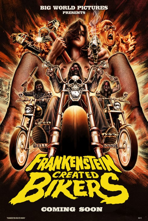
Tom Hodge, under the moniker The Dude Designs, has revealed his poster for Frankenstein Created Bikers, a horror film due out next year from James Bickert. Every month, Hodge continues to give us something awesome to look at, and June is no exception. Over at his blog, Hodge explains the poster in detail: “I knew the sexy dynamite lady had to be central and i thought what could be a more OTT, cheesy, sexy with a 70s vibe than some outlaw bikers riding forth from out from between a girls fishnet suspendered thighs…”.
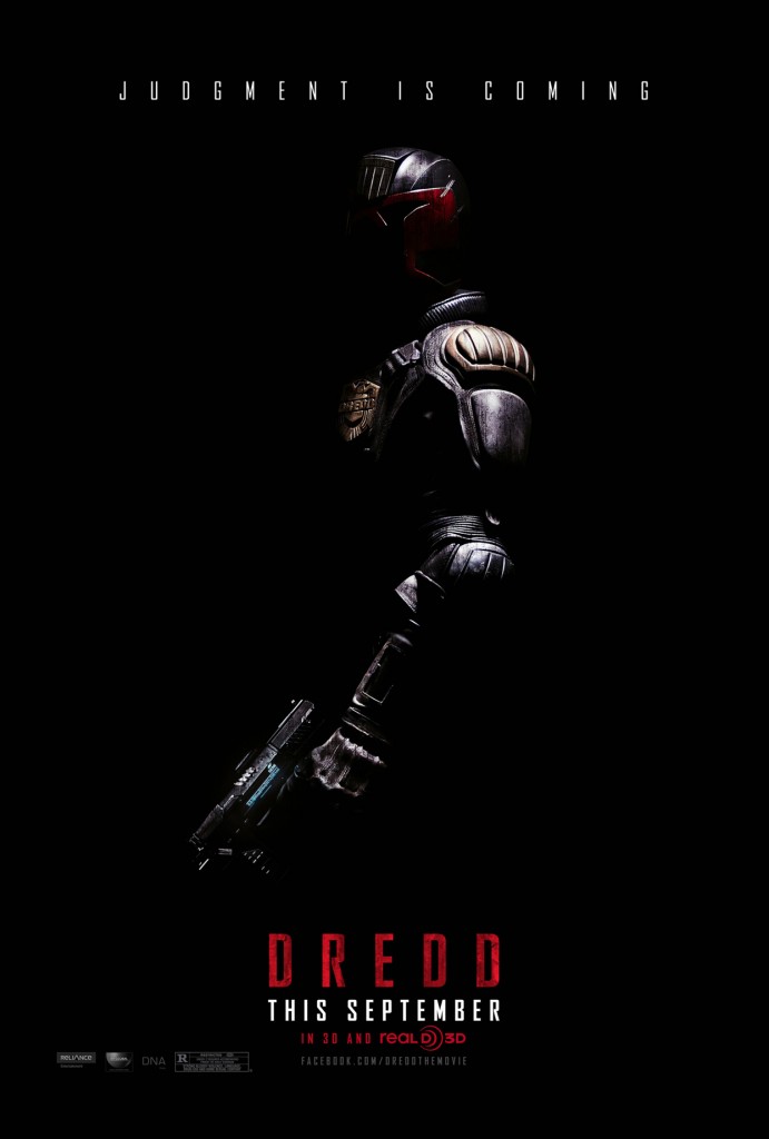
The teaser poster for Dredd, the latest film to adapt the 2000 ADcomic book character Judge Dredd. It is the definition of minimalist, if you ignore the guy in the red and cold suit in the middle. It’s black on black on black, and it couldn’t seem more cool if it tried. This one comes to us from Ignition Print, who have done some outstanding work this year with The Cabin in the Woods, The Dark Knight Rises and Abraham Lincoln: Vampire Hunter.
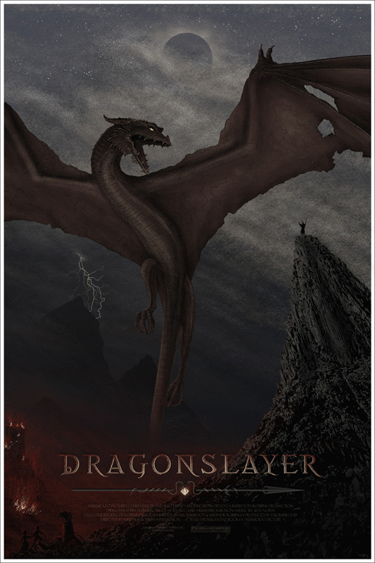
The always reliable J.C. Richard is behind the Dragonslayer (1981) poster, inspired by the Disney and Paramount co-production that was something a little bit different for both studios at the time. J.C. Richard was clearly inspired by the film, and over at the Mondo blog he talks at great length about his inspiration for the poster.
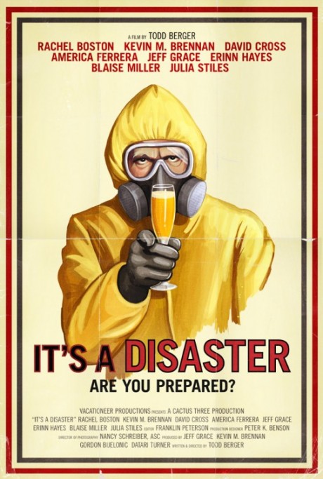
The poster for It’s A Disaster is anything but, hijacking a well-worn recruitment poster, sticking it in a Hazmat suit and quaffing a flute of the finest orange champagne available. The faux aged look of the one-sheet caps it off nicely, although we do feel that the titles could have been separated from the image a little more. Either way, we feel that we’re adequately prepared for the oncoming event, and will remain indoors until it is over.
Katy Perry has a movie coming out, don’t you know? Nothing screams movies like popcorn, and nothing screams louder than Katy Perry fans. The poster showcases both of the film’s best assets. You can interpret that any way you like. Keep in mind that the film is called Part of Me 3D. Careful, you’ll have your eye out.
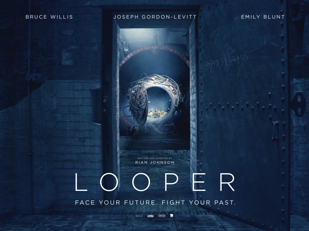
The month also revealed a new poster for Rian Johnson’s time-travel film Looper, starring Joseph Gordon-Levitt, Bruce Willis and Emily Blunt. The poster does everything that a teaser poster should: it shows you the door (quite literally), and invites you to walk through it. We seen the machine in an ethereal glow of white and blue light, and something piled inside daring us to take a closer look. The tagline of “Face Your Future. Fight Your Past” seems contradictory, but this is a time travel film after all, and you have to be careful of those wibbly wobbly timey wimey bits.
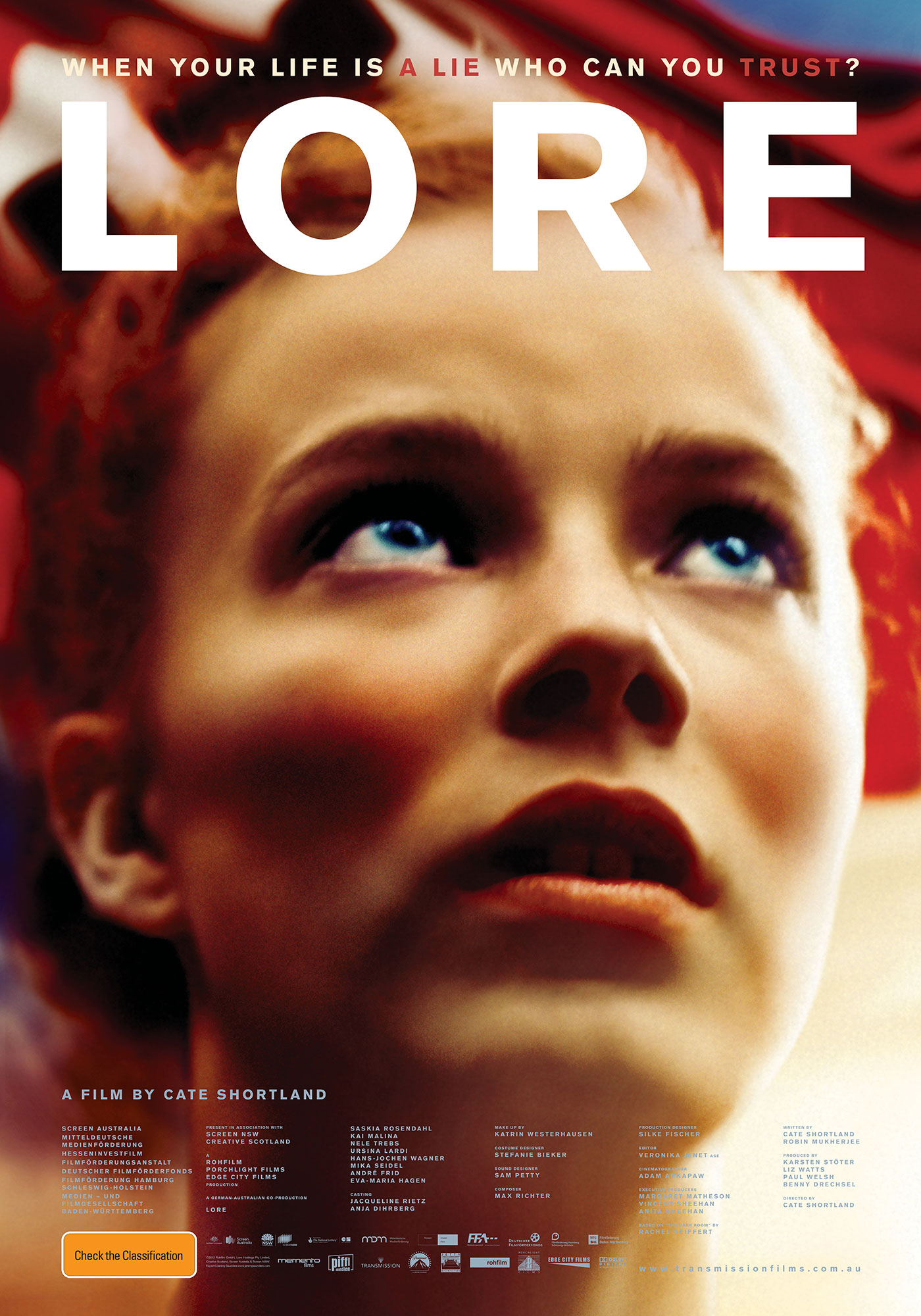
Transmission Films unveiled the one-sheet for Cate Shortland’s Lore, for its premiere at the Sydney Film Festival. Lore, from Somersault director Cate Shortland, is set in the spring of 1945 as the German front collapses and the Allied forces take control over Hitler’s country. Lore is based on the Man Brooker Prize-nominated novel The Dark Room by Rachel Seiffert. This is the work of Australian artist Jeremy Saunders, who has graced us with similarly beautiful posters in the past. The stunning beauty of the face is contrasted with hint of a Swastika waving behind her.
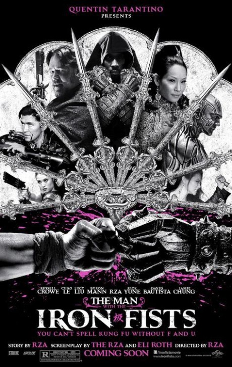
Dropping this week, along with a trailer, the poster for RZA’s The Man With the Iron Fists is one of the standouts for the month. It’s difficult to know where to start on this poster, as it is one of the busiest we have in this month’s lineup. Another one from the good people at Ignition Print, it has to feature one of the best taglines of the year as well: “You Can’t Spell Kung Fu Without F and U”. Right on, brother.
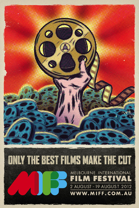
It’s the most wonderful time of the year! Outside of the Sydney Film Festival, that is. The 2012 Melbourne International Film Festival, or MIFF for those who speak the street lingo, is an endurance test. Cramming thousands of sweaty film buffs into small spaces over the course of two weeks, radically altering postures with those seats in that cinema on Russell Street. The victorious arm holding aloft might represent a treasure found, as the tagline would imply, but we prefer to think of the triumph coming by simply making it out alive at the other end.
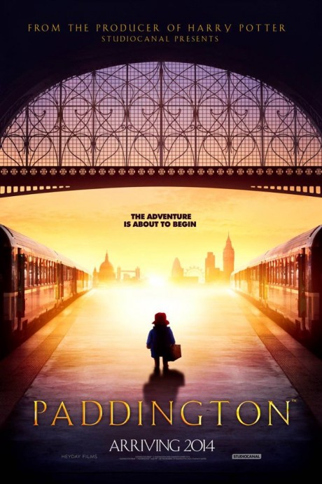
There are some characters who are so iconic, you only need to catch them in profile to know who they are: Indiana Jones. Darth Vader. James Bond. Paddington Bear. Designers The Refinery recognise that the barest (“bearest”?) of silhouettes is all we need to know that the little figure on the station in his wellys, duffle coat and suitcase is none other than the marmalade sandwich loving teddy who has arrived by way of darkest Peru. The only tragedy is that we have to wait until 2014. The adventure is not about to begin at all!
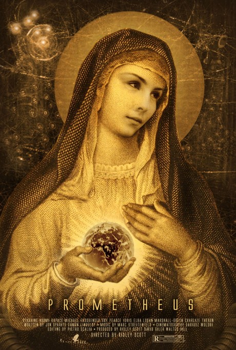
Our good friends at Hopko Designs have sent us their latest creation, another poster for Ridley’s Scott epic sci-fi film Prometheus. Scott Hopko let us know that he “can’t stop thinking about the movie”, and seems to have been inspired by the religious aspects of the film. While they aren’t overt in Damon Lindeloff’s script, Scott and other members of the cast have certainly been referencing that in recent interviews. Casting Noomi Rapace as Mary, with the whole world literally in her hands, speaks volumes about some of the themes that people will be discussing about this film for some time to come.
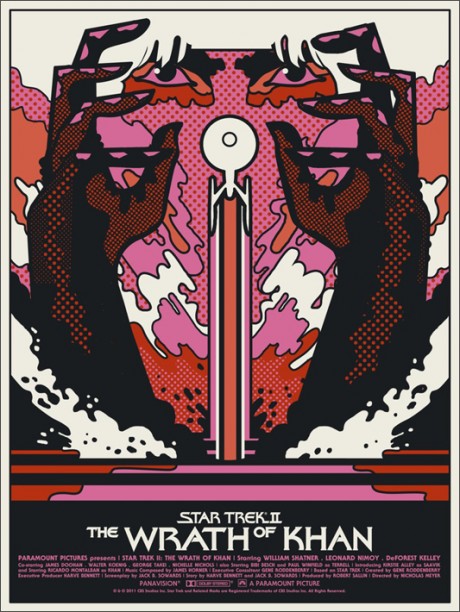
Australian duo Sonny Day and Biddy Maroney, collectively known as We Buy Your Kids, are behind the retro-future of the Star Trek II: The Wrath of Khan. It’s what the future looked like back in the 1960s, man. There’s so much going on there, it’s hard to know where to start, including Khan’s distinctive fringe forming something of an optical illusion at the top of the page. If somebody wants to donate one of these posters to us, we’d be eternally grateful.
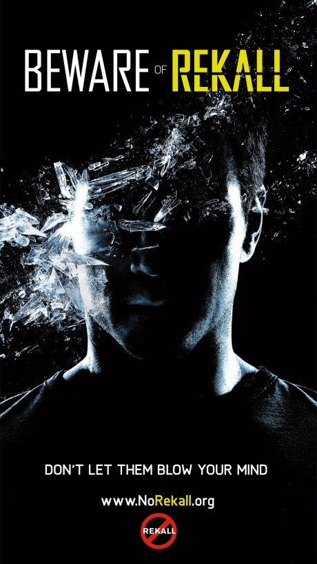
There’s been a total of eight posters (so far) from the Total Recall viral campaign, which have been appearing on billboards and bus shelters around the US. The posters are by designers cold open, who did that terrific campaign for A Very Harold and Kumar Christmas last year. Most of them are about making your fantasies real, but the final one is PSA about the dangers of memory tampering. It’s just coolness in one-sheet form.
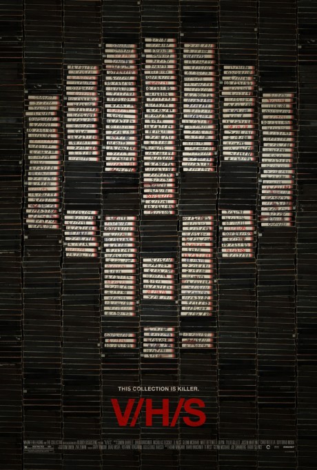
Gravillis Inc., who appeared in last month’s round up, struck on a genius idea for this horror poster for V/H/S. Take a collection of video tapes (remember them?), stack them up high, and let the handwritten labels form a skull. The very simple concept is a highly original one, and something that could only be done with the distinctive colour scheme of the old blank video sleeves. We tried doing this with out DVD and Blu-ray collection, but it kept looking like Hello Kitty for no good reason.


