It’s the end of the month, so it is time to reflect, relax and rewind our way back through the one-sheets, banners, promotional artwork and posters released in the last calendar month, highlighting some of the ones we though were noteworthy. It’s a little section we like to call Best Posters.
It would have been a big month for posters even if San Diego Comic-Con hadn’t landed, but it was that time of the year so we got a metric bucket-load. From official posters, Mondo variants, a festival poster and a viral campaign, it has been another bumper month for people who like looking at nice things to do with movies.
Click images to enlarge
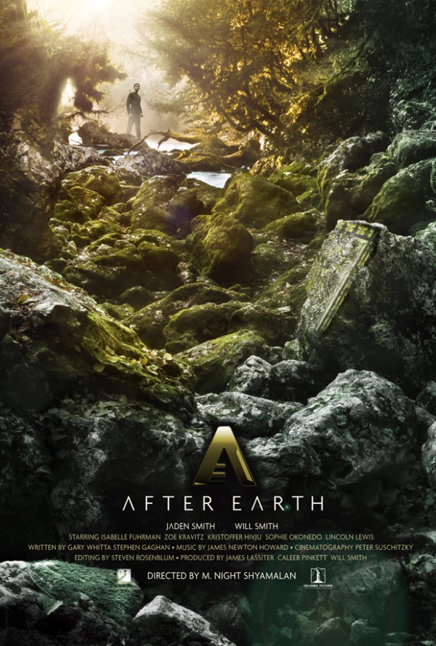
The film doesn’t come out until next year, and we still know very little about it, but that hasn’t stopped our good friends at Hopko Designs from putting together a design for the next M. Night Shyamalan film After Earth. If the movie is half as good as this poster, we’re in for a nice change of pace from the uneven director.
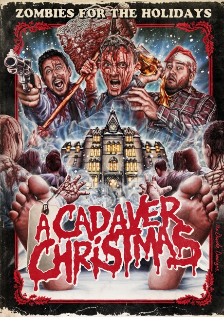
We permanently have a placeholder for whatever it is that Tom Hodge (aka The Dude Designs) is doing, and this one for A Cadaver Christmas definitely caught our eye. As he says on his blog ” I instantly connected the title with that classic cadaver feet/toe tag image so thought it would be a great way to frame the logo in the montage, it then also enabled me to tell the story of the film from top to bottom…”. This was done for the DVD sleeve, but definitely has an 80s vibe to it. Notice the way the edges are worn, to mirror that little bit of sleeve that used to stick out over the plastic?
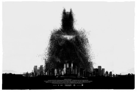
The good people at Mondo have teamed up with British artist Jock, best known for his work on 2000 AD, The Losers and Green Arrow: Year One. Jock contributed concept paintings to Batman Begins (2005), and now as the trilogy reaches its end, the artist has rendered this new poster for The Dark Knight Rises, filled with thousands of tiny bits of bat goodness that recalls a classic scene from that first film. This poster was available exclusively to people who visit the Mondo booth at San Diego Comic-Con.
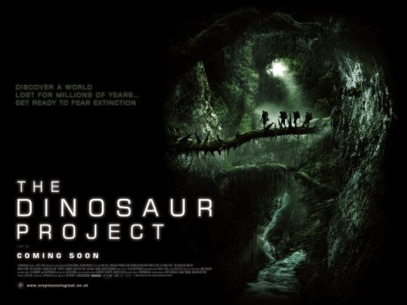
Optical illusions are a sure way to make it into our monthly list, and while this film looks like – what’s a polite word for crap? – the poster for The Dinosaur Project does everything a great sheet should. It teases the exploratory nature of the film, and on first glance it is a dank cave with some people in it. Possibly looking for the one true ring to rule them all. The poster does, of course, form a dinosaur’s head and this might be the coolest poster for a film we have no other interest in.
The electrifying dog is back from beyond the grave! It’s Frankenweenie! Tim Burton’s latest has an appropriately retro poster, especially given he is remaking a short from the start of his career. This Comic-Con exclusive poster was coupled with a homage trailer that came out around the same time, and we particularly like the nod to the “spectacular, spellbinding third dimension”
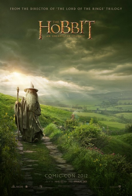
Another Comic-Con exclusive The Hobbit: An Unexpected Journey is curiously devoid of Hobbits, or anybody else, other than Gandalf the Grey (Ian McKellan). The artwork is almost reminiscent of the soft-focused landscapes of artist Alan Lee, who has undoubtedly influenced the series, although this poster design is from oster design by BULLDOG with assistance from mOcean. Now that the series is officially a trilogy, expect more poster goodness over the next two years.
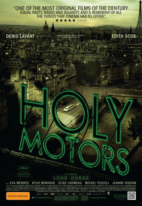
One of our favourite films of the Sydney Film Festival this year, and definitely one of our favourites of the year to date, was Holy Motors. Now Icon Film Distribution has released the Australian one-sheet for the film. Of particular note is that pull quote there at the top of the poster. Go on. Take a closer look. That’s right. It’s from your favourite site on the Interwebs: The Reel Bits. A long quote to be sure, but we’ve never been one for brevity. Check out the original review the quote was taken from.
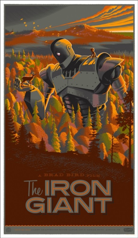
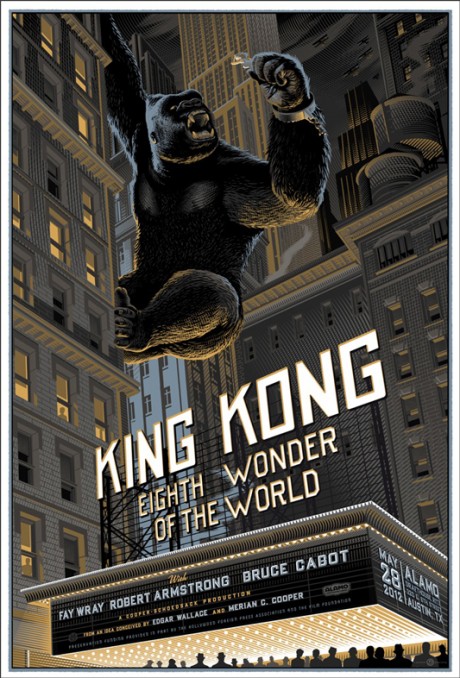
Mondo, the collectible art boutique arm of Alamo Drafthouse Cinema, has unveiled several new posters for classic films this week. Laurent Durieux is behind both posters for King Kong and the one-sheet for The Iron Giant. These beautiful pieces of artwork evoke the wonder these films held when they were first released. They are also really cool. Known for his hatching and cross-hatching approach, the artist provides something distinctive in every print he produces.
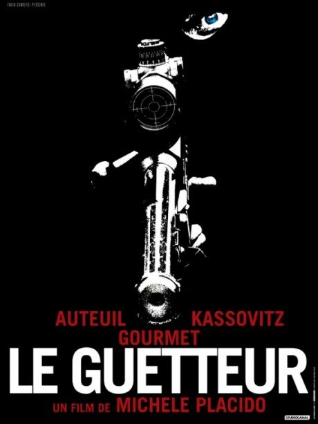
The poster for Michele Placido’s Le Guetteur (The Lookout) caught our eye, so to speak, with the simplicity of its design. The French thriller is about a detective who hunts for the marksman who foiled the plan to catch a notorious team of bank robbers, and you kind of get that from the one-sheet. The design comes from Le Circle Noir, who do a mixture of local French one-sheets for US and other foreign films, along with a number for domestic product as well. Their website has a very comprehensive portfolio of their work.
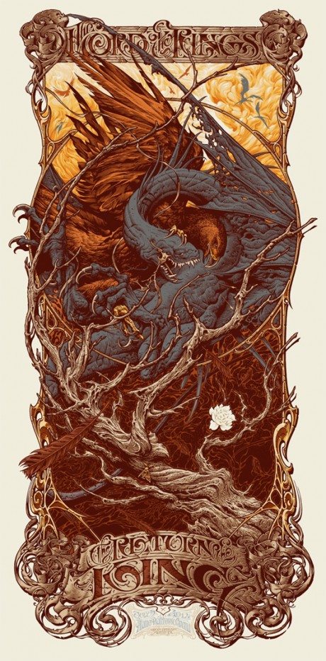
It’s a bit of a Tolkien-fest this month as Mondo has announced that they have a licence for Lord of the Rings posters, starting with Aaron Horkey’s poster (and variant) for The Return of the King. Horkey’s style sits somewhere between artwork and typography, influence by the type of the late 19th and early 20th centuries. The woody and organic style was developed over countless concert and art posters, and would have been seen by Mondo fans last year with Jurassic Park prints. This is the first of a series of posters by the artist.
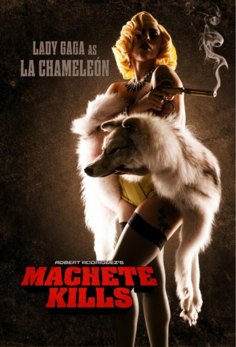
It would be very easy to accuse Lady Gaga of aping Madonna and Grace Jones, because she had, and now she can add acting in B-grade films to her resume as well. In pitch-perfect casting, Robert Rodriguez announced via this cool poster that the songstress/purveyor of meat couture would be in sequel Machete Kills, and she’s brought her own wolf.
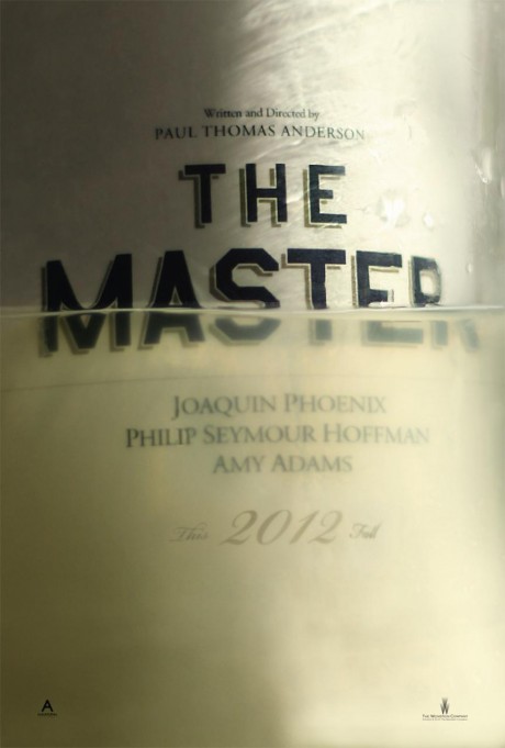
Huffington Post revealed the teaser poster for the next Paul Thomas Anderson film The Master, starring Philip Seymour Hoffman, Joaquin Phoenix and Amy Adams. As the source so nicely describes it, the poster is “a glass-half-full affair”. This is exactly what a teaser poster should be, teasing concepts and feelings rather than three big name actors mugging PhotoShop.
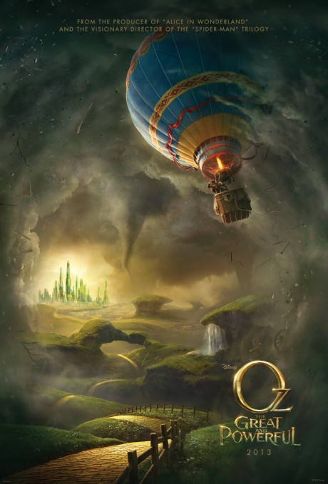
Disney has released the first poster for Sam Raimi’s Oz: The Great and Powerful, due out on 8 March 2013 in the US. The beautiful painted poster evokes an instant sense of nostalgia and the familiar, with the Yellow Brick Road, rolling green hills and even the twister conjuring up memories of the 1939 classic film. The main character is the smallest element on the poster, rightly labelled a teaser, for it is not yet known what his role in this brave new world will be. This one is by BLT Communications, LLC, who most recently did runs of posters for The Amazing Spider-man and The Avengers.
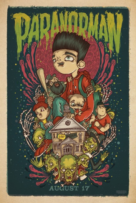
For the release of ParaNorman, Mondo have assembled some excellent artists and placed five new posters around the US at various locations. This particular one comes from Drew Millward. If you do spot one in the wild, take a picture of it and tag it #WEIRDWINS.
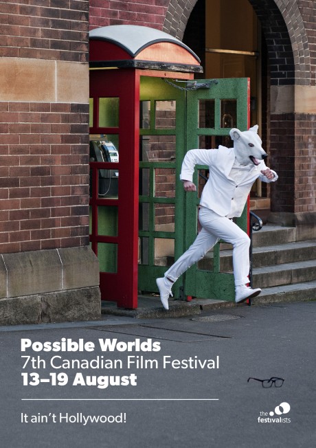
With the tagline “It ain’t Hollywood!”, a white clad animal person emerges from a phone booth, the glasses from his secret identity sitting idly on the footpath. The poster for Possible Worlds, the 7th Canadian Film Festival, was designed by Alexandra De Bonis and photographed by Matthew Lahoud. The site also reliably informs us that the model is the festival’s marketing and sponsorship manager Nick Jarvis. So his secret is actually out, exposing him to all manner of attacks from his enemies and ill-wishers. Stay the course, you shiny white knight of quality cinema!
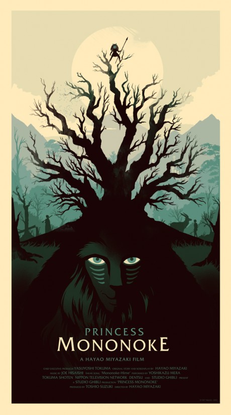
Olly Moss also did a poster for The Dark Knight Rises, and apart from being one of Mondo’s widest releases, it is also joined by the far superior and beautiful sheet for Studio Ghibli’s magnificent Princess Mononoke, which celebrates its fifteenth anniversary this year. Yes, we feel old.

