It’s the end of the month, so it is time to reflect, relax and rewind our way back through the one-sheets, banners, promotional artwork and posters released in the last calendar month, highlighting some of the ones we though were noteworthy. It’s a little section we like to call Best Posters.
It’s that time of the month again. We cover the alphabet of posters for the month from The Ambassador to Zero Dark Thirty, and the festivals, horror films, retro designs and revivals in between. It’s the kind of month umbrellas are boats, Lincoln lives again (again) and where Sylvester Stallone isn’t the messiah, he’s just a very naughty boy.
Click images to enlarge
The Ambassador – Designer: Delicious Design League
Mads Brügger goes undercover as a European ambassador to uncover the truth behind the blood diamond trade. Whether the film is exploitation of expose is currently being debated, but it is is hard to argue with the Delicious Design League’s striking poster, taking diamonds and using them to make a face. Shine on. you crazy diamond.
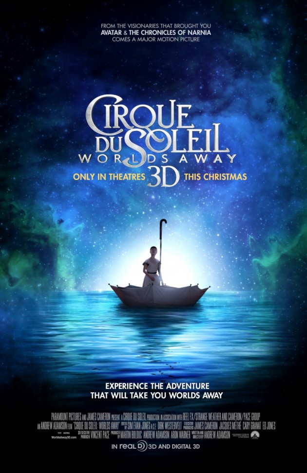
Cirque du Soleil: World’s Away 3D – Designer: BLT Communications, LLC
It’s a very simple design, but a beautiful one nonetheless. As with many Cirque de Soleil posters, it uses the shades of a single colour to surround a single striking image. Here, it’s a girl in an umbrella boat, floating amongst the stars. Of course it is.
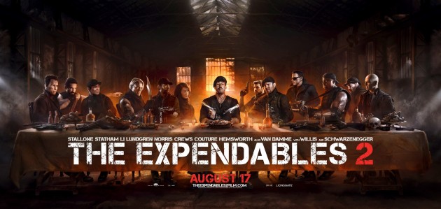
The Expendables 2 – Designer: Ignition Print
Action fans have often seen Sylvester Stallone as the messiah, and his career has certainly risen from the dead more than once. His twelves disciples are lined up on either side, although we suspect that Pontius Pilate would get a grenade to the face before nailing Sly to a cross. Whether intentional or not, Dolph Lundgren is fourth from the left, the exact spot Judas occupies in the traditional painting. As His character betrayed them in the first film, we thought this was a nice touch.
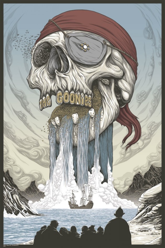
The Goonies – Designer: Randy Ortiz
The Goonies are good enough, and so is this poster. In fact, it is more than good enough, it’s skulltastic. Like the best film posters, it combines all the best elements of the film and elevates it to something more than it is. Indeed, there is more going on than first meets the eye, although it must be difficult to look at anything with an eyepatch and bats flying out of your one good eye.
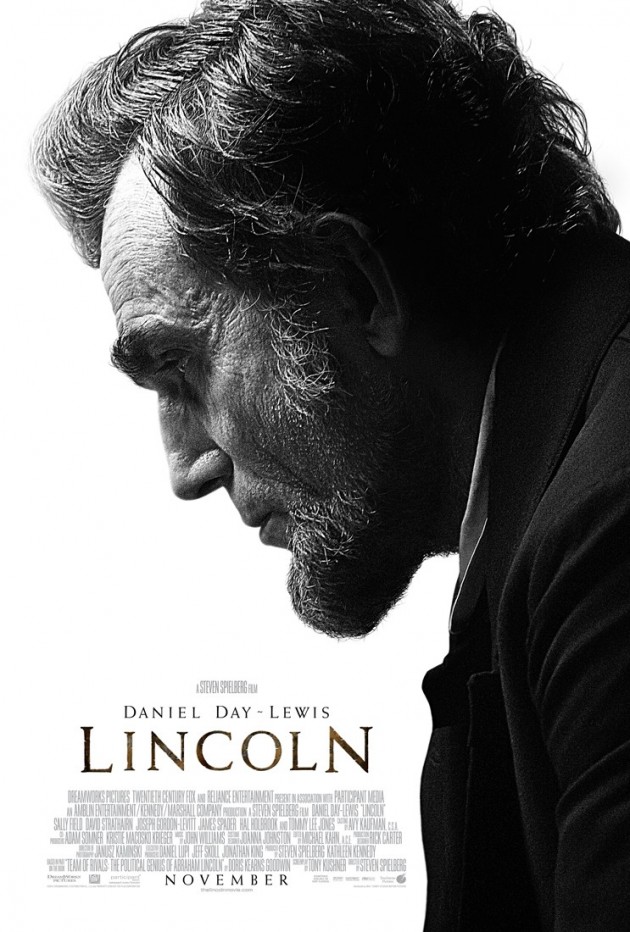
Lincoln
Very little has been released from this film to date, but this poster speaks volumes in its minimalism. Lincoln may have been hunting vampires earlier in the month, but here he is stripped (literally) right back to basics. The spooky resemblance Daniel Day-Lewis has with the historical figure is uncanny, and this is one we are definitely anticipating.
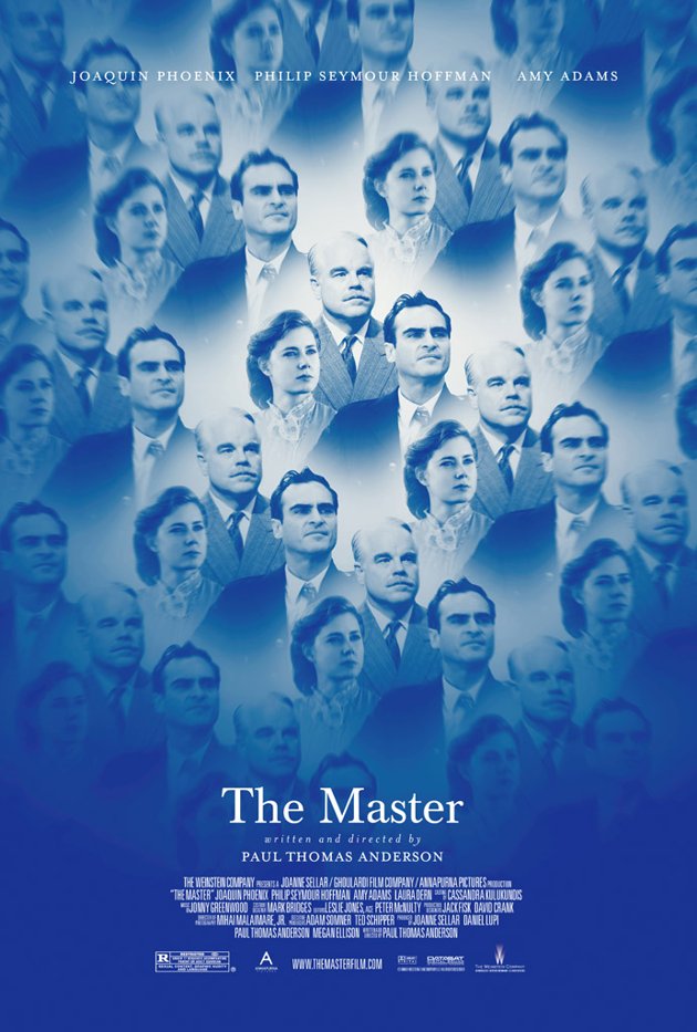
The Master – Designer: PLANETFAB
Unlike last month‘s glass-half-full affair, this gorgeous new design seems to speak to the complexity of the relationships in Paul Thomas Anderson’s forthcoming film, using a kaleidoscope design to signify the tripartite at the heart of the film. Critics and fans have already deified this film, so perhaps it’s PTA that should be at the centre of that poster for The Expendables 2.
ParaNorman – Designer: Tom Whalen
ParaNorman is the gift that keeps on giving. Apart from the five viral posters that the film commissioned to be seen about town, Mondo hired Tom Whalen to put another excellent one-sheet together. Can we have them all please?
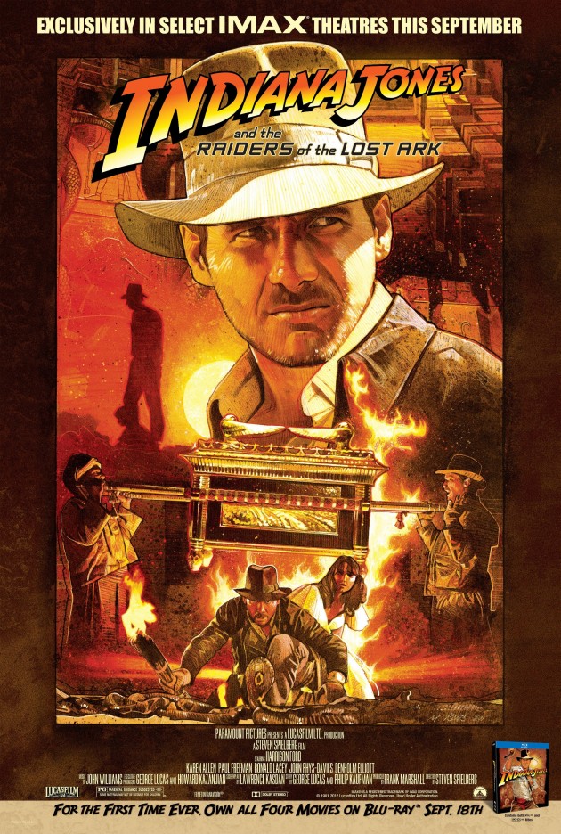
Raiders of the Lost Ark – Designer: Mark Raats
It would be hard to top the late, great Richard Amsel’s original artwork on Raiders of the Lost Ark, and Mark Raats doesn’t try. He captures the same spirit of a time when film posters were drawn, not PhotoShopped, as well as some of the most memorable sequences from the film. Re-issued for the film’s Blu-ray release, along with the IMAX release, this is a great tribute. We also refuse to acknowledge this as Indiana Jones and the Raiders of the Lost Ark. The original title was just fine.
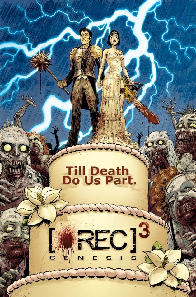
[REC]³ Génesis – Designer: Terry Moore
This incredibly popular and influential Spanish horror series becomes a trilogy, and while it has an official poster, this one by comic book artist Terry Moore is undeniably cool. Best known for Strangers in Paradise, Moore finds true love at the heart of this gruesome scene, and is probably far more interesting than anything the entire found footage genre has spawned.
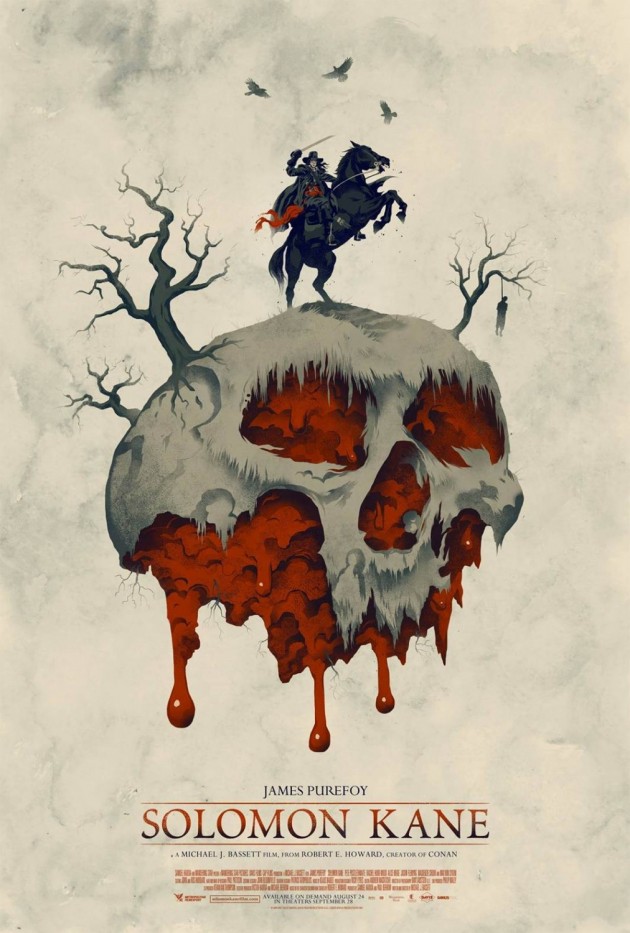
Solomon Kane
Michael J. Bassett’s Solomon Kane is finally (legally) available in the US, and to celebrate they released this surprisingly artistic poster. It looks like something Mondo would dream up for a retro revival, but instead it is used to cover up the fact that James Purefoy is in the film for some reason.
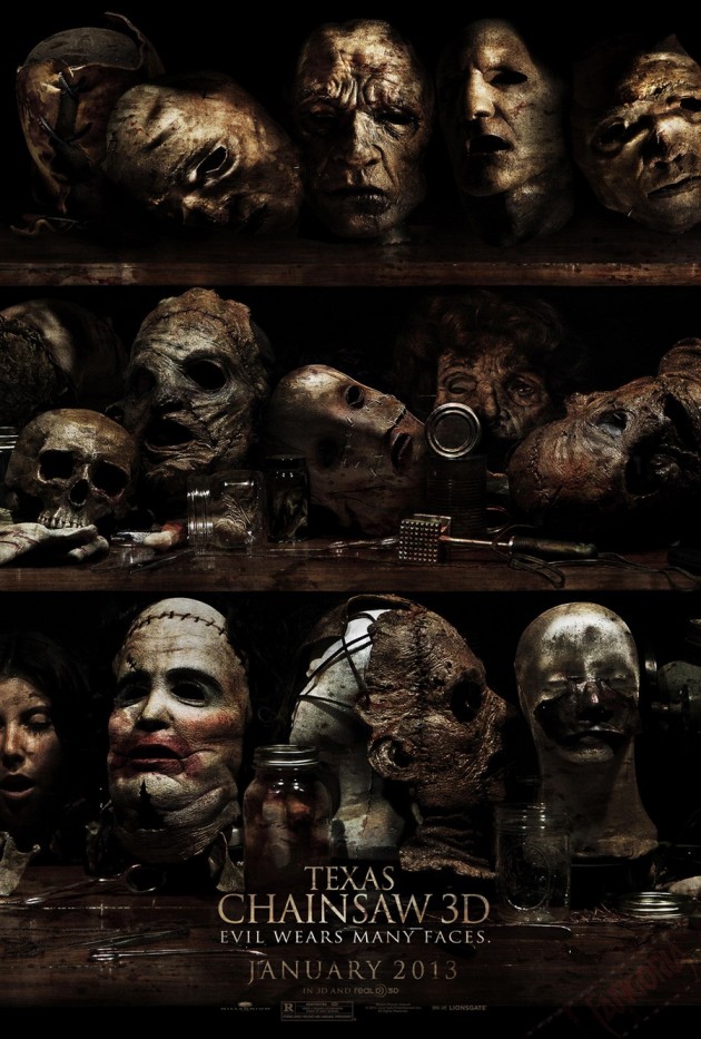
Texas Chainsaw 3D
We have no idea why ‘they’ are dipping into Tobe Hooper’s classic tale with yet another sequel/remake, but perhaps it was simply so they could provide us with this poster. Celebrating the truly grotesque, along with Leatherface’s habit of…making leather faces out of other faces, it might be the most interesting thing to come out of yet another franchise film.
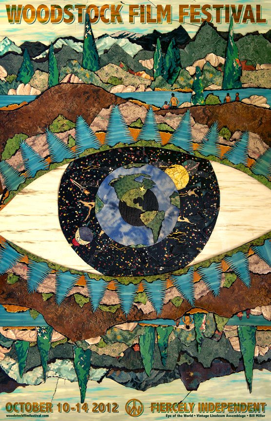
Woodstock Film Festival 2012 – Designer: Bill Miller
According to Green Door, the 13th anniversary poster for the Woodstock Film Festival is “an assemblage made entirely from recycled linoleum flooring called “Eye of the World” by Hudson Valley artist Bill Miller. The poster is the artist’s depiction of the Hudson Valley. Miller has been working with repurposed vintage linoleum for over two decades and creates collage-like pieces that depict bucolic landscapes and political statements about our society”.
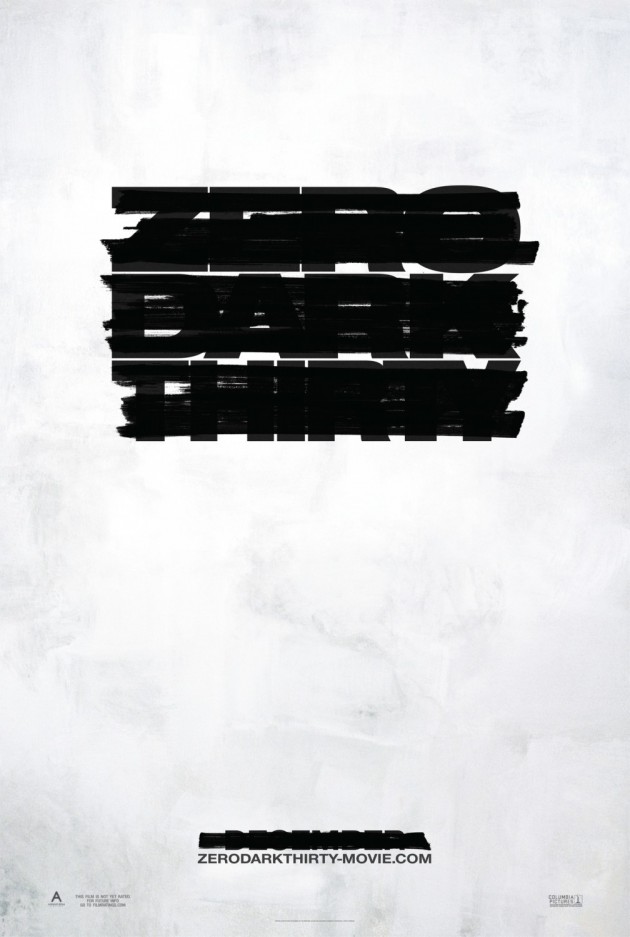
Zero Dark Thirty – Designer: BLT Communications, LLC
Now that Kathryn Bigelow’s Untitled Bin Laden Project has a title, it also gets a poster. The black marker of censorship looms large in this simple concept, and it runs throughout the trailer released this month as well. The design could work against the film, as you have to look pretty hard to work out what the film is called, or what “Zero Dark Thirty” means. Maybe people know these things, or maybe we were never meant to.





These posters are amazing. There is so many talented people in the world. Thanks for sharing this!