It’s the end of the month, so it is time to reflect, relax and rewind our way back through the one-sheets, banners, promotional artwork and posters released in the last calendar month, highlighting some of the ones we though were noteworthy. It’s a little section we like to call Best Posters.
The end of October also means Halloween, so it is no surprise that we have a number of horror posters in this month’s selection. Indeed, one of them is actually for Halloween, making this our de facto Halloween poster selection as well. The month was boosted by the presence of New York Comic-Con, which is always home to some great alternative posters. It’s also great to see some Australian designers including Ken Taylor, Jeremy Saunders and Tom Hodge (The Dude Designs) turn up this month again, for what we think is one of the strongest months to date.
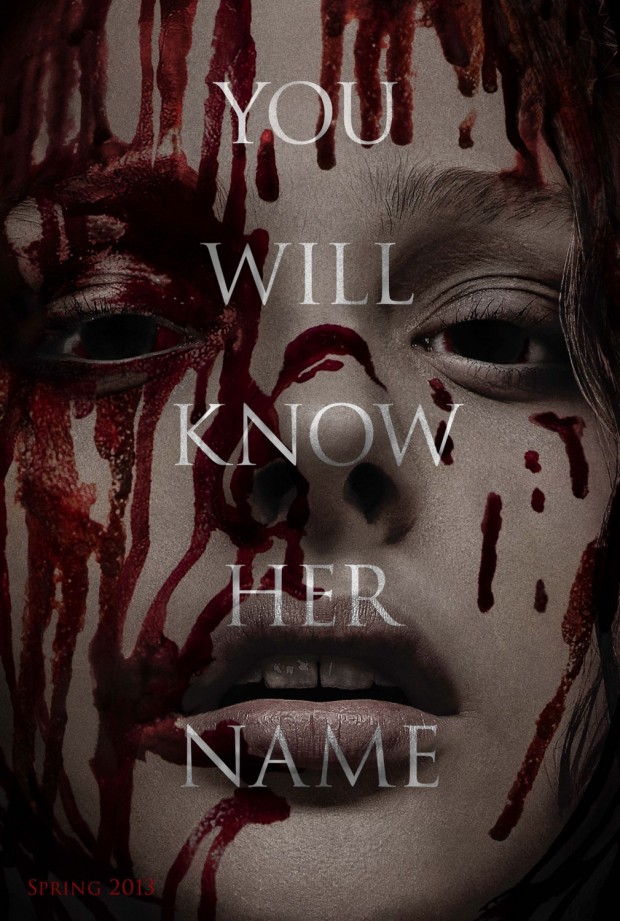
Carrie – Designer: ARSONAL Design
The jury is still out on whether the Carrie remake is a good idea or not, but this first teaser poster is a terrific concept. Designer ARSONAL’s philosophy is stated to be “an idea does not live without proper execution and there is no execution without an idea”. The idea here is simplicity itself, taking the minimalist approach to an iconic horror character, dripping with a familiar bucket of blood. Without even needing to state the title of the film, the poster offers a simple proposition: if you don’t know Carrie’s name yet, you will soon enough.
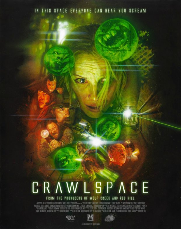
Crawlspace – Artist: Hugh Fleming
The one-sheet for Australia’s Crawlspace, which saw its debut at Sitges 2012 this month, comes from Hugh Fleming. The influences from Drew Struszan are striking, although the same could be said of many handdrawn posters in this era of Photoshop. There’s lots to look at here, with images within the green highlights and a tunnel that seems to go on forever.
The Creature From the Black Lagoon – Artist: Laurent Durieux
Artist Laurent Durieux did posters of all the Universal Monsters, to coincide with the release of the Blu-ray box set and of course, Halloween. They were all very different in style, but we especially liked this ye olde map that makes up the creature. We are now seeing if any of the other islands make shapes. Is the one in the top left a bearded man smoking a pipe. Check out some details from this poster, and the other ones, on the Mondo blog.
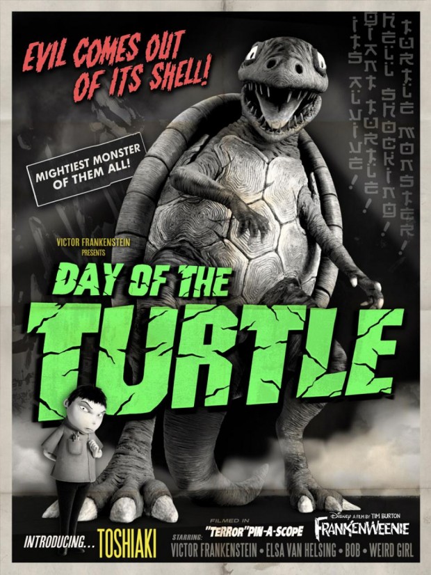
Frankenweenie – Retro poster
In the tradition of the black and white ‘homage’ poster released back in July, Disney released no less than six new posters showcasing the retro aspects of Tim Burton’s new film Frankenweenie. While we were especially fond of The Curse of the Mummy Hamster poster, we can’t look past this tribute to Japanese monster films for our pick for the month. Filmed in “Terror”pin-A-Scope.
A Good Day to Die Hard – Teaser poster
Next year, Bruce Willis will dust off his cool, dry action hero wit to take down more bad guys with accents. This poster is a pure fan joy-buzzer, telling us where the series is going, but never forgetting where they came from. Yippee ki-yay.
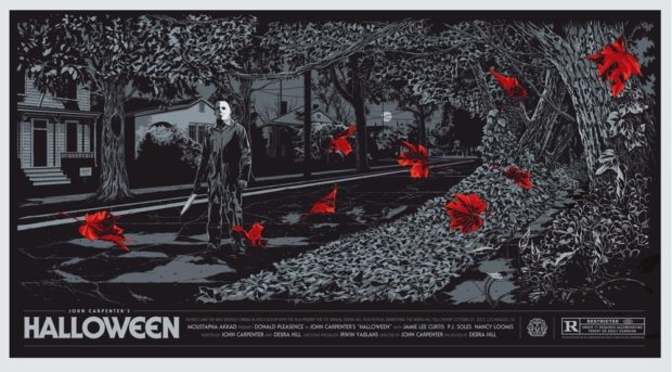
Halloween – Designer: Ken Taylor
Australian artist Ken Taylor delivers a fresh take on classic horror just in time for the trick or treating celebration of the same name. Halloween became famous for bringing the threat of a psychotic madman into the quiet suburban street, and this monochromatic poster almost blends killer Michael Myers into the background, with only the blood-red autumn leaves giving the film a splash of colour. Yet there is an unspoken terror in his innocuousness, making this one of the finest posters of the many we’ve seen for the film over the years.
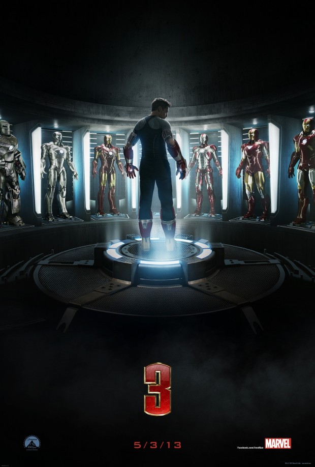
Iron Man 3 – Designers: BLT Communications, LLC
It may not be the most amazing poster in the world, especially given the competition this month, but the image of Tony Stark’s (Robert Downey Jr) various Iron Man suits has become an integral part of the Iron Man 3 campaign. In fact, so recognisable are the suits that the poster doesn’t even need to mention the title beyond the number “3”.
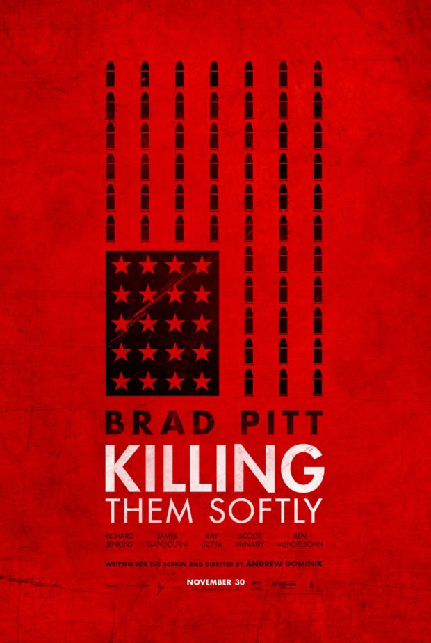
Killing Them Softly – Designer: Gravillis Inc
As far as we can tell, there were 9 alternative posters to Andrew Dominik’s Killing Them Softly released in October. Some of these may never see bus stops or marquees, but we loved this one, recreating the US flag with bullets. The simple, bold design is deceptively simple, with little details like the worn background, and the clean fonts impressing on a second or third glance.
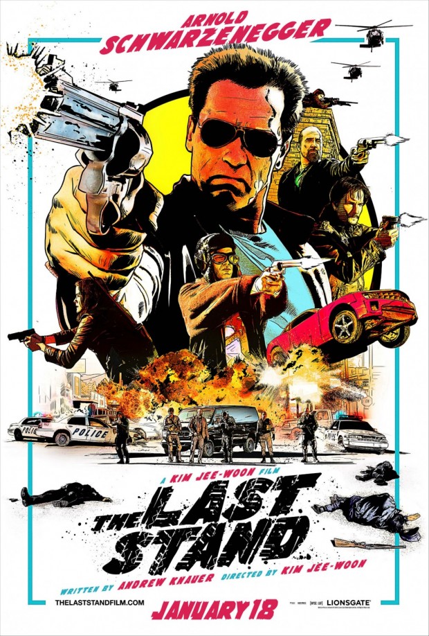
The Last Stand – Designers: Ignition Print
If we didn’t have enough reasons to be excited about The Last Stand – being South Korean director Kim Jee-Woon’s first English language film, and Arnold Schwarzenegger’s first starring role in almost a decade – this poster gives us about a dozen more. It’s a retro throwback to both the heyday of Arnie’s greatest action roles, and a few decades before that of action poster art. Major props go to this hand-drawn design that we hope is indicative of the controlled chaos that we will see in this film when it hits cinemas next year.
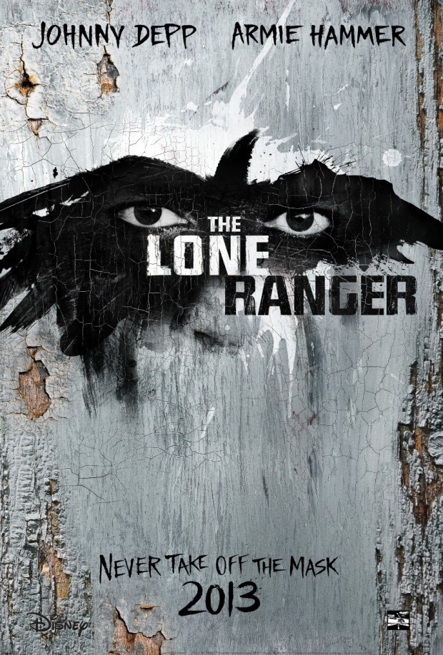
The Lone Ranger – Designer: BLT Communications, LLC
The title may say The Lone Ranger, but this poster and all of the film’s other publicity assure us that Johnny Depp as the faithful Tonto is the undeniable star. This poster aims to look as though it was painted onto wood, and left to face the elements for several decades until Disney was able to put their small stamp on it. Indeed, the Mouse’s logo is quite difficult to see down there in the corner, making the raven-shaped splash of black across Depp’s eyes the real star of this design.
Lost Highway – Designer: Jeremy Saunders
While Australian designer Jeremy Saunders may be taking a break from creating new posters for the time being, it hasn’t stopped him from designing a set of limited edition prints for the The Lynch Project. For each of these prints, Saunders has taken inspiration from an iconic object associated with the film, such as an ear on bright green grass (Blue Velvet) or a blood stained record (Wild At Heart). This print, titled “Fugue State”, is inspired by Lost Highway, using the video tape that slowly draws Fred Madison into the world of duality. Dick Laurent is dead.
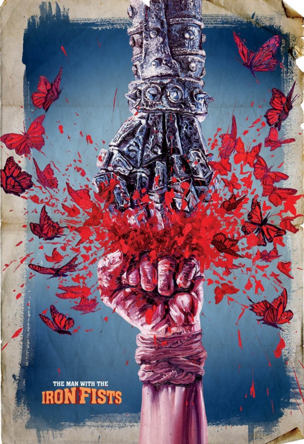
The Man with the Iron Fists – Designer: Ignition Print
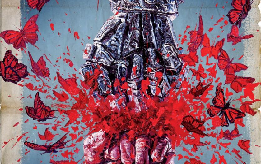
About a dozen cool designs premiered this month at various places on the Interwebs, but this one really grabbed our attention. The stunning design tells you everything you need to know about the film: there will be fighting of some kind and a guy with an iron fist. Plus butterflies. Lots of butterflies.
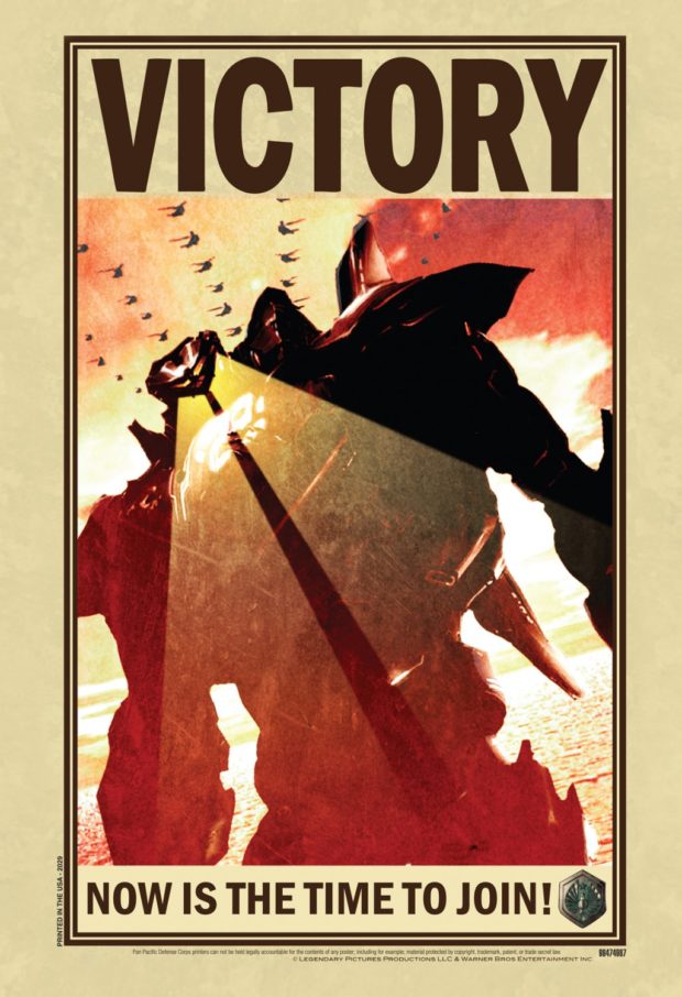
Pacific Rim – NYCC Exclusive
Guillermo del Toro’s Pacific Rim might have everything we are looking for in a film, from giant robots fighting over the pacific to…well, what else do we need? The point is, this came from NYCC and we should rejoice at its existence. Go on. Rejoice. We’ll just be here waiting until you get back.
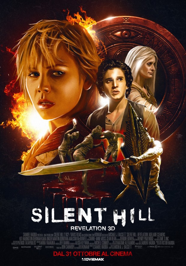
Silent Hill: Revelation – Designer: BIG JELLYFISH®
Why do we suddenly have an urge to see a Silent Hill film? This Italian poster for the latest franchise is EPIC!!! with a capital ‘!’. However, should someone warn the woman in the top left that her hair is/in danger of catching on fire?
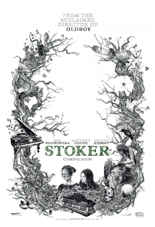
Although it appears minimal and stark upon an initial glance, the poster is filled with tiny detail and the promise of a myriad of gothic horror. It is also the only poster this month that is accompanied by a promo music video, set to “Becomes the Color” by Emily Wells, acts as a metafictional ‘making of’ for the poster, showcasing the hand-drawn illustrations on the one-sheet as well as some of the stunning photography from the film.
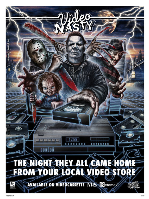
Video Nasties – Artist: Tom Hodge (The Dude Designs)
This one isn’t actually a film poster, but rather a celebration of the good ol’ days of video nasties of all kinds. Artist Tom Hodge, who works under the name The Dude Designs, is one of our favourites here at The Reel Bits, with his love of all things cult cinema exceeding our own, turning the corner and slapping us on the backside as it laps us on the second pass. As Hodge notes on his blog: “Fancy something a little bit special to celebrate Halloween, Horror and the wonderful world of the Video Nasty… well now you can”.
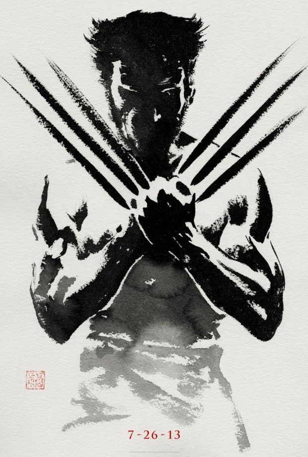
The Wolverine Teaser poster
The simple and iconic design also recalls a Japanese ink wash painting, right down to the seal in the lower left corner. Lovely. With a poster like this, it has to be better than X-Men Origins: Wolverine, right? Right?

