It’s the end of the month, so it is time to reflect, relax and rewind our way back through the one-sheets, banners, promotional artwork and posters released in the last calendar month, highlighting some of the ones we though were noteworthy. It’s a little section we like to call Best Posters.
Oh, it’s the most wonderful time of the month. Well, except when we’re watching movies or the fine run of television on at the moment. It’s been another amazing crop of artwork this May, putting to bed any complaints about the art of the one-sheet being dead. We’ve even got our first “living poster” in this month’s column, along with a hearty dose of surrealism, some trippy perspective shifts, and at least one wiener dog that we’re aware of.
Let us know in the comments below if we’ve missed your favourite, we got it wrong, or better yet, if we got it very right.
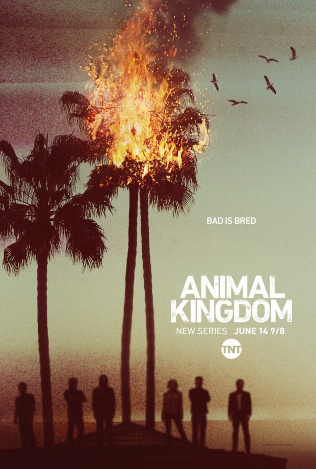
Animal Kingdom – Designers: Ignition
Based on the Australian film of the same name, it’s incredibly different from Jeremy Saunders vision for the original. Indeed, it’s closer in tone to the vibe that Netflix’s Bloodline gives off, undoubtedly capturing some of the market of that recently returned masterpiece.
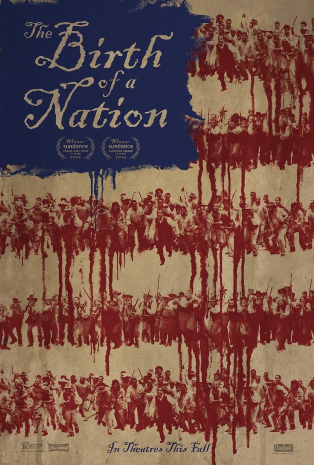
Birth of a Nation (2016)
With a title that clearly links to the 1915 film of the same name, writer/director/star Nate Parker says he “reclaimed this title and re-purposed it as a tool to challenge racism and white supremacy in America.” The picture depicts the start of a slave revolution, with the dripping red of blood forming the US flag. It comes with a “living poster” that shows a revolution in action, and something exciting and fresh in the world of movie posters.
Buddymoon – Designer: The Robot Eye
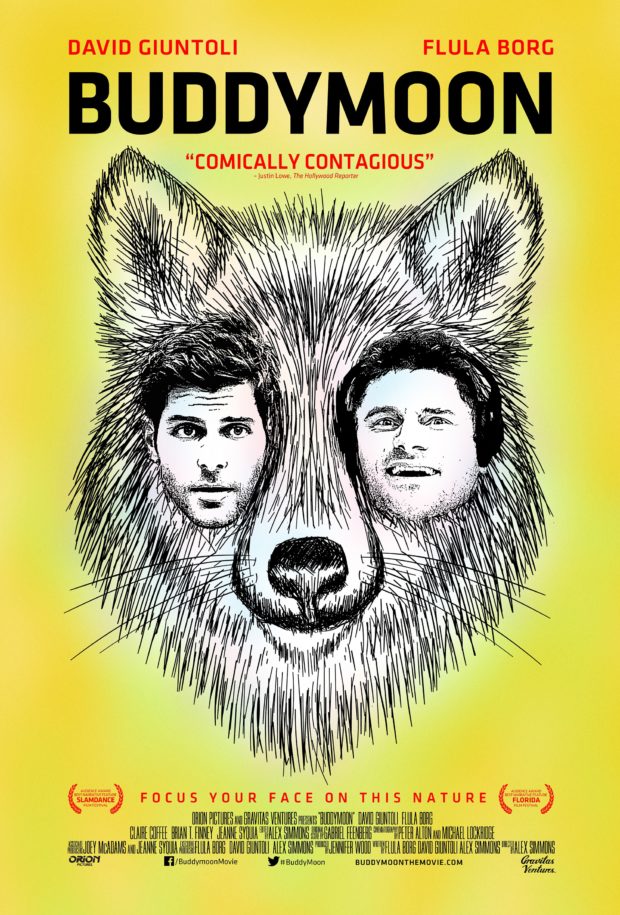
The Robot Eye specialises in independent cinema, and this poster invites us to “Focus your face on this nature.” The terrifying three faces on this poster are hard not to focus on, but the brilliant thing is that we still have no idea what this film is about based on the poster.
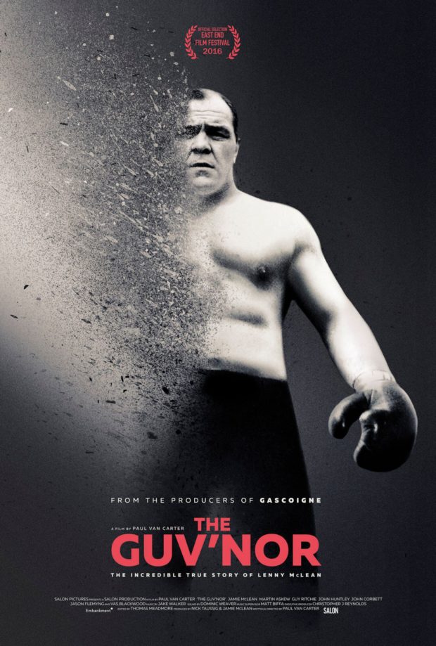
The Guv’nor
The story of John “Lenny” McLean, aka The Guv’nor, explores the origins story of the champion bare knuckle fighter, known to some as “the hardest man in England.” He later had some acclaim as Barry the Baptist in Guy Ritchie’s Lock, Stock, and Two Smoking Barrels. The dynamic poster stands out in a crowd, the way we’re sure Lenny did too.
The Handmaiden
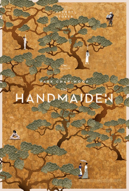
The gorgeous poster only heightens our anticipation for Park Chan-wook’s first film as a director since 2013’s Stoker. It’s a deceptive poster, looking delicately beautiful on first glance, until you notice the smoking man, the possibly forbidden naked romance on the left, and the woman hanging from a tree on the right.
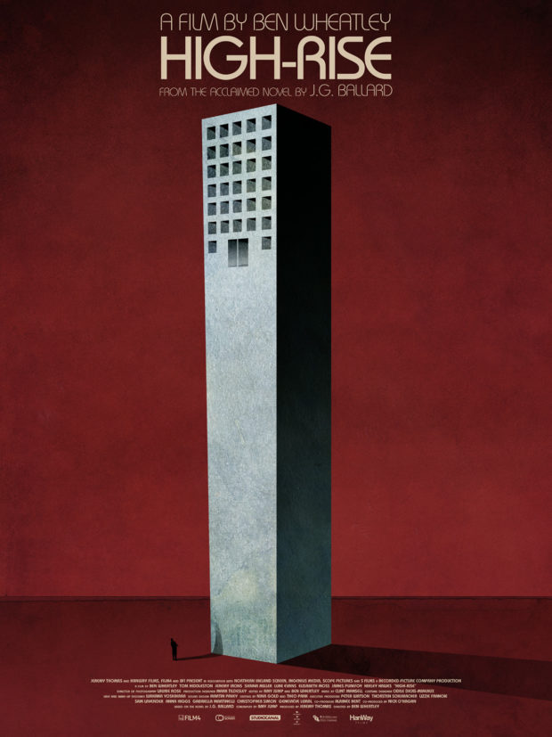
High-Rise – Designer: Jay Shaw
This is one of those cases where we are happy to let Mondo do the talking for us. According to their blog: “HIGH-RISE is the latest masterpiece from one of our favorite filmmakers, Ben Wheatley. The film, based on the J.G. Ballard novel of the same name, tells the story of Robert Laing and his ascension through the brutal social ranks of a residential tower block in 1970s England. While the film was in pre-production, Mr. Wheatley asked Jay Shaw to create a conceptual image to represent the overarching narrative. The building is presented with the entrance on the top floors. You’re either born up there or you don’t get in at all.”
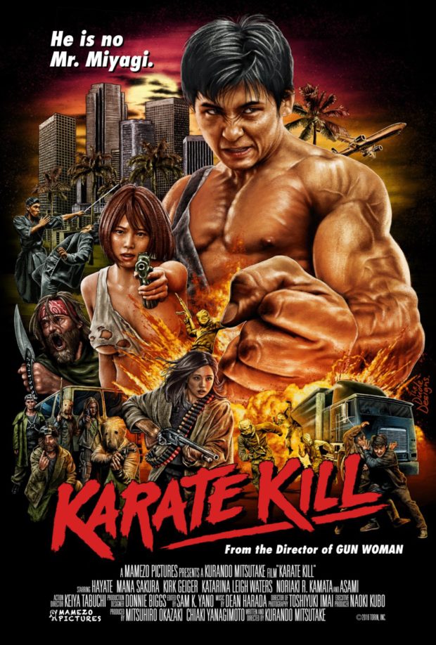
Karate Kill – Designer: Tom Hodge (The Dude Designs)
Tom Hodge (Hobo with a Shotgun) is basically a fixture of this column, and here he captures the batshit awesomeness of Kurando Mitsutake’s martial arts insanity. Hodge’s throwback designs to the glory days of VHS, and this is exactly the kind of imagery that would pop straight off the shelf and into your hearts.
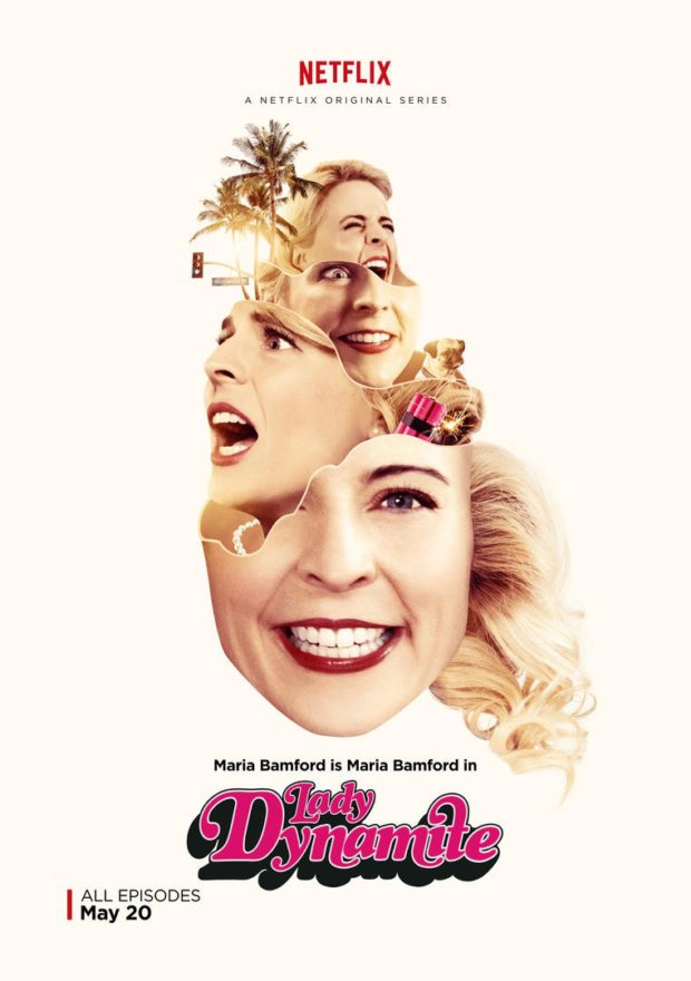
Lady Dynamite
The new Netflix TV series, that launched in May 2016, has a hearty dose of surrealism to it, and this stylish poster captures the only two things you need to know about the series: it gets a little bit weird, and it stars Maria Bamford.
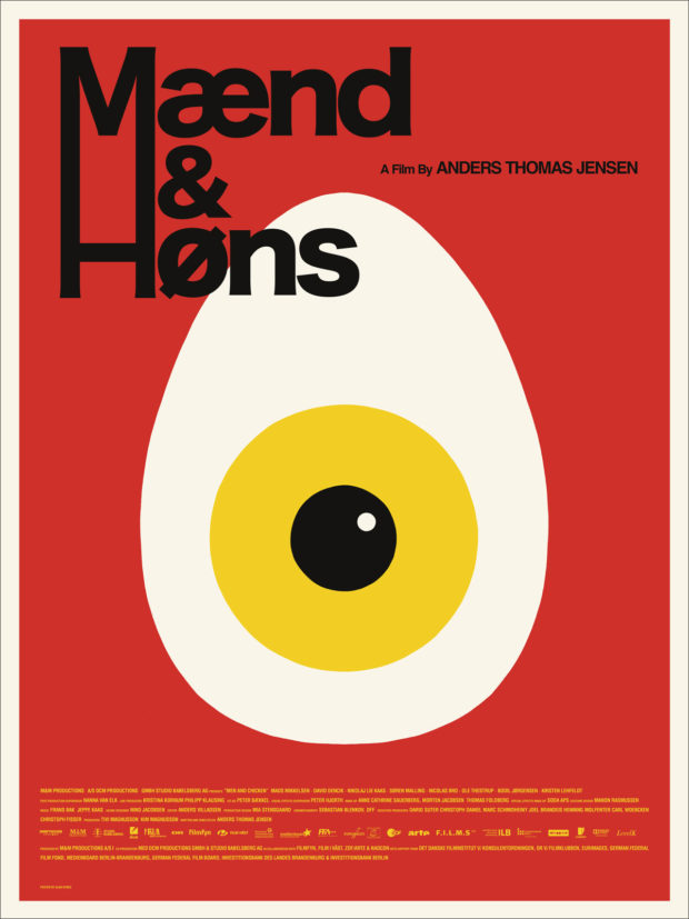
Men and Chicken (Mænd & Høns) – Designer: Alan Hynes
Mondo refers to artist Alan Hynes as the “Swiss Army Knife of poster designers,” delivering a esoteric design for a incredibly unique film, one that has been called an “outlandish hybrid of The Three Stooges and The Island of Dr Moreau.” Mondo adds that Hynes produces “clean and bold aesthetic of classic Scandinavian designs while delivering a perfectly odd visual to accompany the film.” Check out the trailer for more evidence of how perfectly weird this poster is.
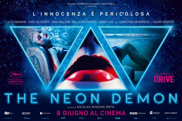
The Neon Demon – Designer: Vertigo Movie Advertising
One of the more talked-about films of this year’s Cannes International Film Festival, evoking “walkout, boos and raves” according to IndieWire. In other words: a must-see film by any standard. This stylish and sleek European poster from Vertigo Movie Advertising evokes sex and seediness, as well as the nocturnal danger evident in Nicolas Winding Refn’s earlier film, Drive.
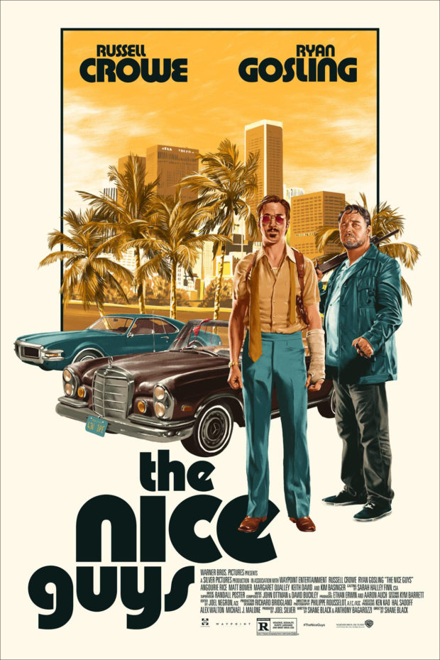
The Nice Guys – Designer: Matthew Woodson
Already one of our favourite films of 2016, as evidenced by our glowing review, Matthew Woodson’s retro design and use of font perfectly evokes the 1970s period that the film revels in, with this 15-colour screen print feeling like an authentic article from the past.
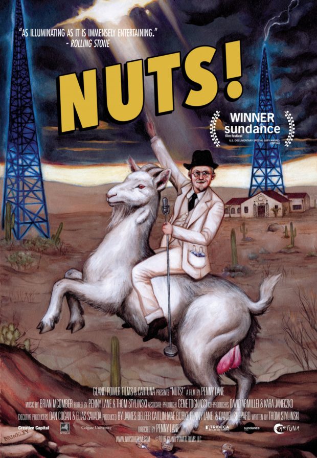
Nuts!
A poster that lives up to the film’s name, mostly because it’s about “an eccentric genius who built an empire in Depression-era America with a goat testicle impotence cure and a million watt radio station.” Nothing tells that story like an artistic rendering of a man riding a prominently hung goat holding a microphone.
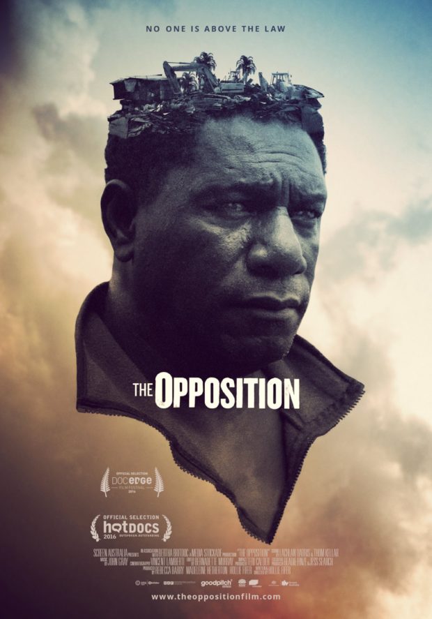
The Opposition – Designer: Jeremy Saunders
Jeremy Saunders is an Australian designer who has graced this column in the past, and this might just be one of his finest to date.The documentary film explores how sustainable industry can be built in developing countries, particularly in the Paga Hill, mountain peninsula of Port Moresby in Papua New Guinea. The image here depicts Joe Moses, leader of the Paga Hill Settlement, who literally has the 3000 people he is attempting to save from eviction on his mind. The film has been censored by the NSW Supreme Court, so a redacted version of the film will feature at the Sydney Film Festival in 2016 with narration over the censored footage by Australian actress Sarah Snook.
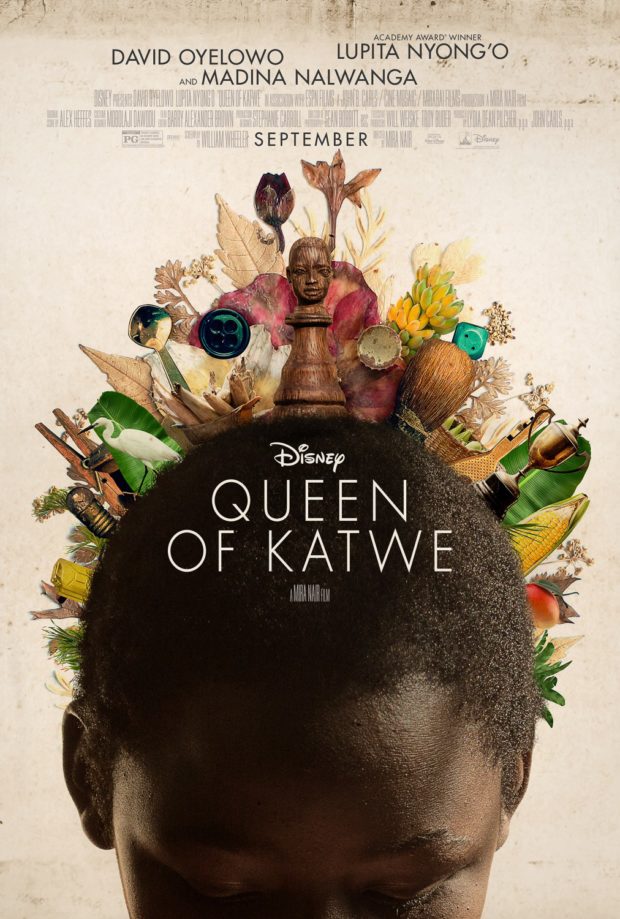
Queen of Katwe
The poster for the biopic Phiona Mutesi, an Ugandan chess prodigy who becomes a Woman Candidate Master after her performances at World Chess Olympiads, follows a thematic theme of items coming out of people’s heads/bodies this month (See also: Lady Dynamite, The Opposition and Smoke & Mirrors). It’s an eye-catching piece that instantly speaks to the location, theme and catholicity of influences on the film’s aesthetic.
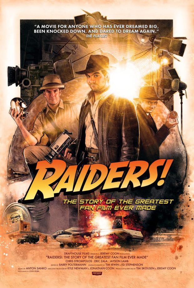
Raiders! The Story of the Greatest Fan Film Ever Made – Designer: Paul Shipper
The story behind fan film, Raiders of the Lost Ark: The Adaptation, the poster is as epic as the story that inspired it. Drawing on the Richard Amsel and Drew Struzan poster styles for Raiders of the Lost Ark and its sequels, it’s a little bit cheeky and instantly reminiscent of the icon the filmmakers so dearly admire.
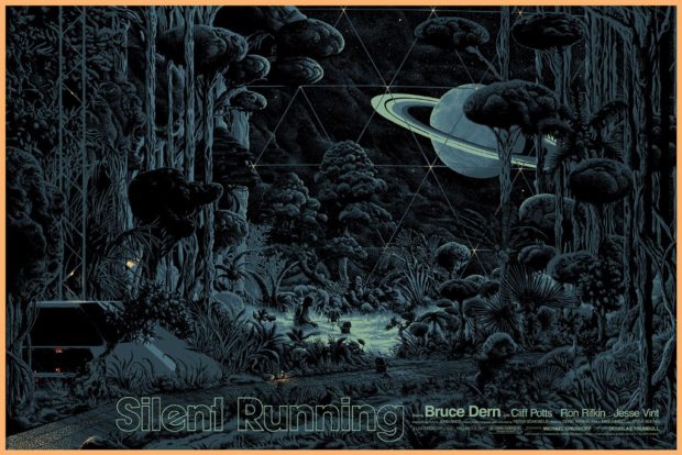
Silent Running – Designer: Kilian Eng
We hate to keep handing you over to the words of Mondo this month, but their summation of their own artist bullpen is spot-on in the case of regular Best Posters artist, Kilian Eng. On their blog, they comment: “Eng’s poster for SILENT RUNNING typifies everything we love about his work. It’s an absolute feast for the eyes but retains a serene atmospheric quality. Bruce Dern’s communion with his robotic compatriots in the center of the derelict space-greenhouse is the perfect visual summation of the film’s themes.”
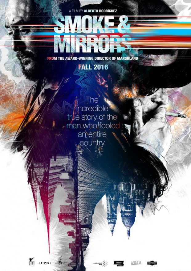
Smoke and Mirrors (El hombre de las mil caras) – Designer: Gabriel Moreno
The English-language poster for Spain’s El hombre de las mil caras, designer Moreno is known for using multiple media (pencil, ink, marker, watercolor, and digital art) to achieve his final results. The shift in perspective on this poster asks a question that demands an answer, and it’s a beautiful blend of colour and black line-art to achieve a discombobulating effect. Check out the original Spanish language version on Moreno’s site.
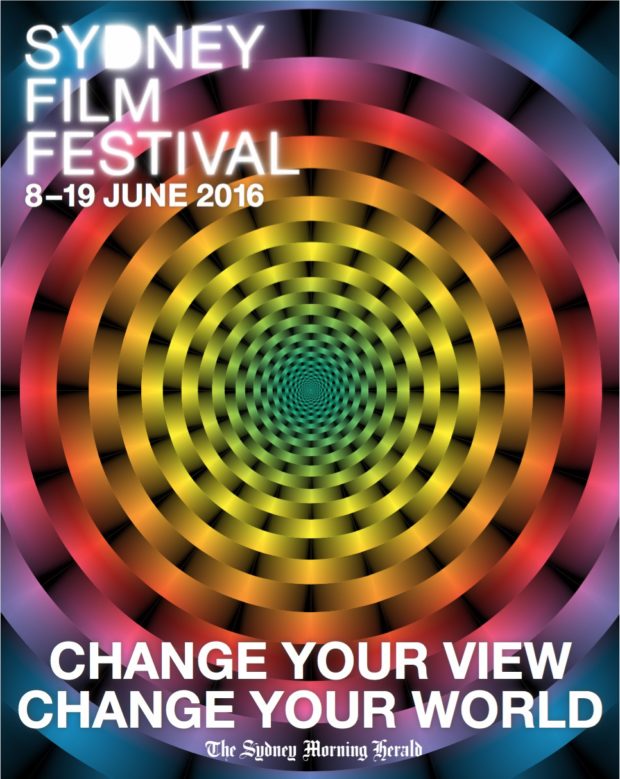
Sydney Film Festival 2016
We are very excited about the Sydney Film Festival this year, in case you haven’t noticed from all the coverage on the site. Their festival poster this year embodies the slogan “Change You View, Change Your World” by offering up an image that appears to be constantly moving. Indeed, it works even better in this digital format than it does in print. Try staring at the dead centre for a few moments, and asking yourself what direction the lines are moving in – or are they moving at all?
Toni Erdmann
Another favourite from Cannes this year, and indeed the recipient of the FIPRESCI Award for Best Film In Competition at the 2016 Cannes Film Festival, it’s almost impossible to know exactly what this film is about from the poster. The minimal plotting advice on the major Internet databases is no help either: “A father tries to reconnect with his adult daughter.” What we do have on this striking poster is a woman embracing something unidentifiable, and a sense of magical realism that we can’t wait to see more of.
The Transfiguration
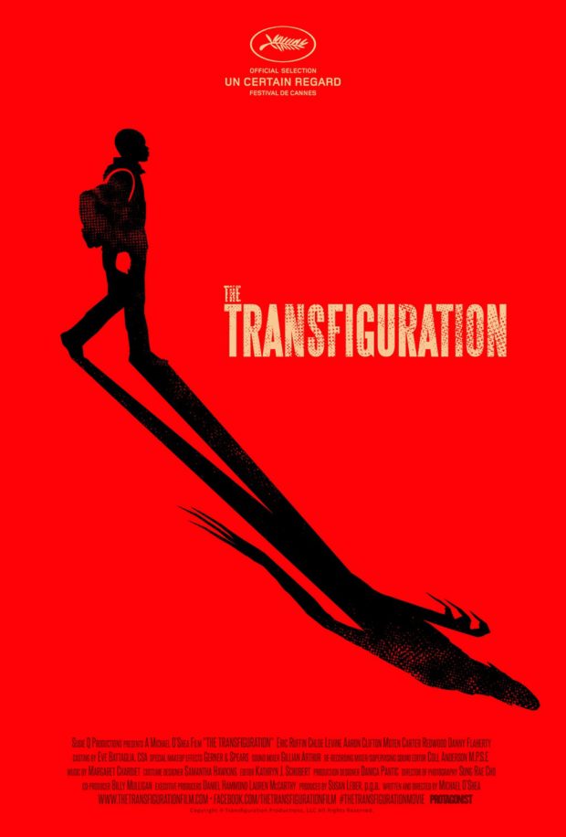
Before playing at Un Certain Regard during Cannes this year, Michael O’Shea (the cult-favourite short Milo) makes his debut as a feature director. The stark and minimalist poster is bathed in blood red, with the shadowy schoolboy figure casting the long Expressionist shadow of a Nosferatu figure in the lower half. It’s a classic poster for a horror film that is already garnering some positive reviews.
Wiener-Dog
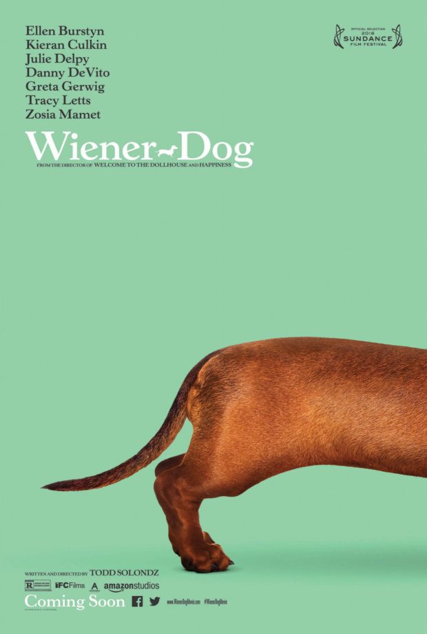
From director Todd Solondz (Welcome to the Dollhouse, Happiness), we get the rear end of a Dachshund. What more could you ask for?
