It’s the end of the year, so it is time to reflect, relax and rewind our way back through the one-sheets, banners, promotional artwork and posters released in the last calendar year, highlighting some of the ones we though were noteworthy. It’s a little section we like to call Best Posters.
We’ve been slack in 2016. We didn’t start this column until April, and then abruptly stopped after August. So we decided to look back at the whole year, which was not an easy task. This list of posters doesn’t reflect on our favourite films, although some of them do double up, and we are sure we missed a bunch. That said, these posters consistently caught our eye after months of staring at them, seeing them plastered to the sides of buses or turning up in our social media feeds.
Let us know in the comments below if we’ve missed your favourite, we got it wrong, or better yet, if we got it very right.
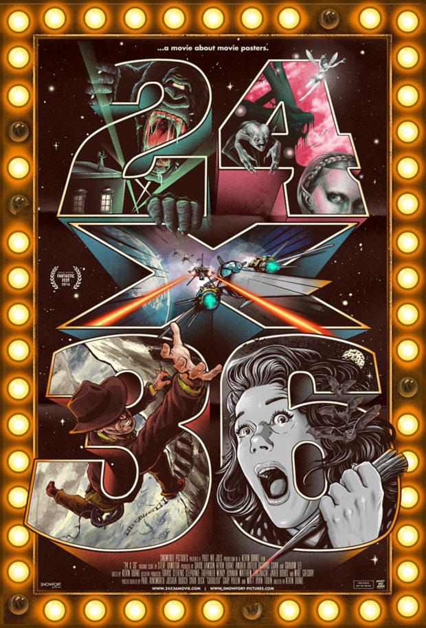
24X36: A Movie About Movie Posters – Desingers: Paul Ainsworth, Joshua Budich, Sara Deck, Gary Pullin and Matty Ryan Tobin
It’s only appropriate that the first poster listed here is from a film about film posters. The art of the poster has become so prolific that the poster itself gets a film: and of course that film needs an equally impressive poster. Combining elements of classic icons from cinema, or at least approximations of them, it take its title from the dimensions of the most common posters.
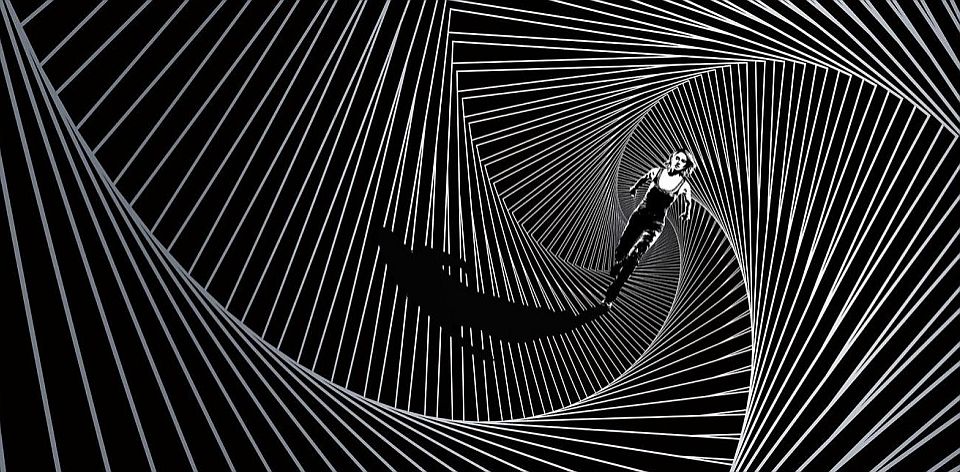
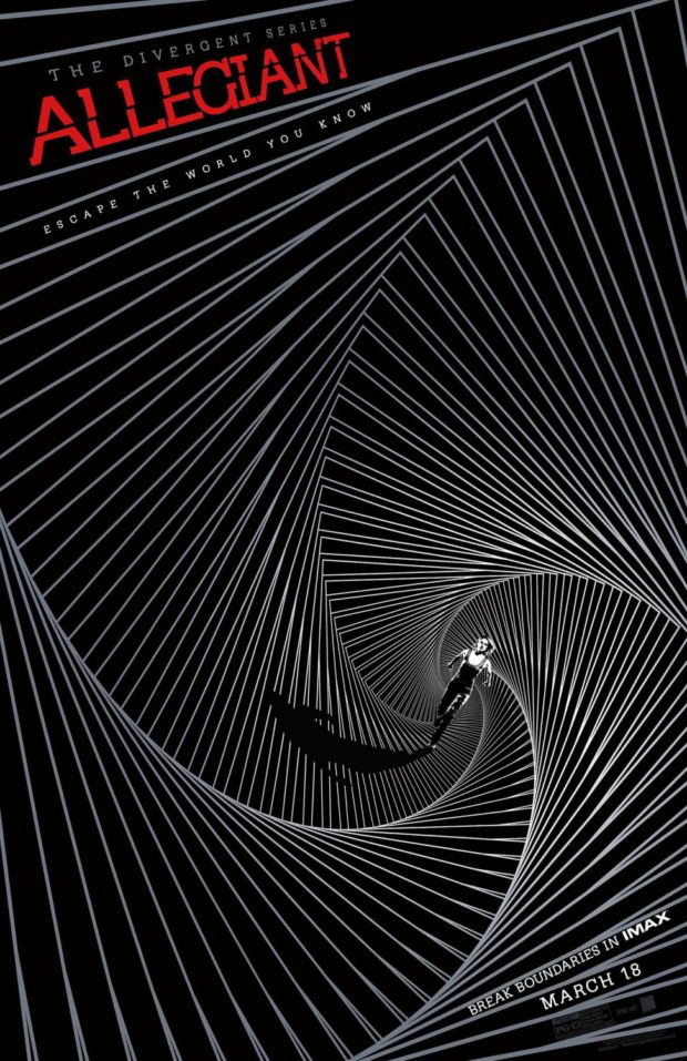
Divergent Series: Allegiant – Designer: LA
While the series may be known for its blockbuster tween appeal, and keeping Shailene Woodley employed, its posters haven’t set the world on fire. Except for this one from LA, a discombobulating swirl of perspective shifts. It almost makes us keen to see the film. Almost.
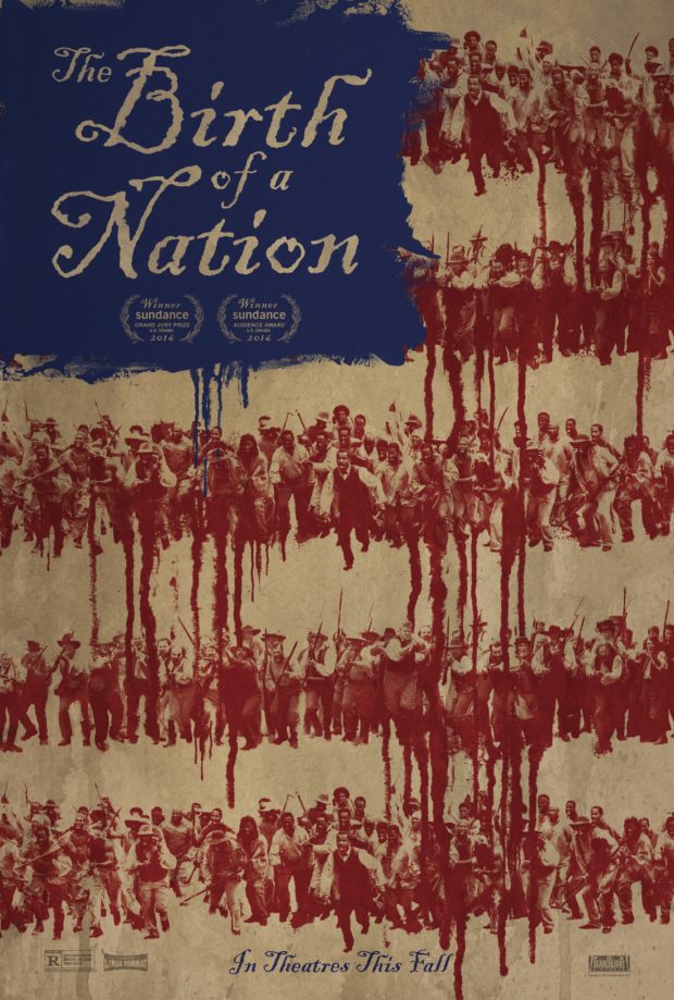
The Birth of a Nation (2016)
The film itself has been the subject of some controversey, especially surrounding writer/director/star Nate Parker. Yet the poster campaign was exceptional. With a title that clearly links to the 1915 film of the same name, Parker says he “reclaimed this title and re-purposed it as a tool to challenge racism and white supremacy in America.” The picture depicts the start of a slave revolution, with the dripping red of blood forming the US flag. It comes with a “living poster” that shows a revolution in action, and something exciting and fresh in the world of movie posters.
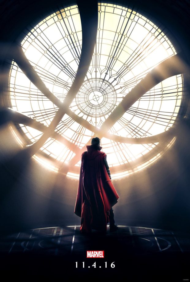
Doctor Strange – Designers: BLT Communications
If we’re being fair, Marvel’s poster have not exactly been inspiring in their cookie-cutter approach to Photoshopping actors. Not so with the two beautiful posters for Doctor Strange. While not as psychedelic as its companion, the iconic imagery of the Sorcerer Supreme silhouetted against the Seal of the Vishanti in his Sanctum Sanctorum mades this one of our most anticipated superhero films of the year.
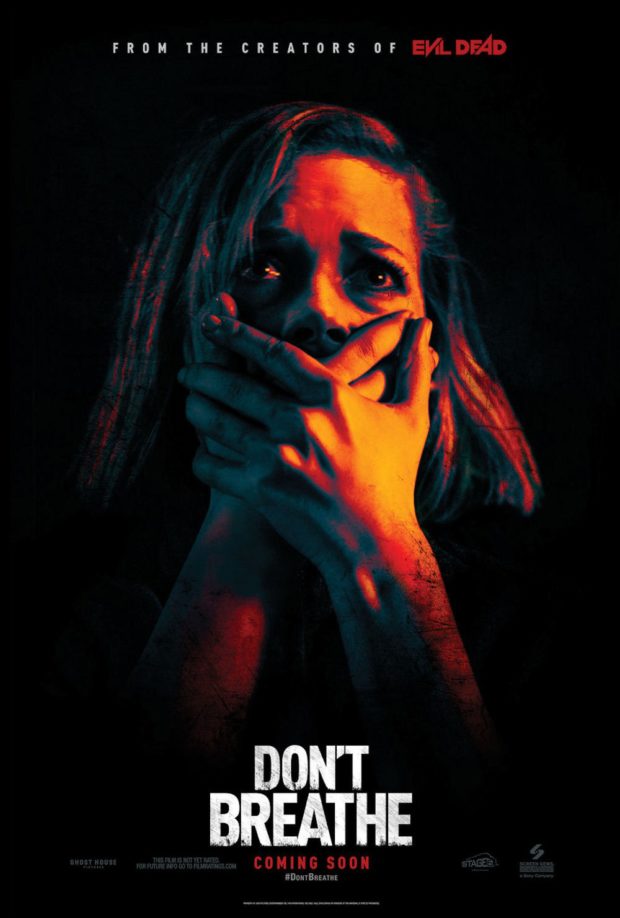
Don’t Breathe – Designer: The Refinery
The film that some have called the best horror film of the year certainly had a unique sense of style, and was genuinely gripping until it descended into torture porn, something we noted in our review. Yet The Refinery’s poster is classic horror through a contemporary filter.
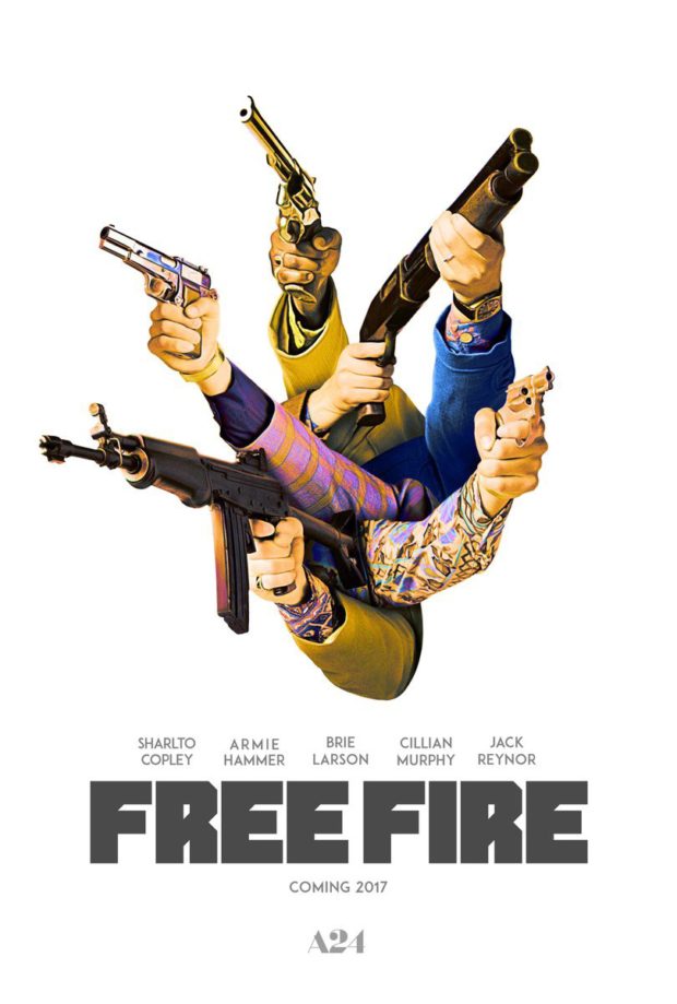
Free Fire – Designer: BOND
The film with a ridiculously good cast also has an utterly ridiculous poster, and was understandably one of the most shared pieces of poster art of the last year. We don’t really need to know what’s going on here, but we can bask in its greatness.
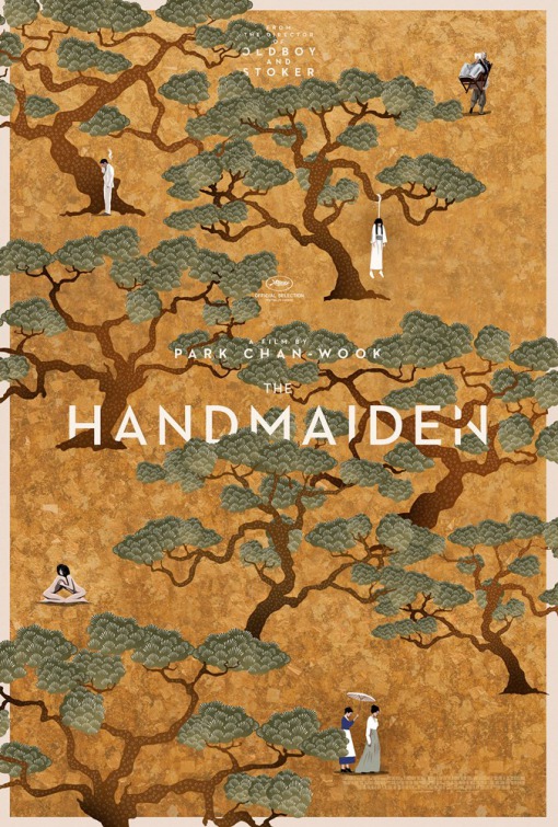
The Handmaiden – Designer: Empire Design
The gorgeous poster only heightened our anticipation for Park Chan-wook’s first film as a director since 2013’s Stoker. It’s a deceptive poster, looking delicately beautiful on first glance, until you notice the smoking man, the possibly forbidden naked romance on the left, and the woman hanging from a tree on the right. It did the trick, and the film was worth the wait, as our glowing review indicates.
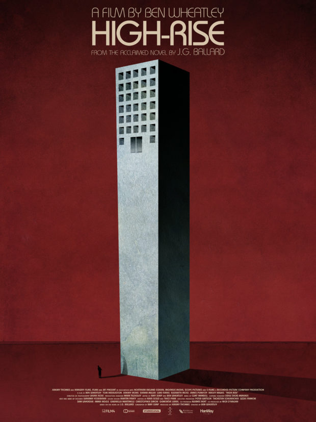
High-Rise – Designer: Jay Shaw
This is one of those cases where we are happy to let Mondo do the talking for us. According to their blog: “HIGH-RISE is the latest masterpiece from one of our favorite filmmakers, Ben Wheatley. The film, based on the J.G. Ballard novel of the same name, tells the story of Robert Laing and his ascension through the brutal social ranks of a residential tower block in 1970s England. While the film was in pre-production, Mr. Wheatley asked Jay Shaw to create a conceptual image to represent the overarching narrative. The building is presented with the entrance on the top floors. You’re either born up there or you don’t get in at all.” If you’re keeping count, that’s not less than TWO Ben Wheatley films on the list here.
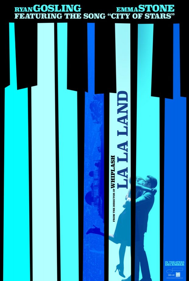
LA LA Land – Designer: LA
Never has there been a more appropriately named design company for a film that LA on LA LA Land. Taking a leaf out of the cut paper style of Saul Bass, but giving it a musical spin in the shape of piano keys, the retro overlay on this award-worthy film from Damien Chazelle (Whiplash). We gave the film a perfect 5 stars, making it Certified Bitstastic.
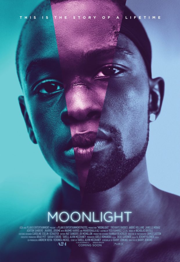
Moonlight – Designer: InSync Plus
You’ll see this film on a lot of “best of” lists this year, but we hope this poster makes it on a few as well. Making exceptional use of the tri-tone colour scheme, it speaks to the trilogy of identities and actors who make up the distinct sections of the film.
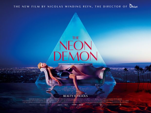
The Neon Demon – Designer: AllCity
One of the more talked-about films of this year’s Cannes International Film Festival, evoking “walkout, boos and raves” according to IndieWire. In other words: a must-see film by any standard. This stylish and sleek poster from AllCity evokes sex, seediness and style, as well as the nocturnal danger evident in Nicolas Winding Refn’s earlier film, Drive. Another one of our favourites this year, we described it as “Showgirls if it was conceived by David Lynch.”
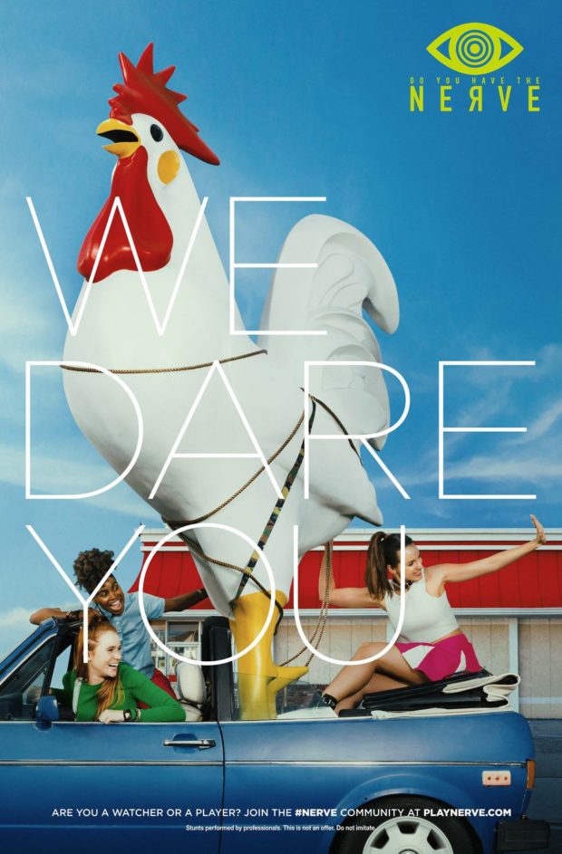
Nerve – Designer: LA (Photography by Cullin Tobin)
The viral campaign for the upcoming NERVE, about people entering an online video reality game, features a series of ads for the app in the film. This one has a giant rooster. Do you need to know more? If so, our review for the film found it to be a timely film on the culture of anonymity in the web, and the dangers of groupthink.
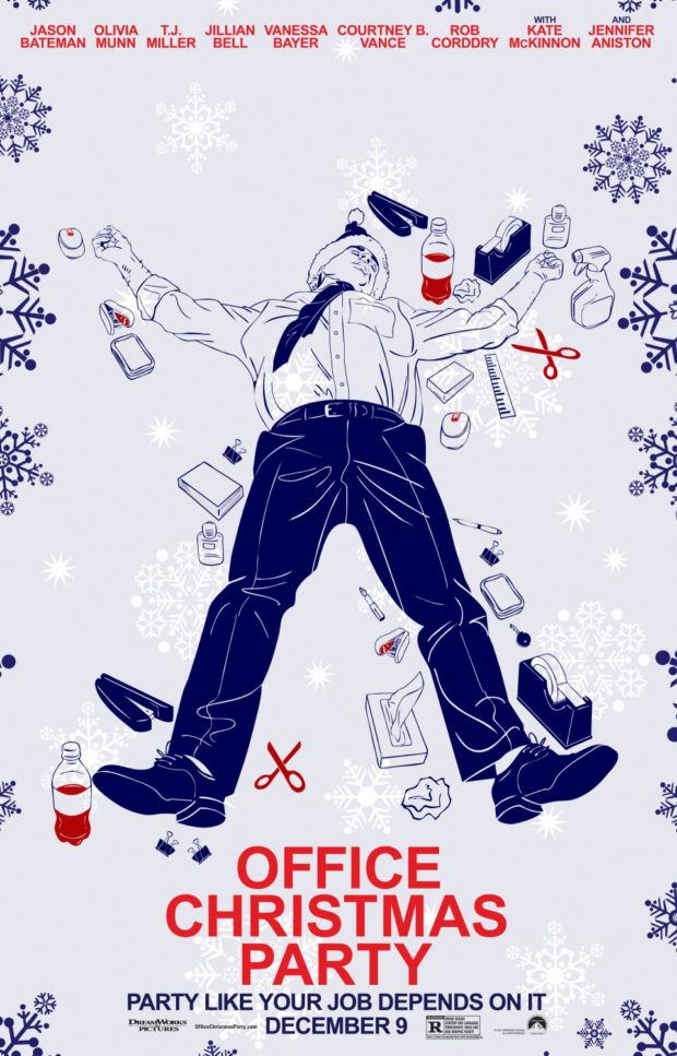
Office Christmas Party – Designer: BLT Communications, LLC
Incredibly appropriate for the time of year that you are probably reading this, one of the funnier comedies set around contemporary Christmas comes with its own set of “instructional” posters, mirroring the “HR” theme of the film. If there’s two things we like, it’s mocking people who have passed out drunk, and functional movie posters.
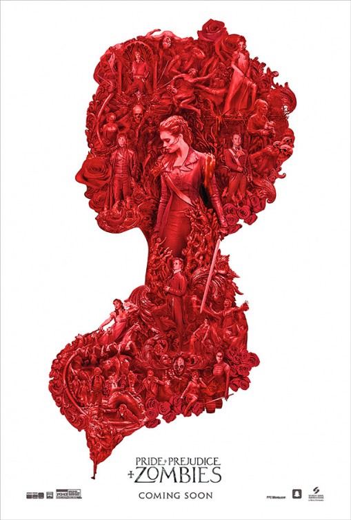
Pride and Prejudice and Zombies – Designer: Ignition
Despite a pretty decent cast, Pride and Prejudice and Zombies didn’t exactly set the box office alight when it was released in February this year, and if you blinked you may have missed its theatrical run. However, this complex poster from Ignition wraps its intricately detailed tendrils around a Regency tale of romance and bloodletting.
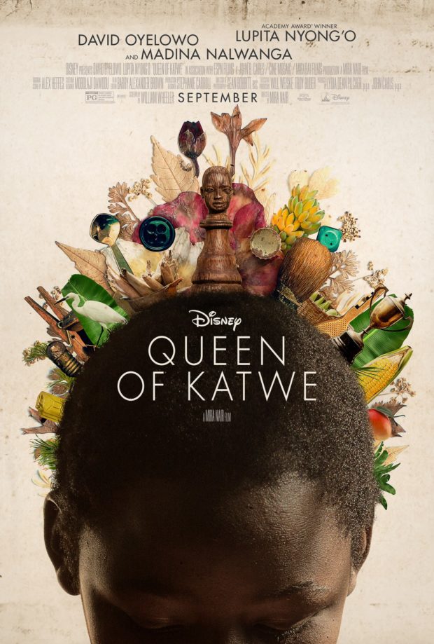
Queen of Katwe – Designer: Palaceworks
The poster for the biopic of Phiona Mutesi, an Ugandan chess prodigy who becomes a Woman Candidate Master after her performances at the World Chess Olympiads, follows a theme of items coming out of people’s heads/bodies this year (See also: Lady Dynamite, The Opposition and Smoke & Mirrors). It’s an eye-catching piece that instantly speaks to the location, theme and catholicity of influences on the film’s aesthetic, and it’s also one of the most charming films of the year.
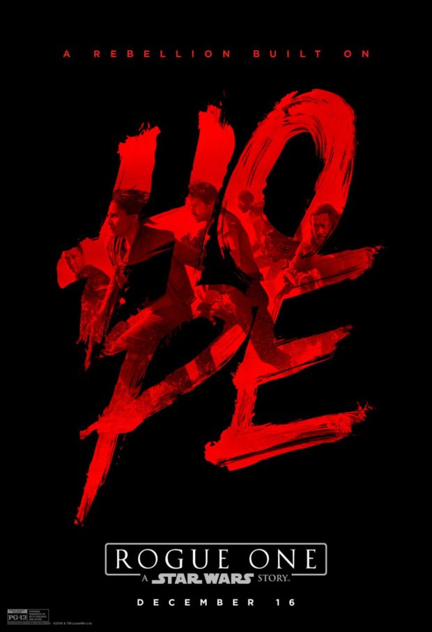
Rogue One: A Star Wars Story – Designer: BOND
There are well over 40 posters for this year’s Star Wars film by our rough count, many of them featuring spectacular recreations of the cast, minimalist imagery or retro tributes. However, for our money, one of the biggest films of the year works best with this simple poster, one that overlays the word “Hope” over the top of the sprinting cast. After all, rebellions are built on that stuff.
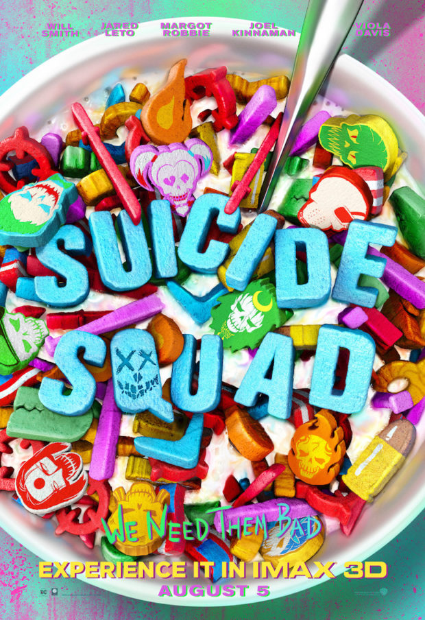
Suicide Squad – Designer: Concept Arts
Like this poster, the final SUICIDE SQUAD film was be everything that this one-sheet represents: it was bright, colourful, filled with iconic images and bad for your teeth. Warning: do not attempt to put the film in your mouth.

