It’s the end of the month, so it is time to reflect, relax and rewind our way back through the one-sheets, banners, promotional artwork and posters released in the last calendar month, highlighting some of the ones we though were noteworthy. It’s a little section we like to call Best Posters.
Happy New Year! After rounding up the Best Film Posters of 2016, it’s time to get cracking on the nominees for 2017.
This month we go from the abstract, to the impressionistic, to the psychedelic, and the just plain disturbing. In other words, it’s a perfect start to the year. Also new this month: trends in posters we’ve noticed.
Let us know in the comments below if we’ve missed your favourite, we got it wrong, or better yet, if we got it very right.
Poster Trends: Slogans Over People
Every now and then, we start to notice trends across posters. This one isn’t new, but it popped up a few times this month. Posters that don’t necessarily have the title of the film prominent, but a giant slogan over the face or body of a person. In the case of the Baywatch posters, they published at least half a dozen of them.
Our favourite posters of January 2017
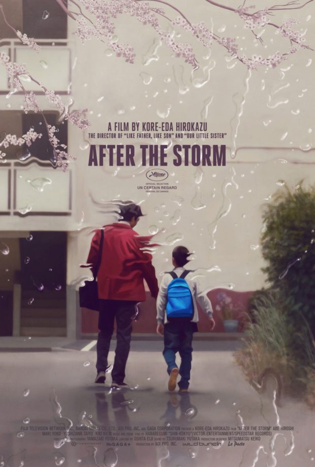
After the Storm – Designer: Akiko Stehrenberger
One of the best films of the 2016 festival circuit, the 2017 theatrical release comes with a stunning poster to match. Akiko Stehrenberger takes the central father and son figures of Hirokazu Kore-eda’s film, with the ‘lens’ filtered through the storm that redefines their relationship. Read the full review.
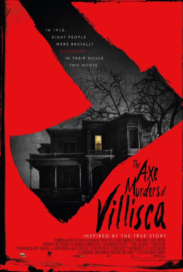
Axe Murders of Villisca – Designer: InSync Plus
Another trend we love is ‘things inside shapes of objects’ and this creepy as heck house inside of an axe, with a creepy as heck child inside the house, fits the bill several times over.
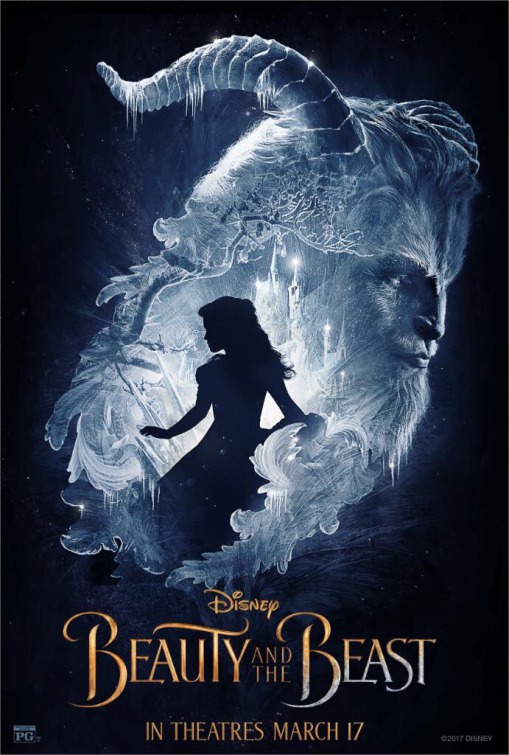
Beauty and the Beast (2017)
There’s been a few posters released this month for the Disney remake, but this is the only one that captures the delicate beauty of their most enduring story.
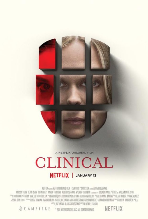
Netflix’s original film may tend towards the traditional genre tropes, but the poster stands out for literally deconstructing the psychological thriller theme. Check out our full review here.
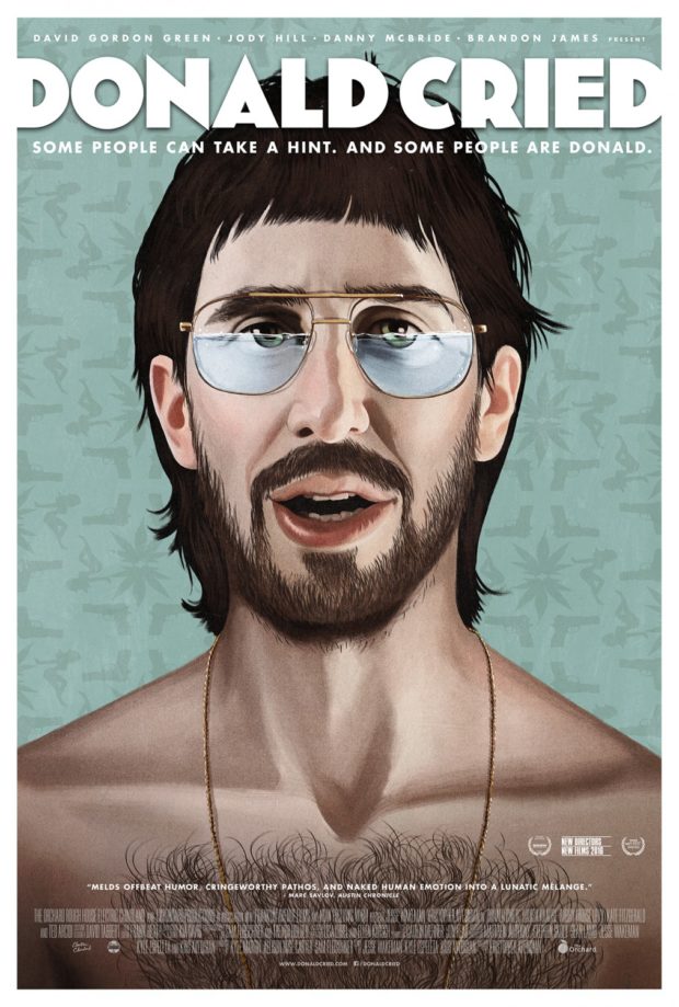
Donald Cried – Designer: Gravillis Inc and Akiko Stehrenberger
Another one from Stehrenberger, working with Gravillis Inc, Kris Avedisian’s award-winning debut feature (an extension of his 2012 short) comes with eye-catching poster and the hairiest chest of the month.
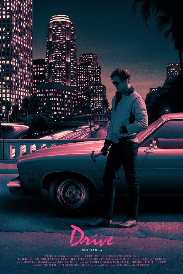
Drive – Desinger: Roy Kurtz (for Mondo)
In hiring Kurtz for this project, Monod referred to him as “a perfect fusion of artist and property.” They aren’t wrong: the artist captures the seediness of the LA background and the iconography of the lead, bathing it all in a neon glow.
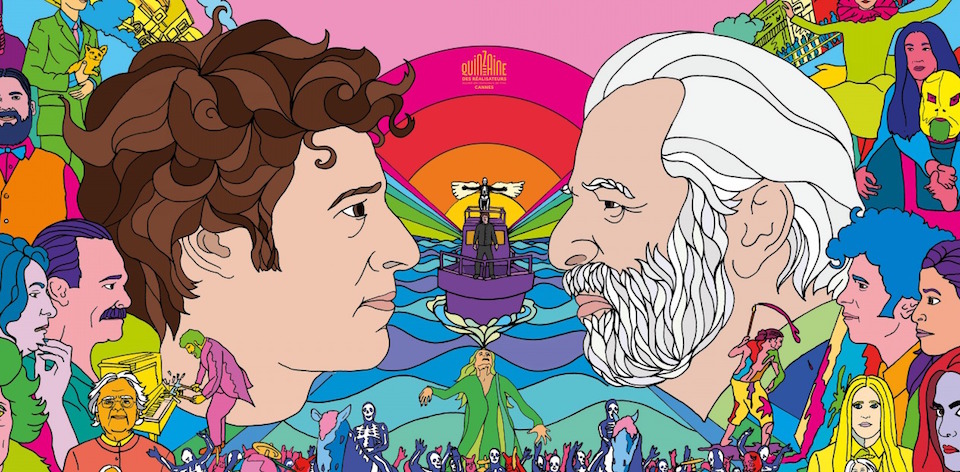
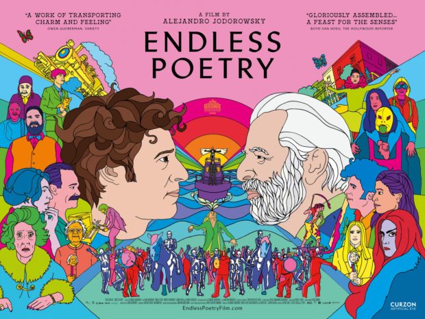
Endless Poetry – Designer: Andrew Bannister (UK)
We would expect that the poster for Alejandro Jodorowsky’s to be a bit batshit crazy, and this psychedelic trip beneath the waters once sailed by a yellow submarine is something we could happily get lost in for hours. Hmmm….where were we?
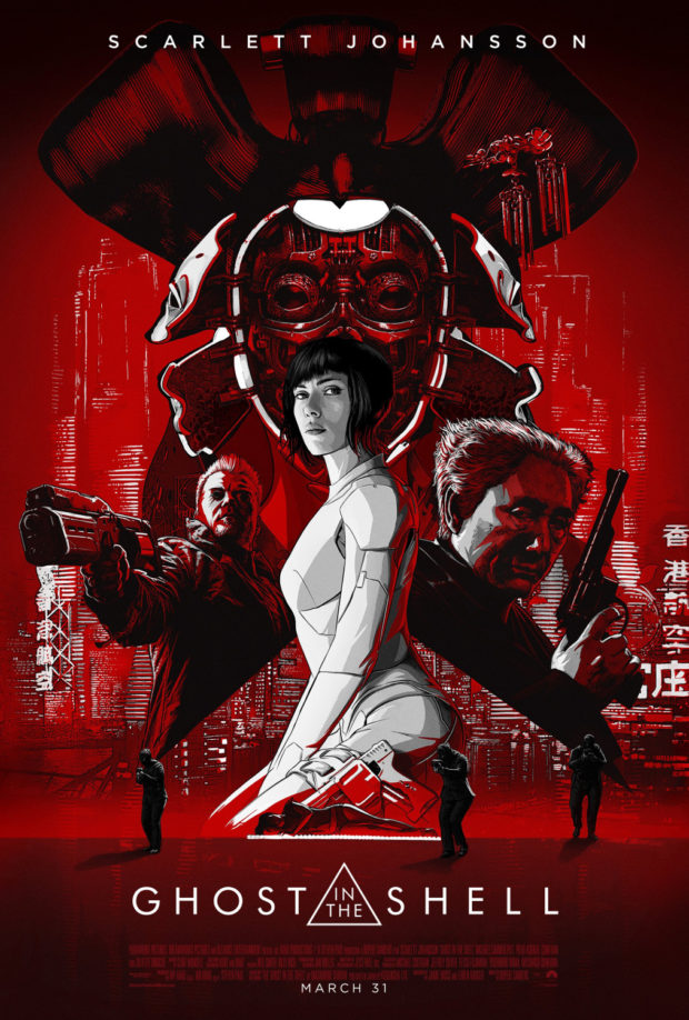
Ghost in the Shell – Designer: LA
The jury is still out on the wisdom of this live action remake of the classic Japanese manga/anime, but this LA designed poster is 100% cool. In particular, we like the way it uses the the triangular motif to frame the placement of the figures in this redder than red print.
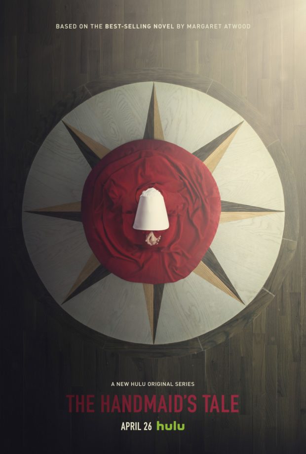
The Handmaid’s Tale
Even if you’ve never read Atwood’s novel (and you should because it’s terrific), this poster tells you much of what you need to know about the restrictive world of the Handmaids, Econowives and Angels that inhabit a society that is not too distant from our own. Were it not for the folded hands (presumably’s Offred’s), you could almost mistake this for an object – which is very much in keeping with the themes of the work.
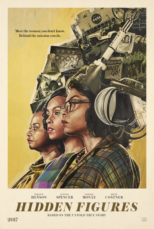
Hidden Figures – Designer: Gravillis Inc
A poster of equivalent power to the message behind one of the more inspirational films of the year. Unlike the standard one-sheet, which concentrates on the three figures at the heart of the story, this one gives equal time to their monumental achievements and knowledge. If there’s any sense of style left in the world, this should be the DVD/Blu-ray cover for all time. Check out our full review here.
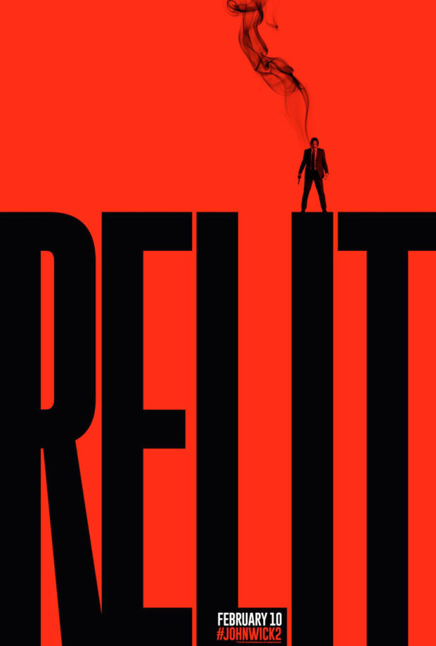
John Wick Chapter Two – Designer: LA
There is a massive cult buzz surrounding this sequel, so much so that it doesn’t even need to prominently display the title of the film. Indeed, our only clear indicator is the small hashtag at the bottom. Let’s hope sad Keanu’s career continues to be as relit as this poster.
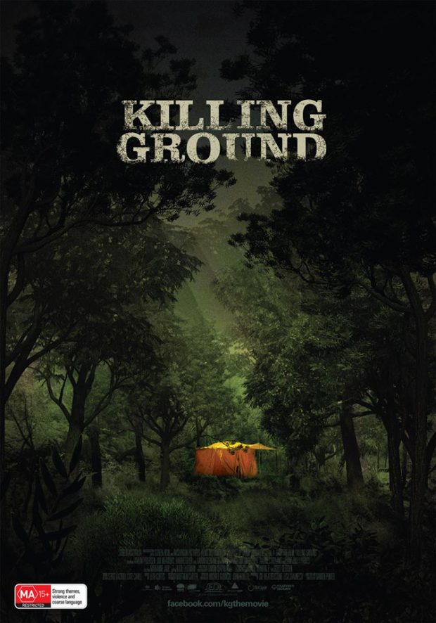
Killing Ground – Designer: Jeremy Saunders
The first of two Jeremy Saunders designs in this month’s selection, the Australian film is about a couple who go camping and discover a bloody toddler wandering the bush. We hope that writer/director Damien Power’s film is half as creepy as this poster.
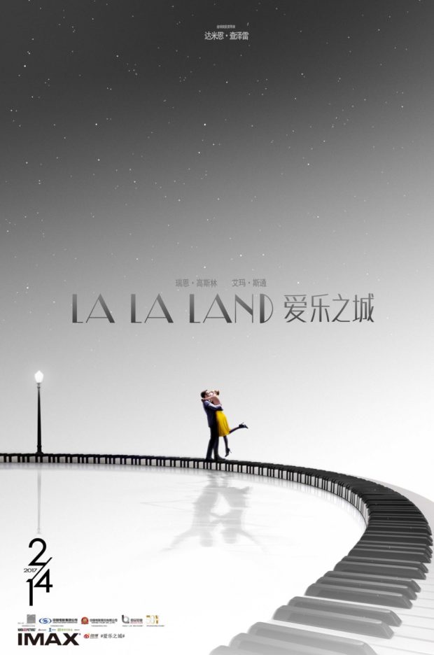
La La Land (Japan)
Another month, another LA LA LAND poster. This film seems to lend itself to gorgeous designs, but this one-sheet – part of a series for the Japanese release – depicts Sebastian and Mia dancing on a giant set of piano keys.
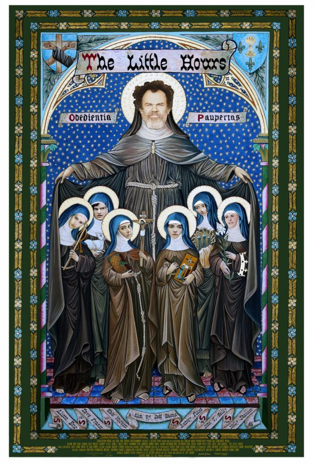
The Little Hours
Jeff Baena (Life After Beth, Joshy) has a comedy coming out about a man hiding out in a convent full of “emotionally unstable nuns” during the middle ages. What better poster to convey that wonderful concept than this one?
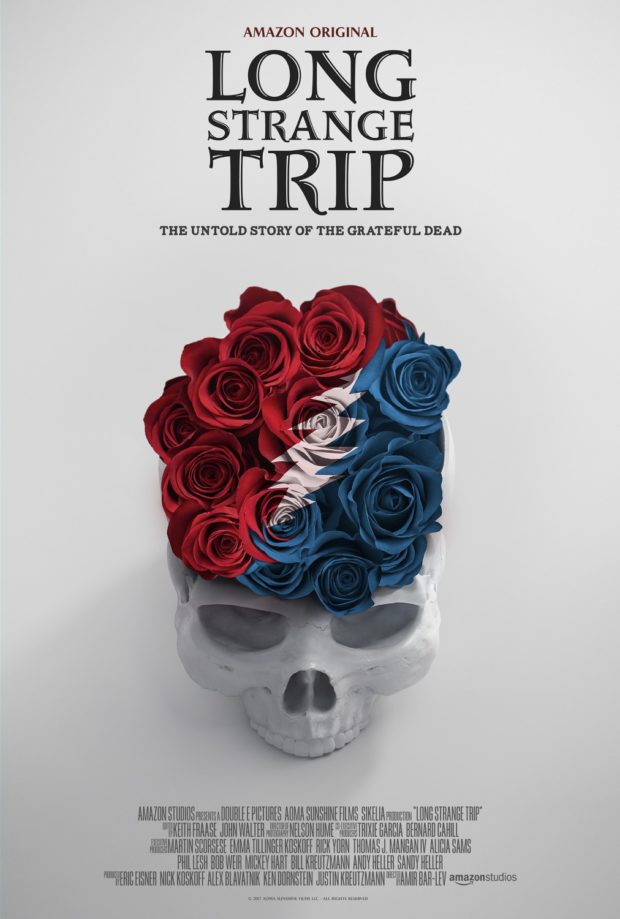
Long Strange Trip
Fans of The Grateful Dead, better known as DeadHeads (because Deadites have vexxed Ash for too long), will finally get to see the untold story of their favourite band on Amazon. Then it won’t be untold anymore. Did nobody think this through? Cool poster though.
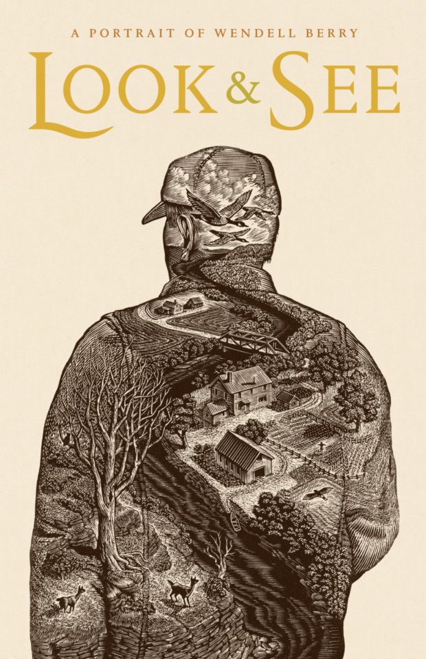
Look & See: A Portrait of Wendell Berry – Designer: Wesley W. Bates
This wood engraving style of poster is a perfect accompaniment to this film concentrating on poet, writer, farmer and environmental activist Wendell Berry. The film is lensed through his works, and this poster is a literal window to what makes him tick. Check out this amazing video 2-hour video of Wesley W. Bates showcasing his meticulous wood engraving process.
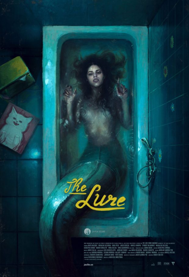
The Lure
One of the more interesting films of the last 12 months, to say the least, was this lesbian-vampire-mermaid-musical from Poland. You can check out our full review here, but you should really see it for yourself.
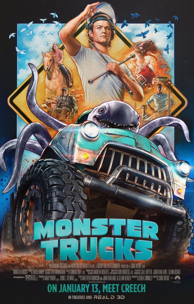
Monster Trucks – Designer: BLT Communications and Steven Chorney
This epic retro poster seems to be for a movie entirely different to the one that actually hit cinemas. While this poster offers us the possibility of a Spielbergian flight of fantasy, the actual film was trucks with monsters in them driving in circles really fast.
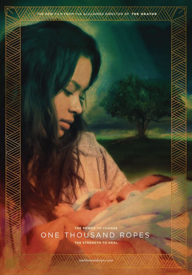
One Thousand Ropes – Designer: Jeremy Saunders
A film and poster that we are particularly excited about. Samoan New Zealander Tusi Tamasese, who we interviewed back in 2011 for his debut The Orator, is following it up with this deeply personal film about family connections. Saunders stunning poster shows some of that connection in a single image, literally framed in the traditional trappings of the island environment.
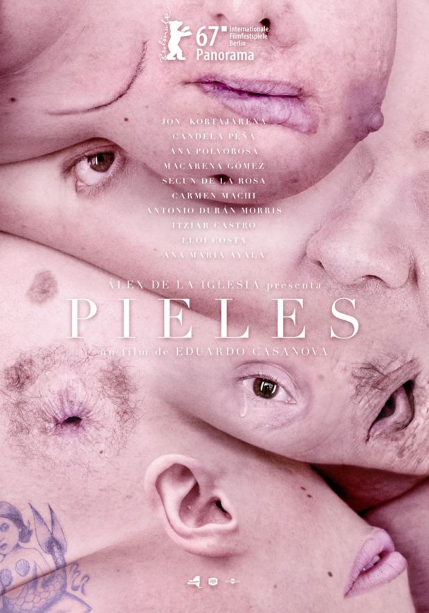
Pieles – Designer: Barfutura
There are no words.
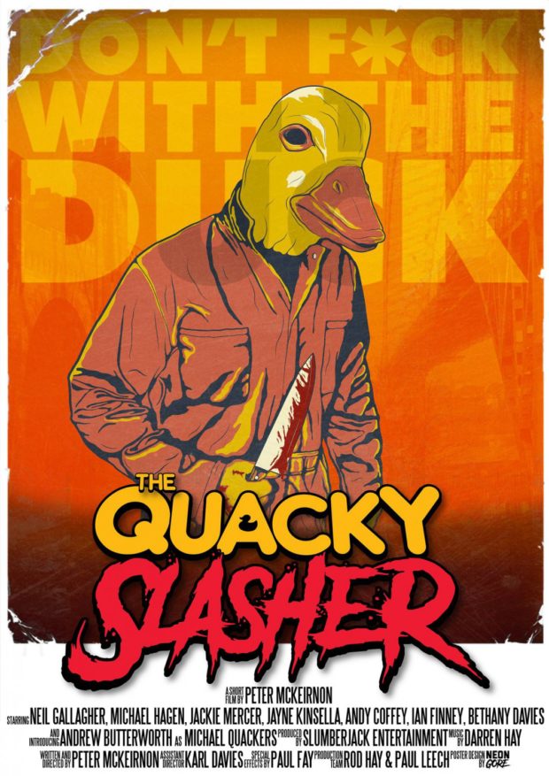
The Quacky Slasher – Designer: NeonGoreUk
We rarely include short films on here, but this is an exception for obvious reasons. Apart from having the best horror title since The Greasy Strangler, the grim visage of a duck with a bloody knife is enough to turn anybody vegetarian. Even if we hadn’t already been sans meat since 1999.
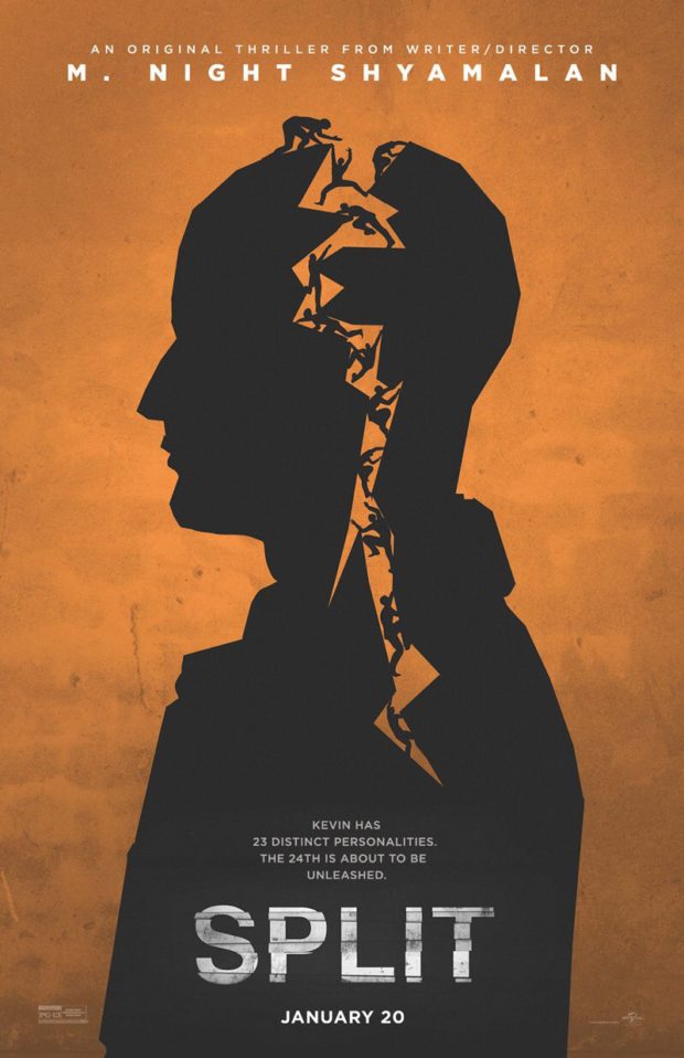
Split – Designer: LA
Audiences are divided over M. Night Shyamalan’s latest, but not as much as the head filled with little people in this poster. Now we want to see the entire film animated in this style.


Comments
3 responses to “Best Film and TV Posters of January 2017”
Hey, this is Matt from NeonGoreUk, super happy you included The Quacky Slasher we designed, Thank you so much, is it possible to update it to show that we designed it please?
Thank you again.
My pleasure, Matt. Done and done. 🙂
Thanks 🙂