It’s the end of the month, so it is time to reflect, relax and rewind our way back through the one-sheets, banners, promotional artwork and posters released in the last calendar month, highlighting some of the ones we though were noteworthy. It’s a little section we like to call Best Posters.
And we’re back, deep in the heart of the post-awards season. There’s a few Oscar nominees and winners, past and present, in the midst of this month’s illustrious company.
Let us know in the comments below if we’ve missed your favourite, we got it wrong, or better yet, if we got it very right.
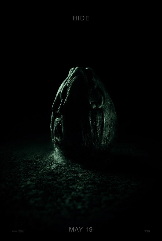
Alien: Covenant – Designer: InSync Plus
Ahead of a new trailer released this month, and following the phenomenal “Last Supper” short film, the simplicity of the design on this poster mirrors the original theatrical poster for Alien. However, the classic tagline “In space no one can hear you scream” is now reduced to a simple “Hide.” Either way, we’re terrified.
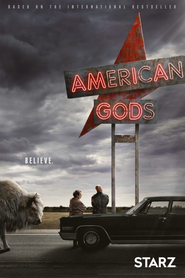
American Gods – Designer: BOND
One of our most highly anticipated TV shows of the year is the adaptation of Neil Gaiman’s most epic of novels. What’s great about this poster is how it reduces the grandeur of the journey down to a beat-up car and the back of Mr. Wednesday and Shadow. Plus a random bison. Looks like they’ve got it just right.
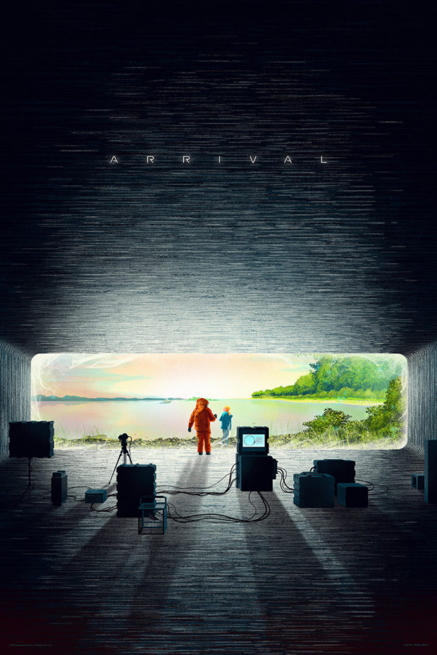
Arrival – Designer: Kevin Tong
Best Picture nominee gets this minimalist poster from Kevin Tong, contrasting (or maybe integrating) the two major elements of Louise Banks’ (Amy Adams) life. The stark coldness of the alien craft looks out over the one place that gives her peace. If only the film’s ending had been this subtle.
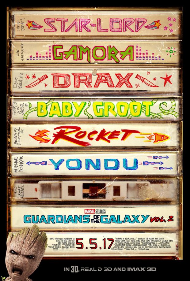
Guardians of the Galaxy: Vol 2 – Designer: BOND
There couldn’t be a more appropriate poster for the sequel to Marvel’s most entertaining hit to date. We’d like to think each character has personally monogrammed their tapes. As cute as Baby Groot is, the character that launched a thousand toy lines, he almost seems incongruous with the tape deck.
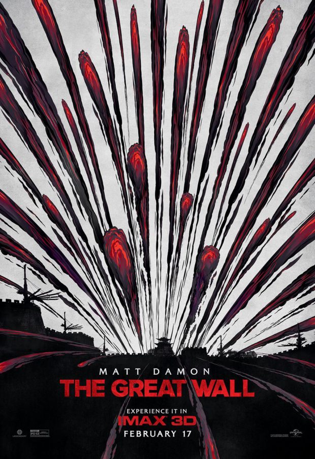
The Great Wall – Designer: BOND
The film may not have set the critics on fire, and in saying that, setting critics on fire is not the best way to endear yourself to them either. Nevertheless, BOND’s variant IMAX poster comes flying at you like an anachronistic Matt Damon.
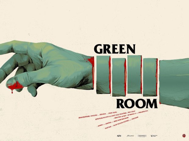
Green Room – Designer: Oliver Barrett
Jeremy Sauliner’s modern cult-classic gets the Mondo treatment, with a simple but eye-catching piece of imagery that looks like it could happily sit in a old cinema lobby or be Xeroxed into a flyer. It’s a good thing Barrett also did a black and white “Flyer Variant,” albeit maintaining the crimson drippings.
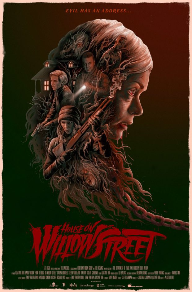
House on Willow Street
This horror flick is getting some decent reviews at the moment, and if this one-sheet is anything to go by, it should be great. Our only issue is that it tells us that evil has an address, but it’s never more specific than the street. This is how mail gets lost, people!
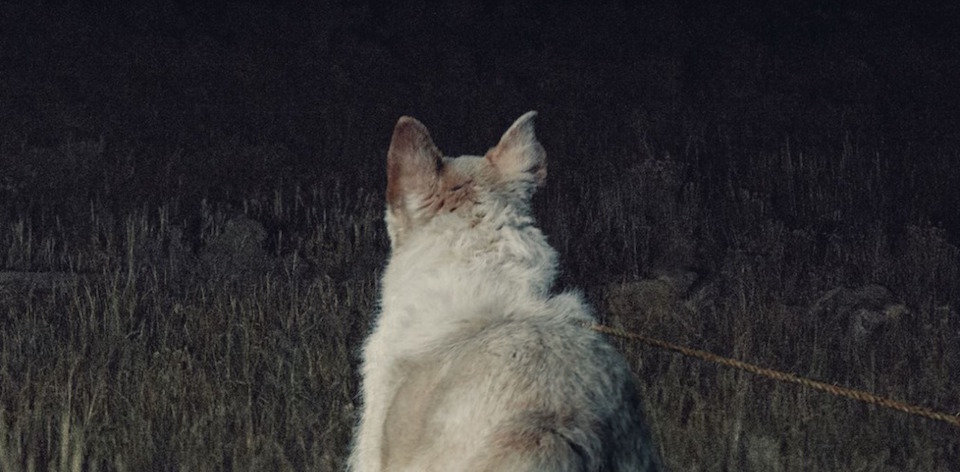
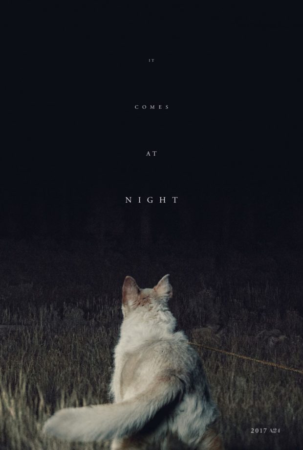
It Comes at Night – Designer: InsyncPlus
So many questions: what is the dog looking at? What is in the dark? Who is holding the rope? It’s queries like these that make for the best spooky posters, drawing us into a world that will more than likely creep the bejeezus out of us. That’s why you’ll find no bejeezus on this site.
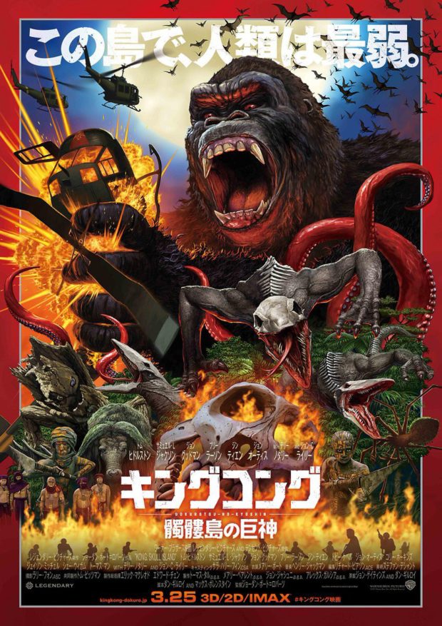
Kong: Skull Island (Japan)
Solidifying Kong’s place as a kingly monster alongside Godzilla, this Japanese monster mashup is both old-school and a thrilling hint at the epic to come.
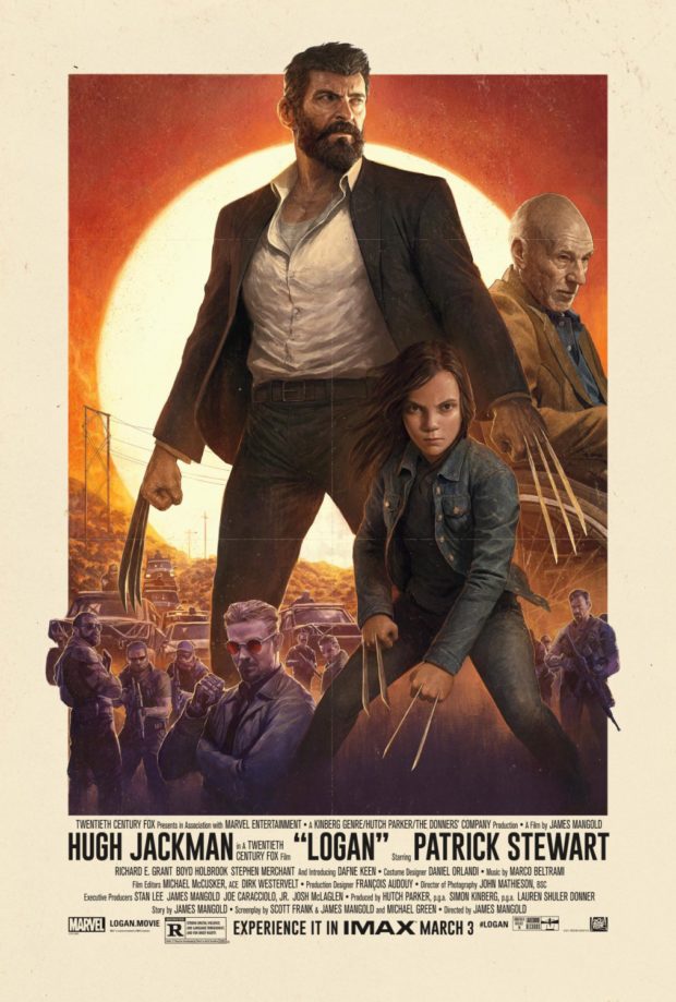
Logan (IMAX)
The film defies convention with its dark outlook and relentlessly violent narrative, and we say those exact words in our review of the film. This throwback poster, designed for the IMAX release of the film, gives it real grindhouse kind of feel and the last time that Wolverine may ever look this tall.
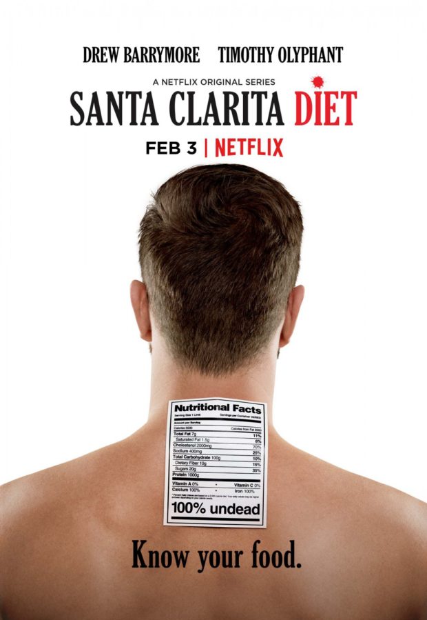
Santa Clarita Diet – Designer: and company
This very black Netflix comedy has a poster sequence that plays on the whole “you are what you eat” motto, depicting various body chunks in vaguely digestible formats. We like the simplicity of the nutritional facts plastered to the back of a would-be victim’s neck.
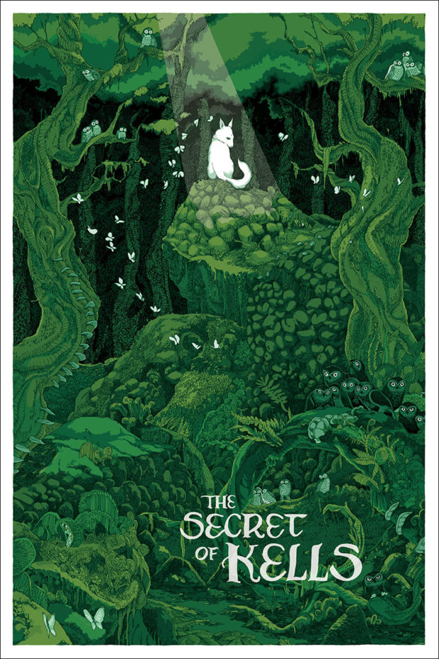
The Secret of the Kells – Designer: Jessica Seamans
Crafted for Mondo posters, this 2009 animated film gets the deluxe treatment from Seamans who called this a “dream assignment” as she attempted to capture the “beautiful and visually dense” nature of the film and its environments. This is the kind of poster we would happily be lost in for hours.
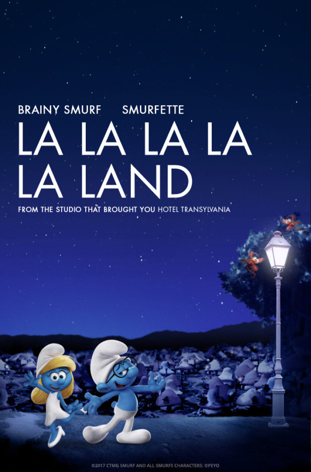
The Smurfs: The Lost Village – La La Land Parody Poster
Part of a series of posters that parodied the 9 Oscar nominees for Best Picture this year, we chose this one because the film itself won briefly, but ultimately lost to Moonlight after a ceremony snafu. If Warren Beatty pulled this out of the envelope, he’d just win our hearts.
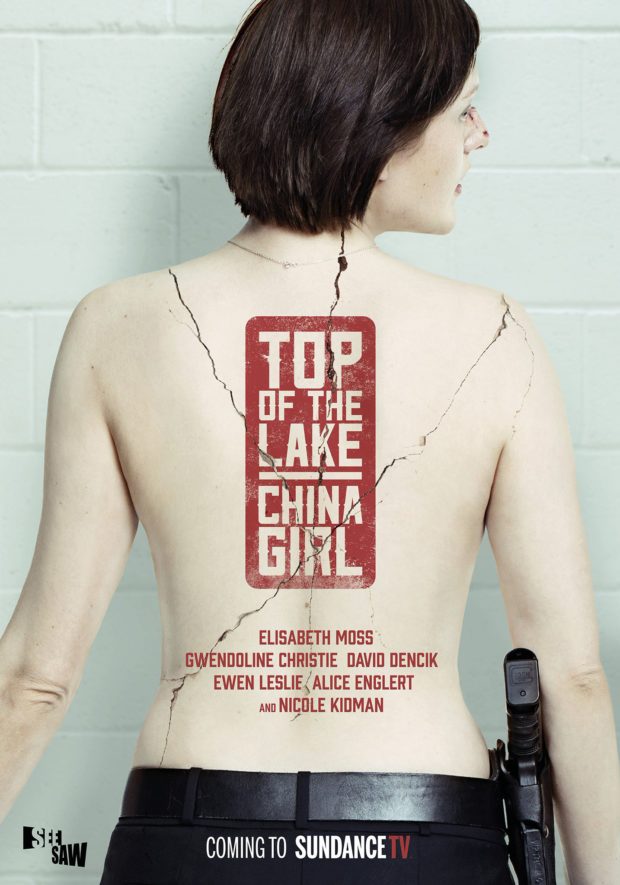
Top of the Lake – Designer: Jeremy Saunders
Australia’s own designer Saunders creates a power piece of imagery for the Sundance TV screening of Jane Campion’s series.
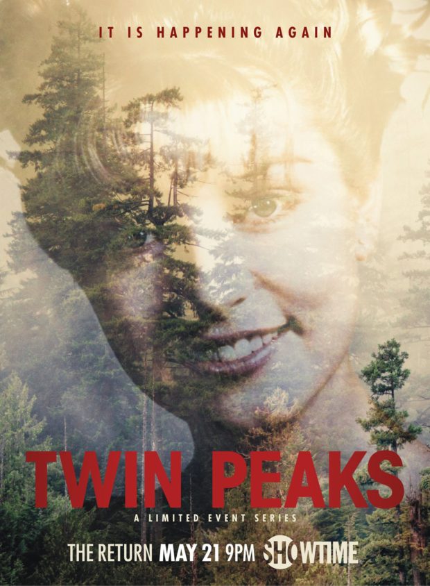
Twin Peaks
A damn good poster. Does this even need an explanation? We just want the series now.

