It’s the end of the month, so it is time to reflect, relax and rewind our way back through the one-sheets, banners, promotional artwork and posters released in the last calendar month, highlighting some of the ones we though were noteworthy. It’s a little section we like to call Best Posters.
We love poster art, as this monthly column would indicate, so it’s always a joy when it’s difficult to choose from the plethora of options. Practically every genre and several mediums are represented in our line-up, with artists ranging from the traditional PR films (BLT Communications LLC has a big slice of this month’s pie) through to artists known for their comic book work (Becky Cloonan, Tula Lotay, Francesco Francavilla).
Let us know in the comments below if we’ve missed your favourite, we got it wrong, or better yet, if we got it very right.
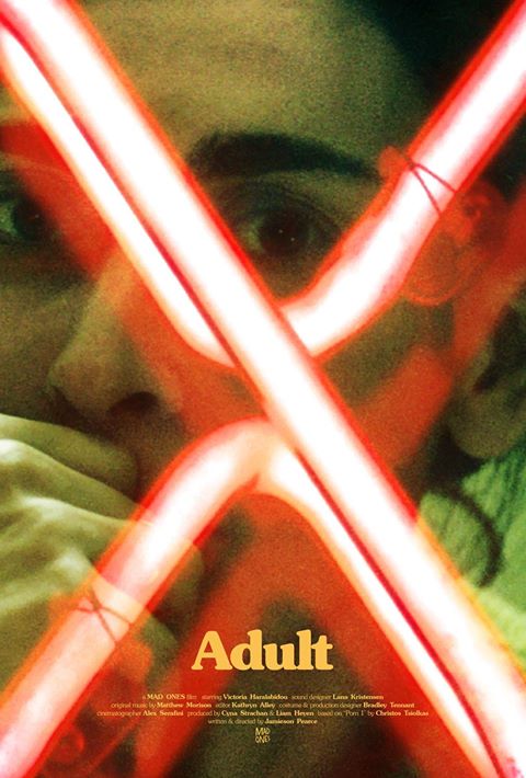
ADULT – Designer: Jeremy Saunders
Saunders is seemingly a staple on our monthly lists – and for good reason. The way his designs highlight faces, texture, and light are visually engaging, and in this case X literally marks the spot(light).
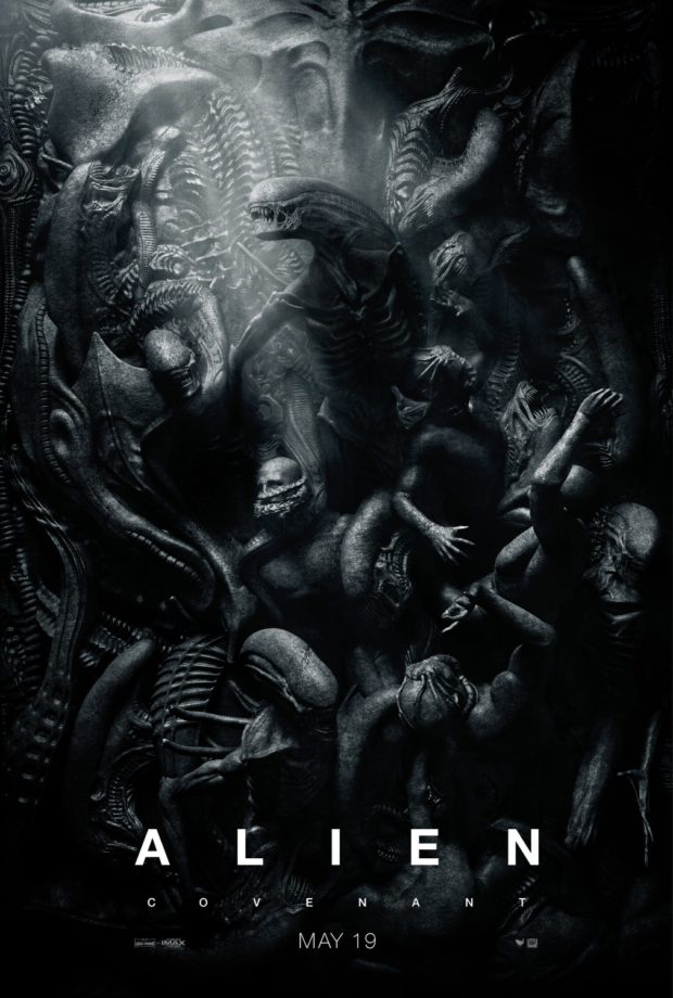
ALIEN: COVENANT – Designer: BLT Communications LLC
The return of Ridley Scott to the franchise is already compelling, but the twisted body horror is a tip of the hat to H.R. Giger in its literal combination of body parts and other things that are terrifyingly familiar. Either that or it’s the strangest ‘morning after’ story never told.
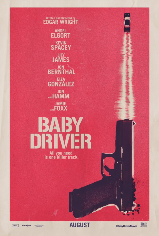
BABY DRIVER – Designer: BLT Communications LLC
Already the subject of massive internet hype, this comparatively understated one-sheet has all the minimalism of the Coen Brothers’ Fargo tracking through the snow coupled with the promise of director Edgar Wright’s fast-editing wizardry.
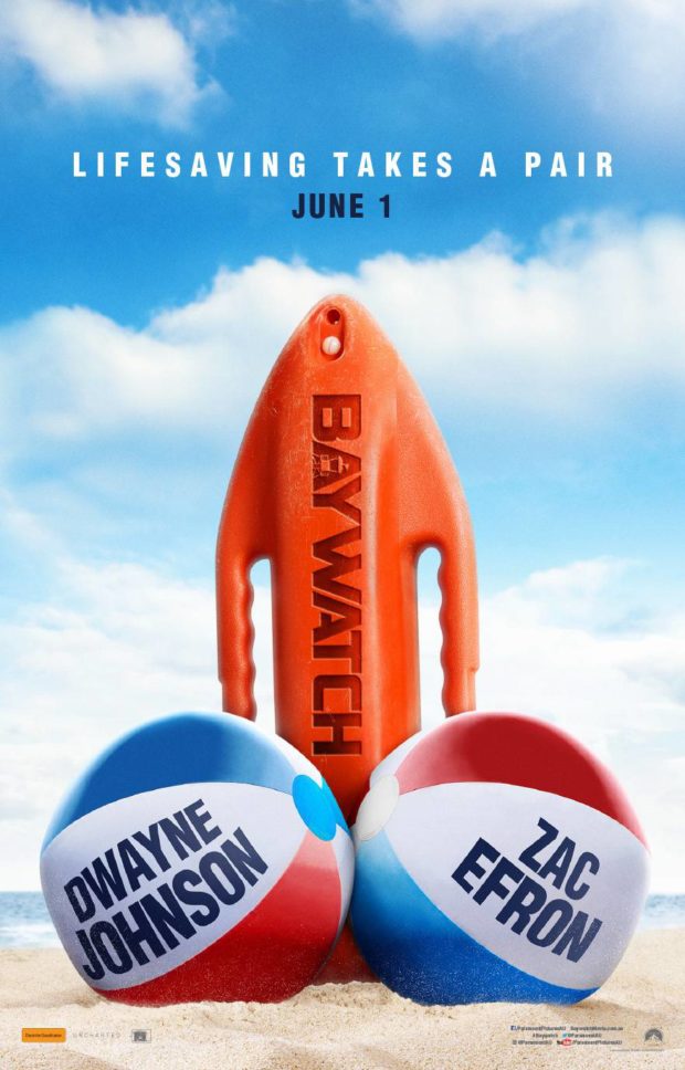
BAYWATCH – Designer: BLT Communications LLC
Some people stand in the darkness, afraid to step into the light. Others just need a giant set of balls. What we love about this poster is that it tells you literally everything about the film, but like the object it insinuates it also promises that the real fun is yet to come.
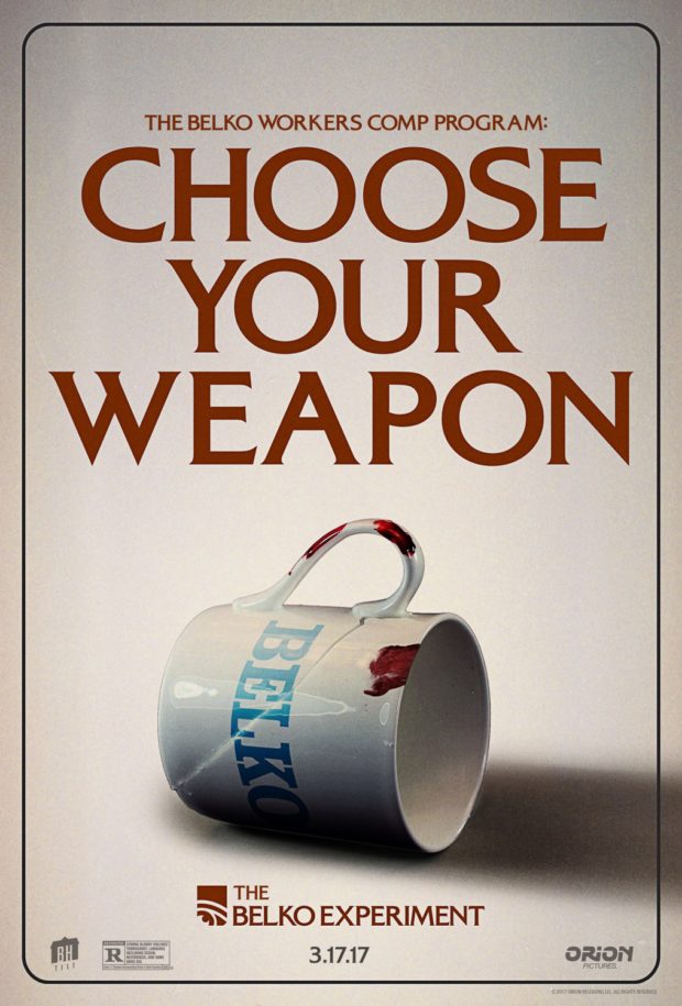
THE BELKO EXPERIMENT – Designer: Blood and Chocolate
The horror film directed by Australia’s Greg McLean and written by James Gunn that reads like a combination between Office Space and Battle Royale. This is part of a series of HR-inspired posters that feature everyday office objects bloody and smashed. If only our tea cups looked this clean.
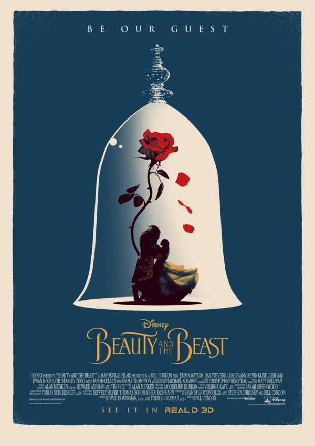
BEAUTY AND THE BEAST – Designer: Matt Ferguson (UK)
The credits notwithstanding, the beautiful thing about this design is that it’s equally applicable to the 1991 film and the 2017 live-action remake. It’s simplicity itself, with a near silhouette of an iconic scene captured forever in a glass case against a plain background. The texturing adds to the timeless quality.
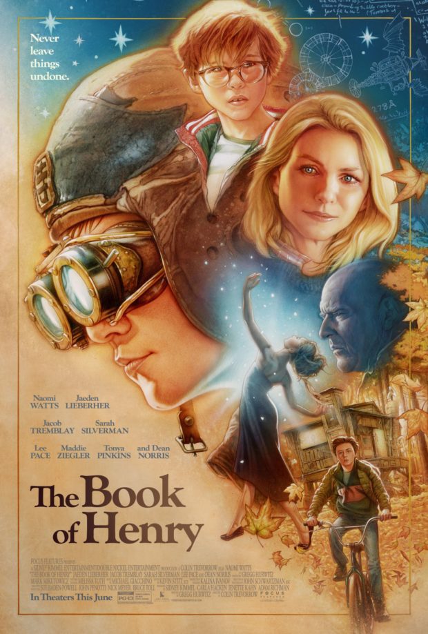
THE BOOK OF HENRY – Designer: P + A and James Goodridge
An immediately iconic poster that instantly recalls Richard Amsel or more specifically Drew Struzan. It’s the kind of imagery that invites you to go on an adventure, and return to it as you would a well-worn book.
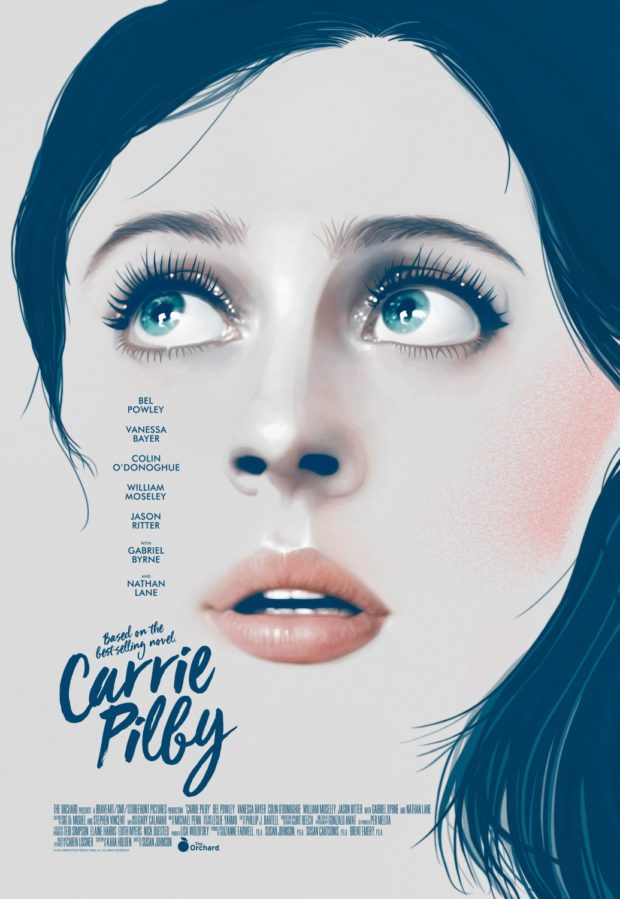
CARRIE PILBY – Designer: The Refinery
The coming of age story has been marked for its predominantly female production crew. It can also be praised for it’s gorgeous graphic marketing designs, as the run of hair effortlessly frames those glistening eyes that draw the viewer in.
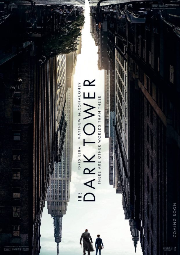
THE DARK TOWER – Designer: WORKS ADV
The first poster for Nikolaj Arcel’s THE DARK TOWER has arrived online – and it’s as complex as the saga that inspired it. We’re thinking the design is more Dark City than Inception. Make sure you flip your device’s screen and look at it from the other direction, and you might just see a fellow who goes by many names.
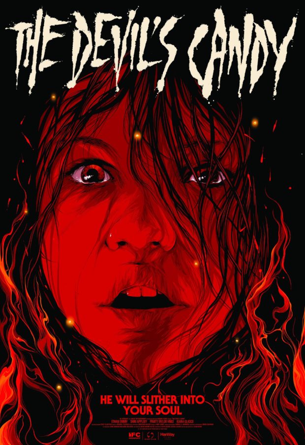
THE DEVIL’S CANDY – Designer: Ken Taylor
The always reliable Taylor bathes his subject in red, ensuring that if “He” doesn’t slither into your soul, then his poster will slither into your heart.
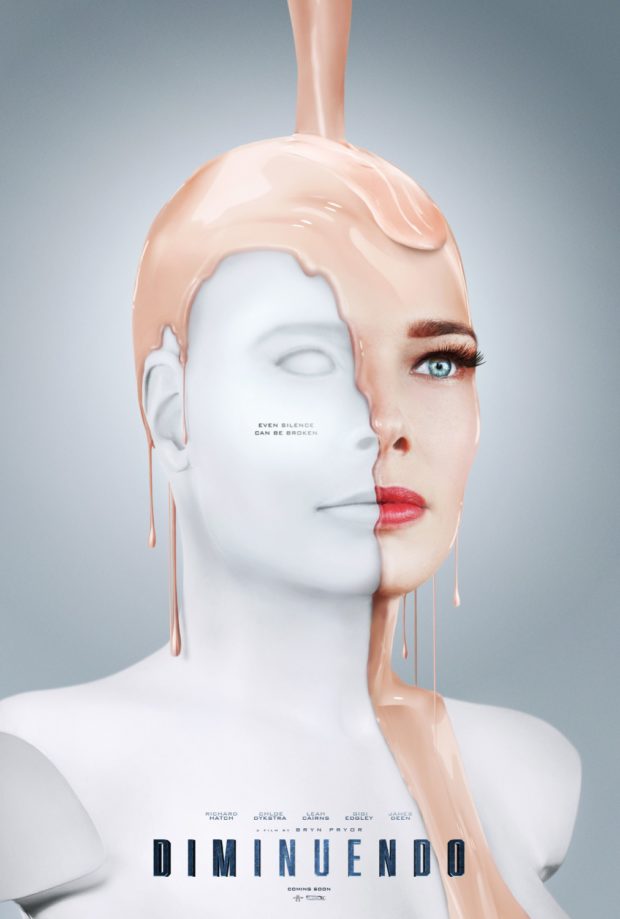
DIMINUENDO – Designer: MOTTO
Isn’t this how Viserys Tagaryen died? Meaning “to decrease in loudness,” the final film of actor Richard Hatch (who died in February) the poster communicates the theme of identity the movie appears to play with.
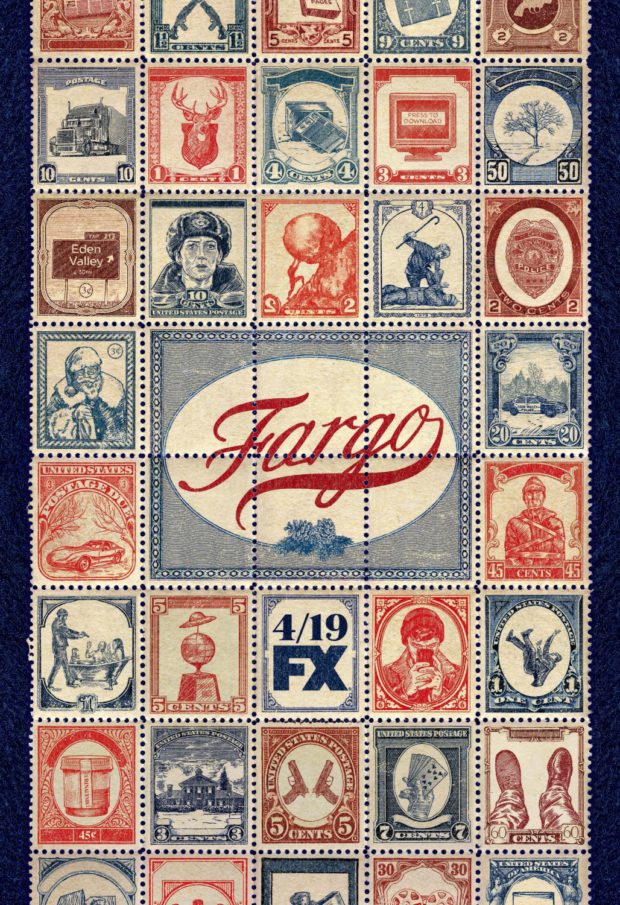
FARGO: SEASON 3 – Designer: ARSONAL
The prospect of another series of FARGO, especially with Ewan McGregor playing no less than two roles. This stamp-based poster appeals to our philatelic sides, and it’s neat that it plays with the existing colour palette of the show’s branding.
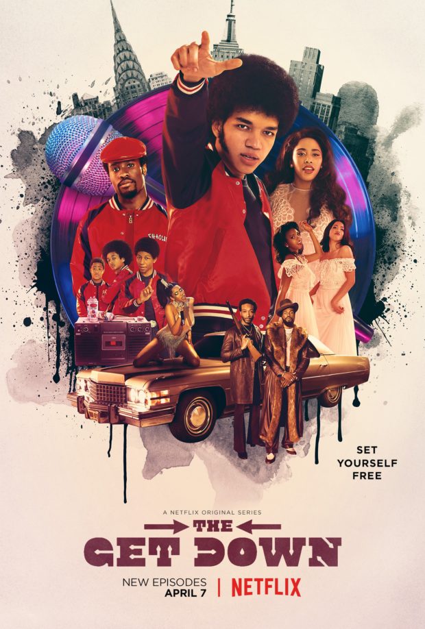
THE GET DOWN – Designer: Gravillis Inc
The second half of Baz Luhrmann’s origins of hip-hop comes back to Netflix in April, the collage approach is frame against the dripping paint of the street art that peppered the first instalment.
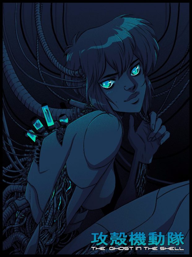
GHOST IN THE SHELL – Designer: Becky Cloonan
Another design that could apply to the original or the remake, Cloonan created this poster in partnership with Mondo and Kodansha Comics. It’s gorgeous.
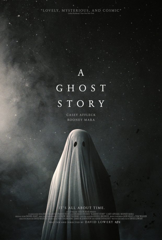
A GHOST STORY – Designer: P+A
Already pegged for a number of “best of” lists, this is a poster that fully embraces the power of minimalist design.
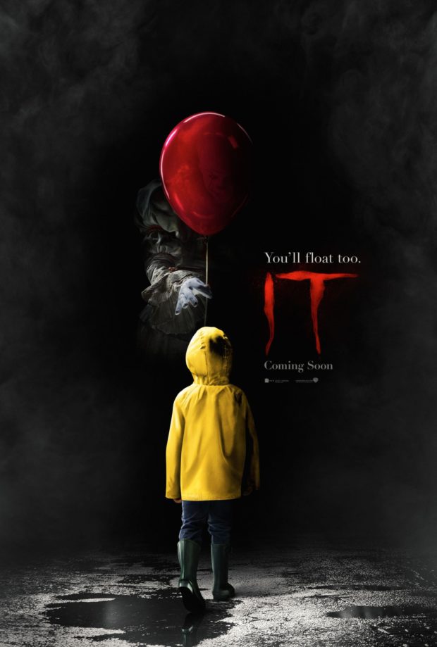
IT – Designer: Canyon Design Group
The first poster for Andrés Muschietti’s adaptation of IT mercifully keeps Pennywise mostly out of sight, so he can now only hurt us when we think about his horrifying visage in the dark recesses of our mind.
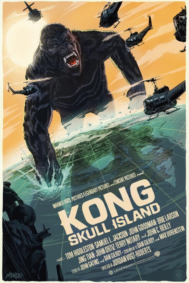
KONG: SKULL ISLAND – Designer: Francesco Francavilla
In the film, which we quite liked actually, Kong’s size is significantly larger than previous versions and he always seems to be framed by the sunset. Francavilla goes for broke on both of these things, with a Kong who is literally taking on the world.
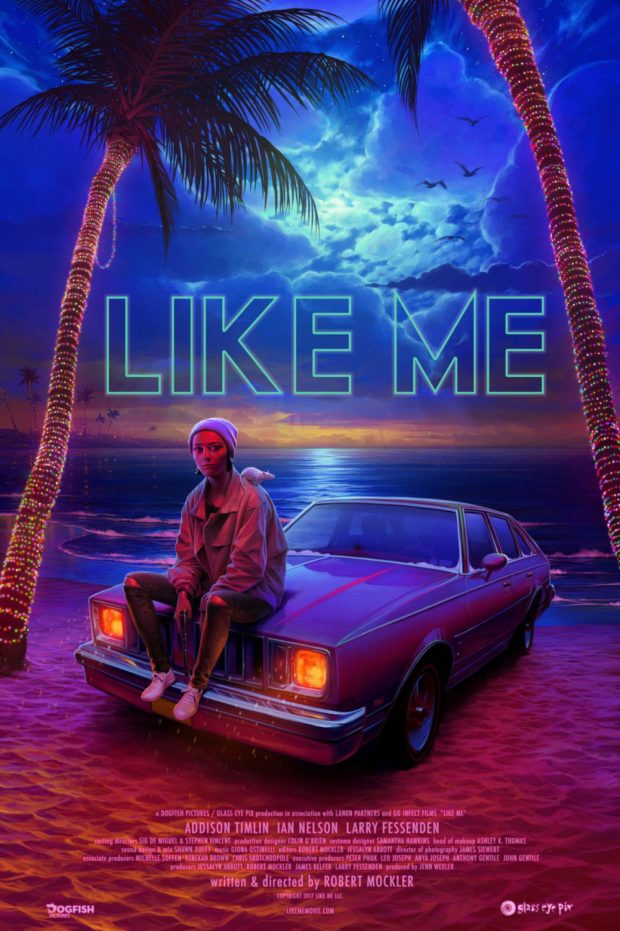
LIKE ME
Do you? Like me? Surely you like this poster though, with its neon moonlight illuminating rising star Addison Timlin (Little Sister) and her pet rat.
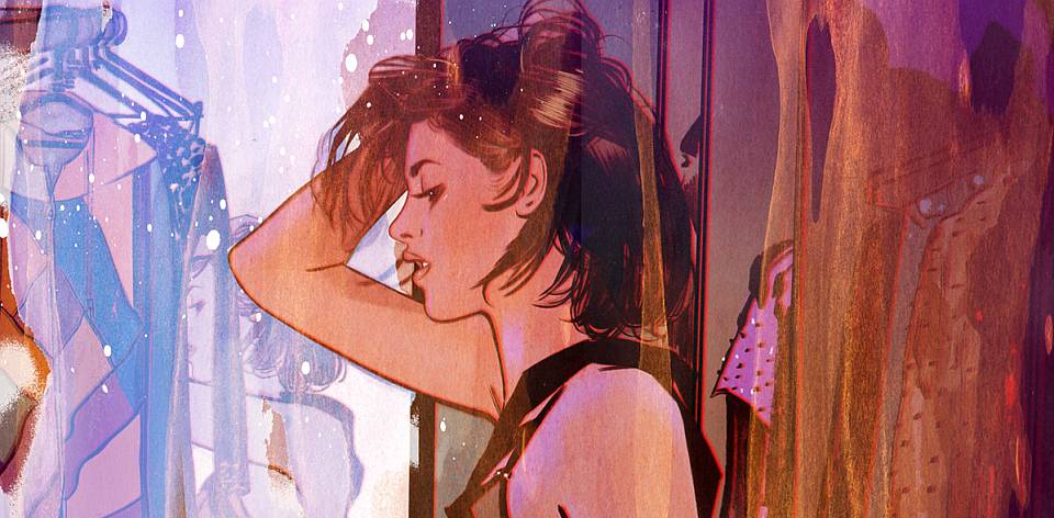
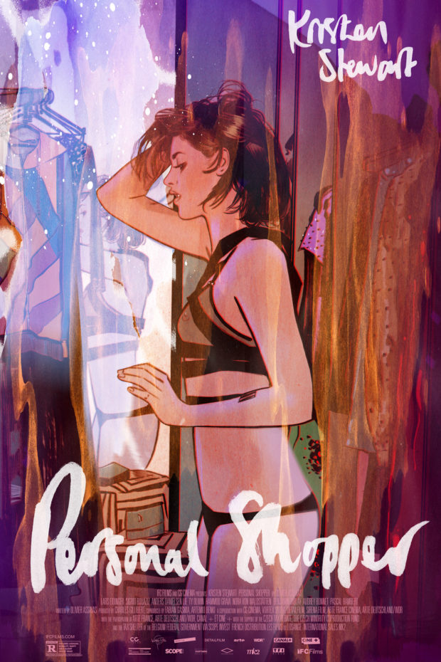
PERSONAL SHOPPER – Designer: Tula Lotay
Lotay, the pseudonym of Yorkshire based comic artist Lisa Wood, commented: “I wanted something ethereal like the film, that captures the tension and underlying sexiness of Stewart’s character. I hope I’ve done it justice.” The artist has done more than that, and while we didn’t appreciate the film as much as Lotay did, her interpretation in this poster makes us want to take a second look.
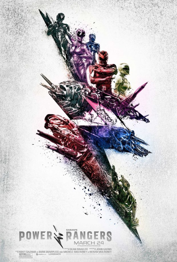
POWER RANGERS – Designer: LA
The film may have received a critical bashing, but this poster recognised something that the original teaser poster did almost a year ago: there’s a beauty and style to this film, even if it’s eventually buried in the sturm und drang.
SILICON VALLEY: SEASON 4 – Designer: Buster INK
One of our favourite things are posters that take the viral approach, advertising a product or service from the film or TV show itself. The fourth season of the HBO series, an insanely sharp parody of California’s IT crowd, makes that possibility possible.
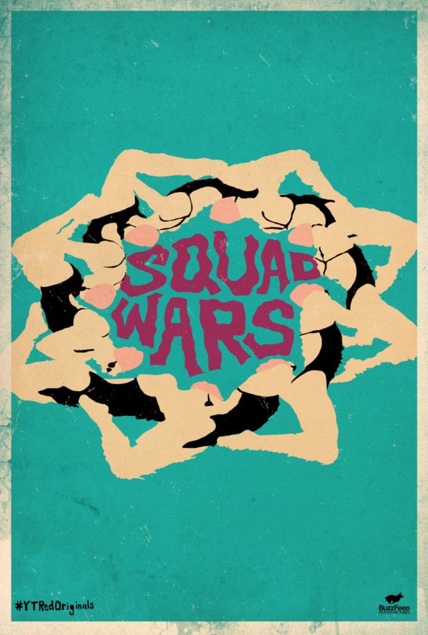
SQUAD WARS – Designer: Cold Open
The YouTube Red series is produced by BuzzFeed, and the distinctly Jackass vibe doesn’t inspire us. However, the one thing we like more than posters is synchronised swimming, and these illustrated swimmers as all one big star in our eyes!
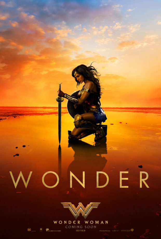
WONDER WOMAN – Designer: BOND
The “Wonder” across the middle is almost a review for the poster. This is everything that Patty Jenkins’ film represents to the DC Extended Universe: a bright and hopeful light at the centre of a hitherto dark Trinity.

Comments
1 response to “Best Film and TV Posters of March 2017”
Squad Wars looks like a ripoff of a John Wesley painting.