It’s the end of the month, so it is time to reflect, relax and rewind our way back through the one-sheets, banners, promotional artwork and posters released in the last calendar month, highlighting some of the ones we though were noteworthy. It’s a little section we like to call Best Posters.
This month we’ve got everything from the heavy-hitting posters for the next Star Wars film through to independently produced Australian noir (Trench). If there’s a theme this month, it’s duality: at least four posters work in multiple directions (Colossal, Newton, Sense 8, The Mist), while others (Star Wars, The Void) show the divide between light and dark. Yeah, we get deep around here.
Let us know in the comments below if we’ve missed your favourite, we got it wrong, or better yet, if we got it very right.
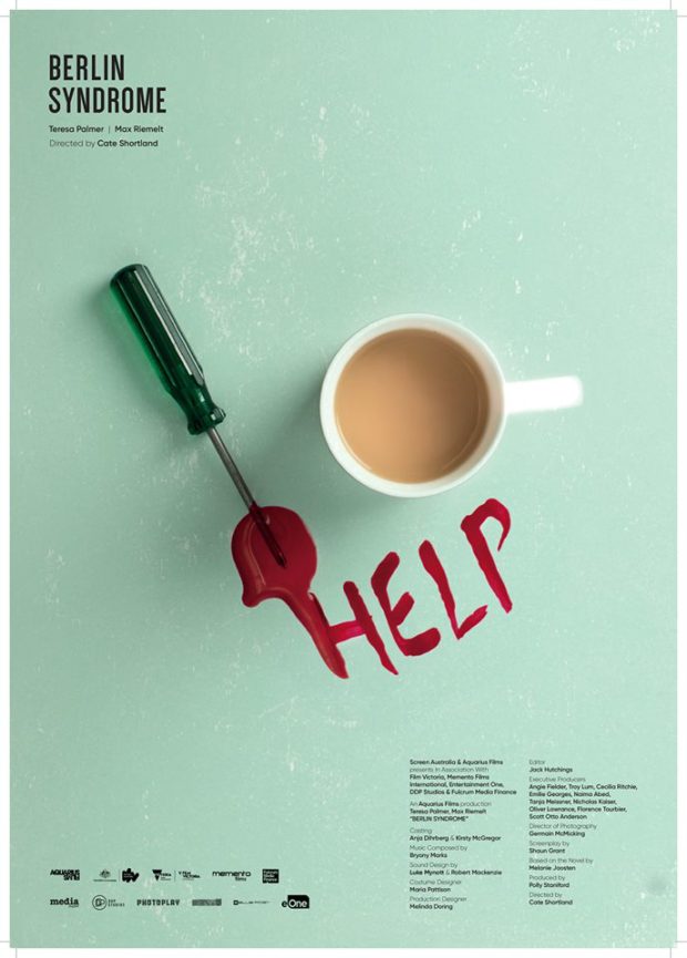
BERLIN SYNDROME – Designer: Jason Cooper
Cooper created a series of posters for Cate Shortland’s beautifully shot kidnap thriller. Using the themes of “Deception,” “Entrapment,” and “Control,” Cooper’s minimalist approach highlights the tension underlying the film and the importance of small objects in this closed environment. This poster recalls a particularly climactic sequence in the film.
COLOSSAL – Designers: We Buy Your Kids
Australian duo We Buy Your Kids (and Mondo) stretch the poster to giant-sized lengths for this visual representation of the most unique monster film in a long time. Text notwithstanding, the imagery could be viewed in either direction, as a kind of psychedelic reflection of (literal) inner demons.
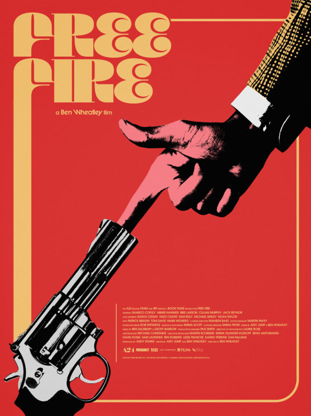
FREE FIRE – Designer: Jay Shaw
The film takes us back to the wide-collared 1970s for a balletic bit of gunplay where the words fly as fast as the bullets. Jay Shaws retro design, including the groovy font and the Dadaist/photomontage look of the finger blocking the gun barrel.
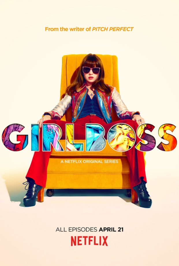
GIRLBOSS – Designers: P+A and Autumn de Wilde
Using photography by Autumn de Wilde, Britt Robertson owns this vividly coloured poster for the new Netflix series.
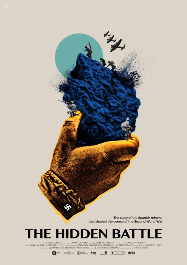
THE HIDDEN BATTLE (La Batalla Desconocida) – Designers: PABLO DÁVILA ESTUDIO
The visually striking poster features art by Pablo Dávila Castañeda, photography by Suso Bello, and photo retouching by Joan Locubiche. The studio comes together in a montage for Paula Cons’ documentary.
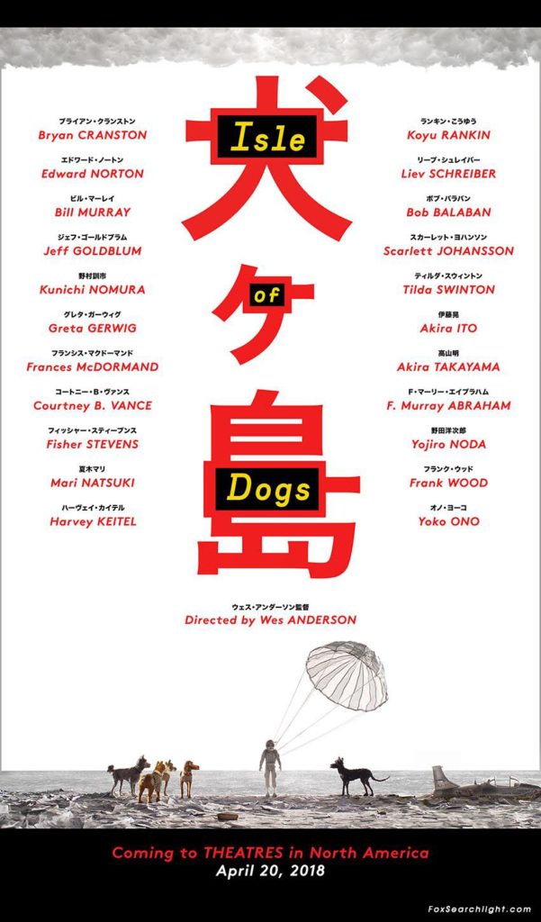
ISLE OF DOGS
The most interesting thing about the poster for Wes Anderson’s forthcoming film, about a boy’s odyssey in search of his dog in Japan, is how plain it is. The bulk of the poster is dominated by the impressive cast list with their names duplicated in Japanese, but it’s the titular dogs surrounding a recently (crash)landed pilot that draws the eye.
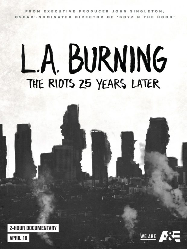
L.A. BURNING – Designers: Leroy and Rose
A powerful poster for the film documenting the 25th anniversary of the LA Riots, Leroy and Rose go a long way towards earning their self-appointed slogan of being the “best agency in the universe.” The visual concept is a simple one, but they pull it off beautifully.
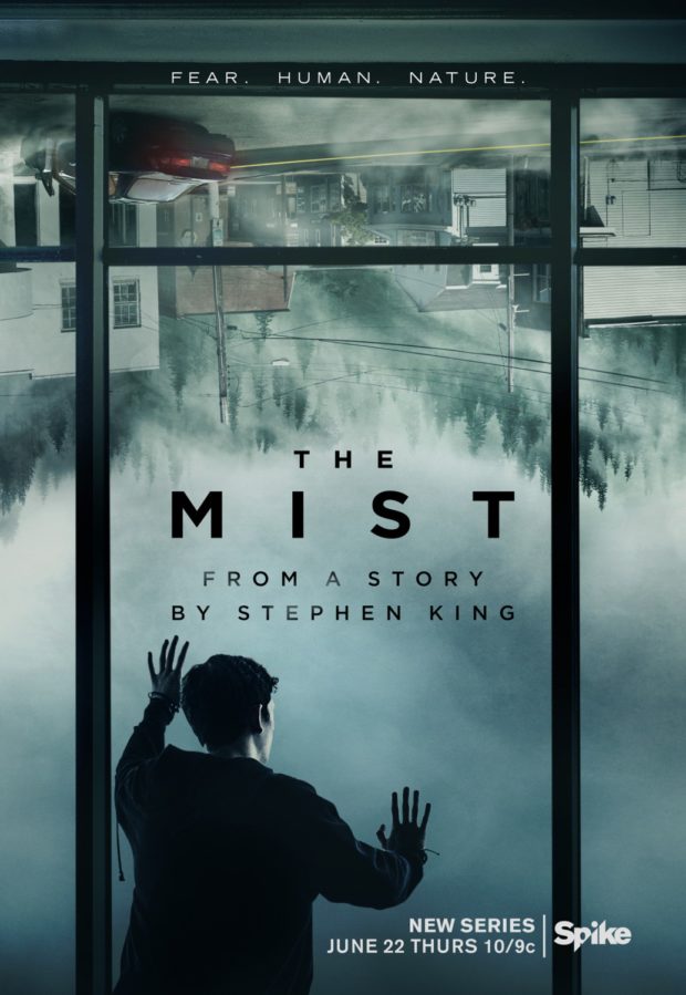
THE MIST
As the Year of Stephen King rolls on, the forthcoming TV show gets a one-sheet that quite literally flips the script. Interestingly enough, a similar concept was used for The Dark Tower poster that we highlighted last month. Mind you, we also included the poster for It, and that clown can damn well stay the right way up, thank you very much. We must move on: there are other worlds than these.
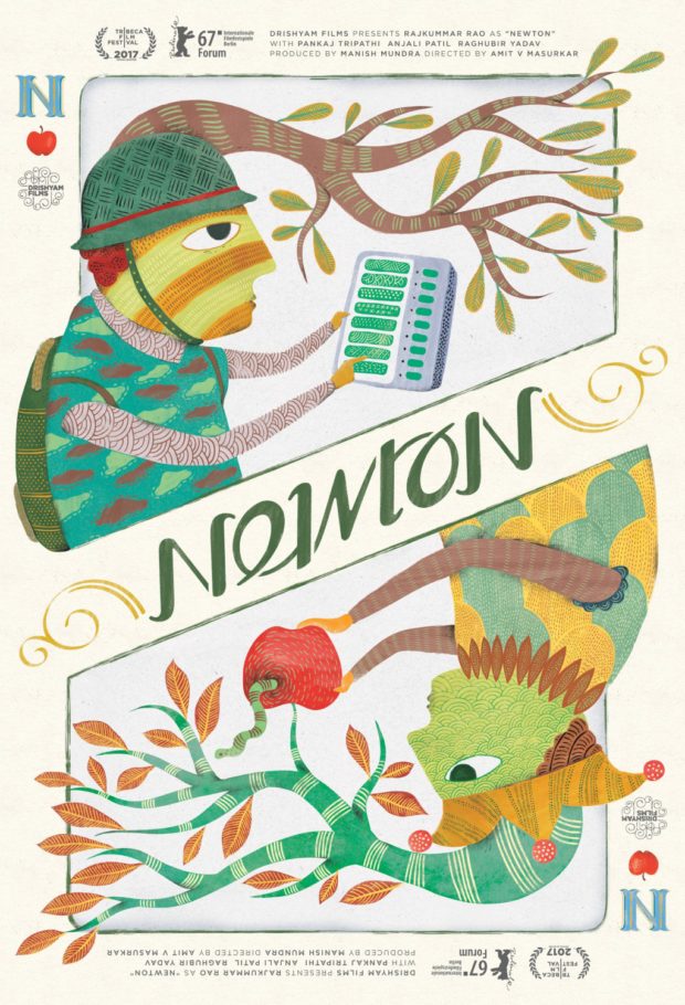
NEWTON – Designers: By Two Design
The film, which follows the fight for free elections in India, gets a beautiful and organic design from By Two Design. On their website, they explain their inspiration: “In collaboration with the clients, we took inspiration from folk art specific to the region and adopted the vibrant colours and textures in a contemporary context. The poster was thought of as a playing card, to convey duality and the title of the film is an ambigram.”
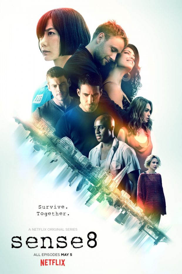
SENSE8: SEASON 2 – Designers: BLT Communications, LLC
What were we just saying about upside-down worlds?
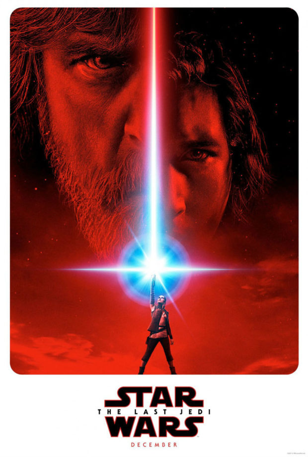
STAR WARS: THE LAST JEDI – Designers: LA
If this is going to be the Empire Strikes Back of the sequel trilogy, then red seems like a reasonable choice of colour. The posters naturally recall familiar elements from the past, with Daisy’s pose reminiscent of Luke’s in the original Star Wars poster designed by Tom Jung for the 1977 release.
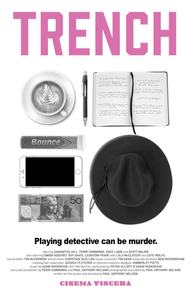
TRENCH – Designer: Julyan Stephens
We’re pretty excited about the release of this Australian noir from Paul Anthony Nelson and Perri Cummings. We asked Paul about his thoughts on what he wanted for the teaser: “I wanted to give a little insight into the unconventional — and not particularly professional, or efficient — detective we’re introducing here, by spotlighting the tools of her trade. And we felt that the “knolling” approach (ie. the art of photographing neatly arranged objects from above) was such a distinctly modern way of seeing things, that it was a perfect way to flag TRENCH‘s constant collision of the past and the present, which runs through everything about the movie — from its film noir setting in modern-day Melbourne, to the way it was shot in digital, but framed at a 4:3 ratio in black and white like an old Hollywood noir. So we pitched this idea to our poster designer, Julyan Stephens, and he came back with this. Needless to say, he landed the plane like a champ.”
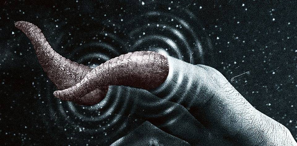
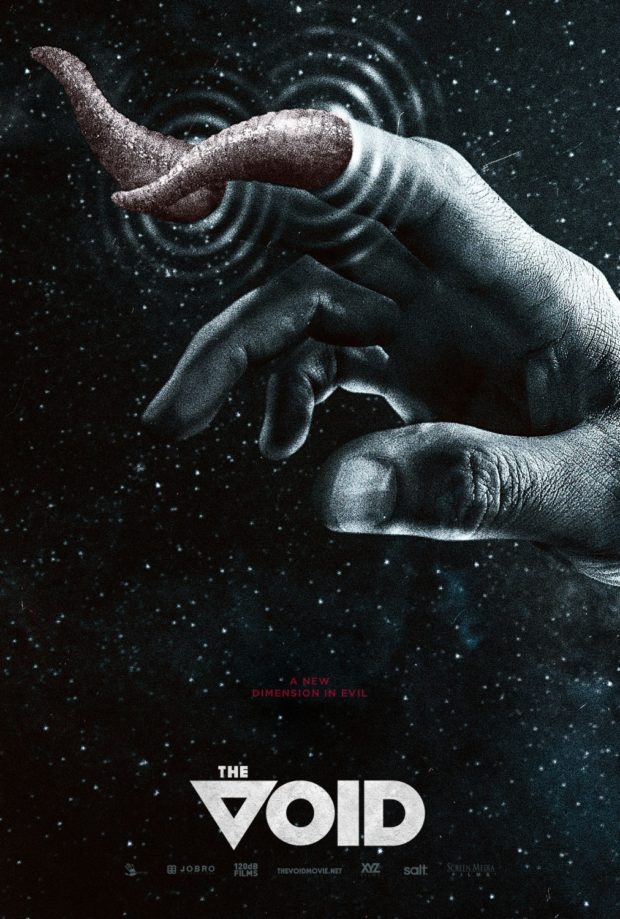
THE VOID – Designers: Gravillis Inc
Canada has a lot of big claims to make in the horror genre, from David Cronenberg to John Fawcett, and the poster for Steven Kostanski and Jeremy Gillespie’s creature feature really puts its finger on what creeps us out the most.

